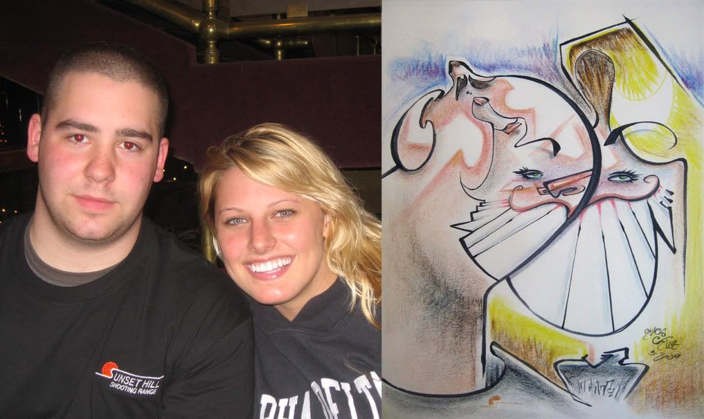
 1. I redrew this couple for fun. the sketch I sold to them was just ok. and felt I missed their distinct features so I redrew it later on. this is sorta where I would like my sketches to be more of. aggressive yet simple. and less marker lines, more with colors.
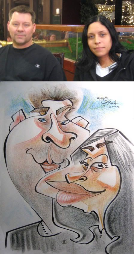 2.
2.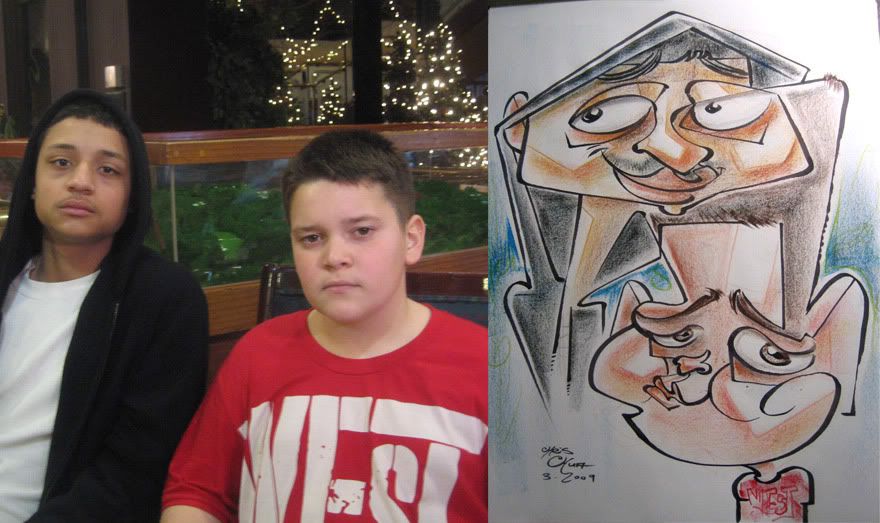 3. these were the kids of the pic right above, they wanted one after seeing me draw their parents. I liked the top kid more than the bottom, made his eyes too big.
 4.I like his cheek to her nose line. could have pushed the guy more. I liked the 1 line of the pupils of the woman.
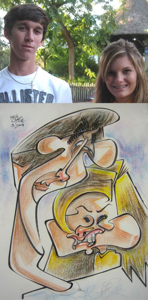 5. another redraw for fun of previous customers a few months ago at Busch Gardens.
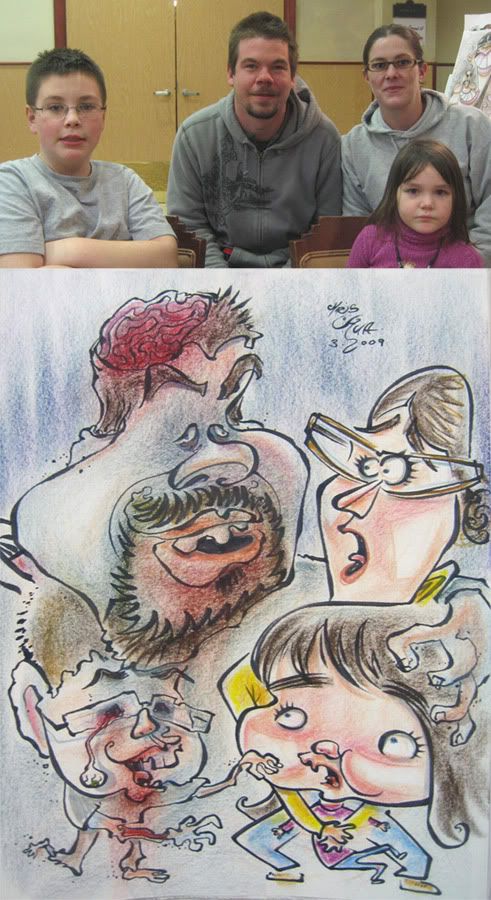 6.this was a cool family. they came up to me and said they wanted to be zombies, which is awesome and I've never gotten asked before. although the bad news is that I'm really not that good with bodies unless I have a clear idea. but at least it was a fun idea. as I was planning it out they said that the dad and son were more the big zombie fans, so I suggested that 2 of them were zombies scaring the other two and they liked that idea. so with bodies, usually, I'm using what little brain power I have trying to come up with something and on top of that I needed to figure out a layout for 4 people, so I didn't have much brain power to think about style and usually resort to a more tame (realistic-y for me) style. and less designy. I think it came out ok, I liked the ideas and it's fun, but stylistically a sort of step back from where I'd like to go. they liked it so that's cool.
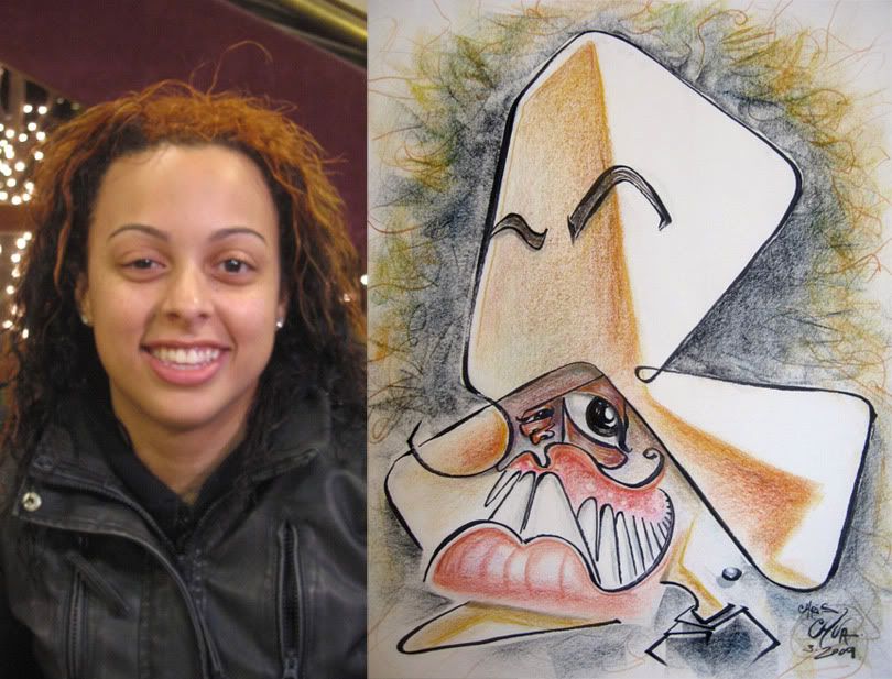 7.a redraw for fun. trying some things.
 8. I like the baby's Mr.T...shirt. likeness on left kid needs some work, too much forehead.
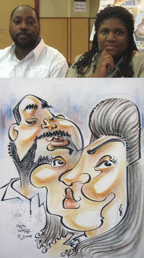
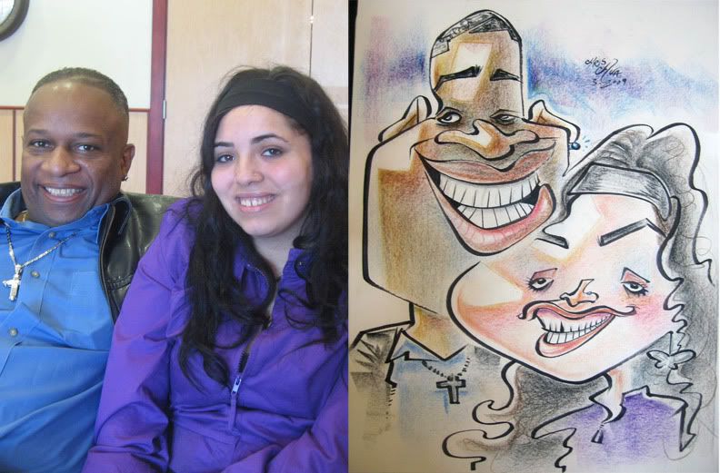 9. could have pushed it further but they were REALLY cool people, very chill, fun to talk to. and they really liked the sketch. the ideal customers really. oh and when they were about to get a caricature, they stopped by to say they were going to go eat first and then get their caricature done, the girl was psyched and gave me a high five. high fives rule, I like'm. high fours rule too if you're my friend, Gabe Hunt.
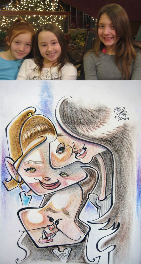 10.
10. 11. redraw for fun. I like the nose/hair and openness of the hair kid.
 12. made the woman's mouth too low.
-------------------------------------------------
I saw Watchmen, it was all right. thought it moved a little too slow in the beginning, special effects, action and most everything else was decent. Malin Akerman (Laurie Jupiter in the movie), I think she's got a wonderful face. kinda unorthodox/unconventional (in a good way), distinct and very cute. hey, I'm a caricature artist, I look at faces, heh. I think she'd be fun to draw. I'll have to draw the cast sometime. oh and the guy who played nite owl, Patrick Wilson, he was in a movie called Hard Candy, GREAT movie, check it out if you get a chance, also stars that girl who played Juno. cool thriller.


11 comments:
I'm really liking it when you've gone back and re-done them. That one of the girl with that weird grimace-smile is splendid!
Dude, you are out of control. I really love these images. You're a monster.
Peace,
Joe
Amaz-tastic stuff as usual, i really like those redraws, the first one especially, for the reasons mentioned, simple and agressive.
inspiring.
Amazing works here! Very unique! And very inspirational!
fran- thanks! I was happy with that smile too.
joe, william, ioo- thanks, guys!!
those are all very enjoyable. I really like the bootom one and i aggree abouther mouth.
Great distortions!!!!!
Great distortions!!!!!
DUDE! I'm really diggin' the more graphic/lighting effects you're doing with the color. It makes more seance with your drawings, all I have to say past that is......seriously you have LOST YOUR MIND!!!!! ......well, you lost it a long time ago, but every once and again I have to reiterate that.
thanks, guys! sean, glad ya like the graphic coloring, I think it fits with my style. I'm still messing around with coloring. Alex Clare was showing me some different color stuff that I wanna try out. man, I was watching him draw in the park yesterday and he doing some killer work. when you gonna come and visit?!
Hey Chris! I think your style is interesting. See my work at www.ecaricaturas.blogspot.com
Greetings from Mexico City!
Post a Comment