Saturday, December 06, 2008

Caricature- 24 Person Commission! (NOV 2007)

Here's a commission I did last year, NOVEMBER 2007, for the spa at Great Wolf Lodge, Poconos.
I didn't go too crazy and I'd exaggerate some features differently now that I have more experience but overall, I was happy with it. This is by far the most amount of people I've drawn in a caricature, I think the previous most might have been around 10. I had fun doing it and thought for kinda winging the placement of everyone, it came out decent. oh and only 1 person was offended, heh. and it's one of the ones I didn't go as exaggerated on too! funny how people react.

Well, I'll be going to Busch Gardens, Florida, to draw caricatures for a little while with super talented, Sean Gardner and gang. Hopefully, I'll do some crazy and better work so I'll have some new park sketches to post here. I've been doing a LOT of sketching and figuring things out recently and I think I figured some stuff out and am anxious to test it out in a park setting. so see ya in a bit! oh and I'll post the subpar work I did at last month's NCN convention when I get back.

Caricature- Super connect line, Jafar-ish, mermaid man (OCT 2008)

drawn during the month of OCTOBER 2008 at Six Flags, NJ & Dorney Park, PA

nothing too too crazy this month. better than last month, at least did some passable stuff to end the season ok, but still in a funk.

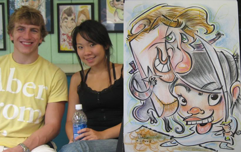
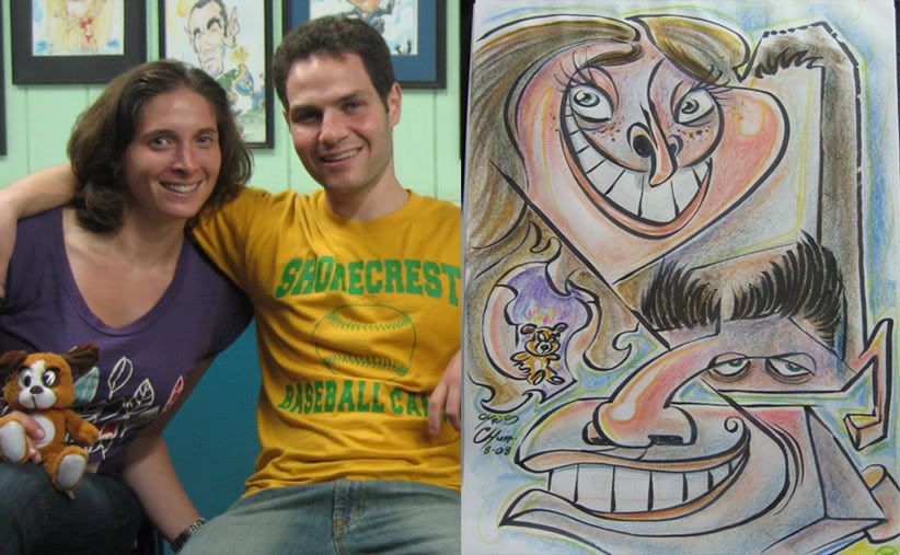
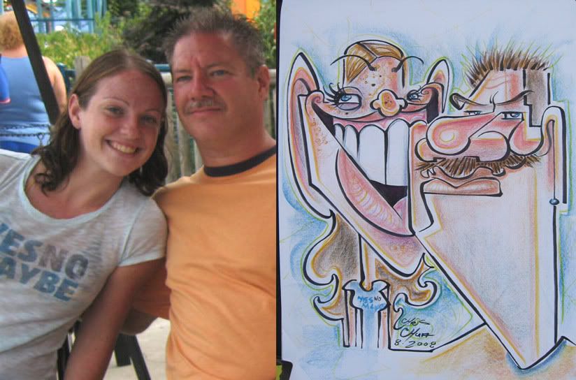
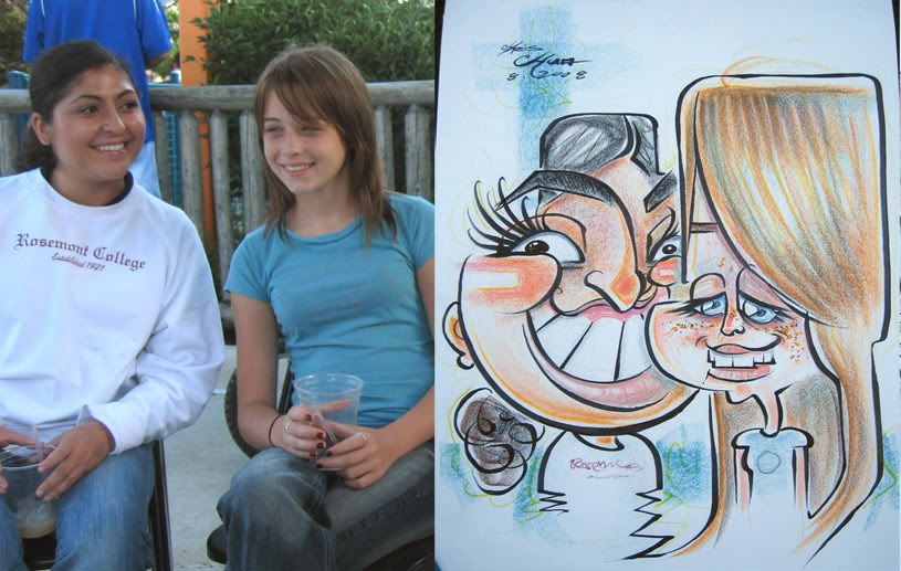
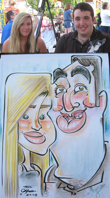
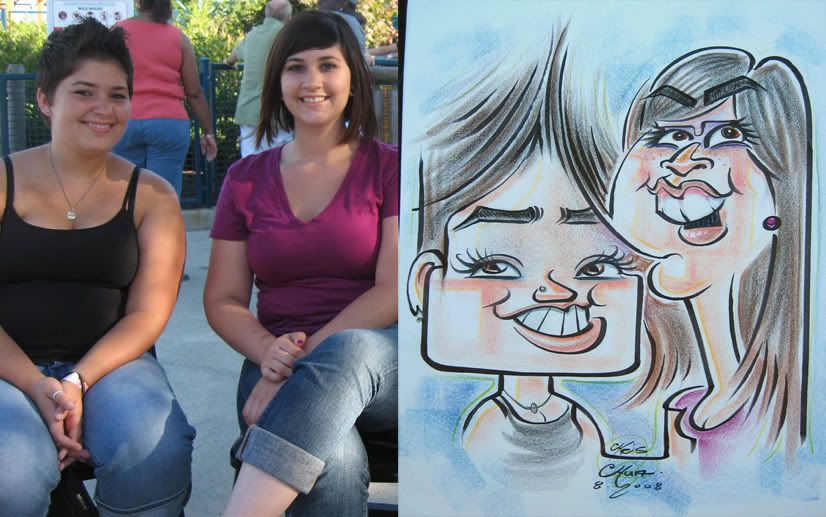
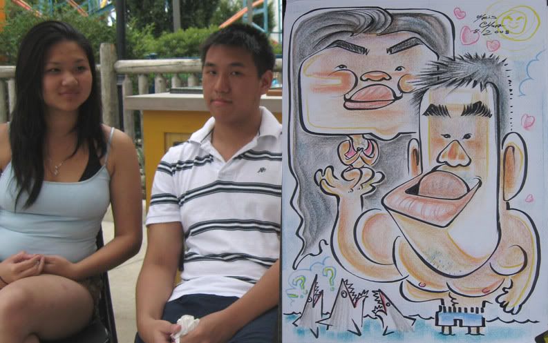
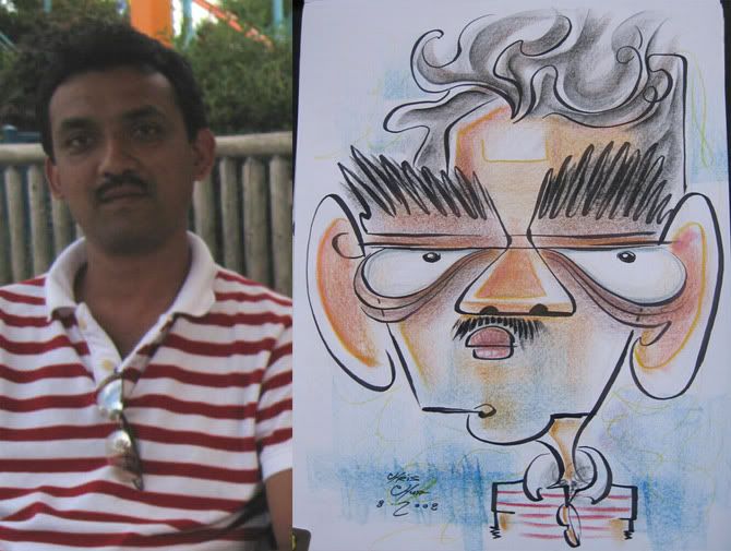
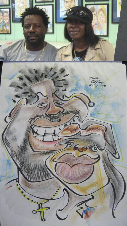
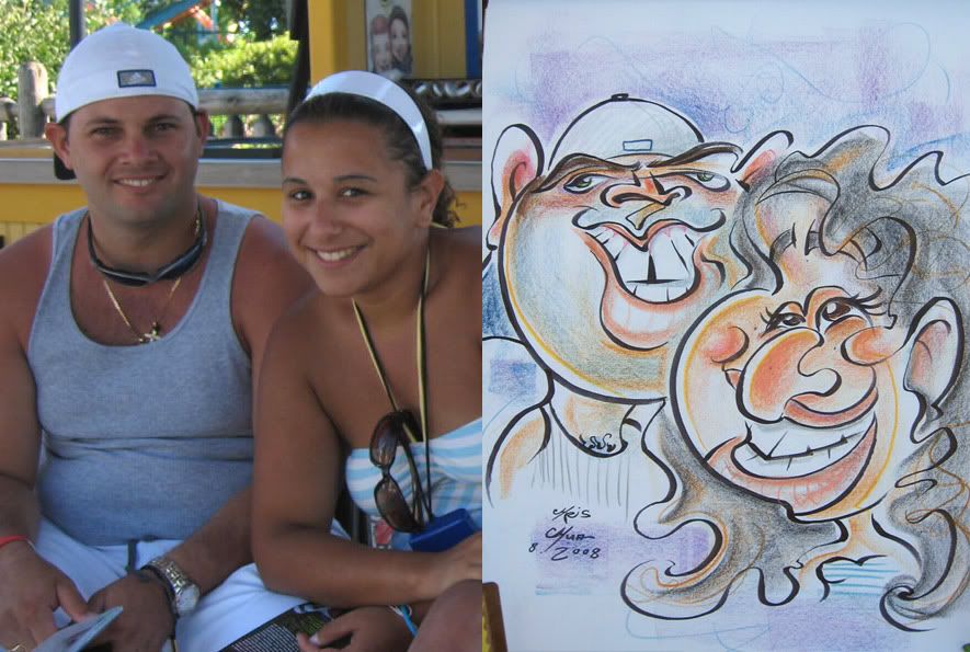
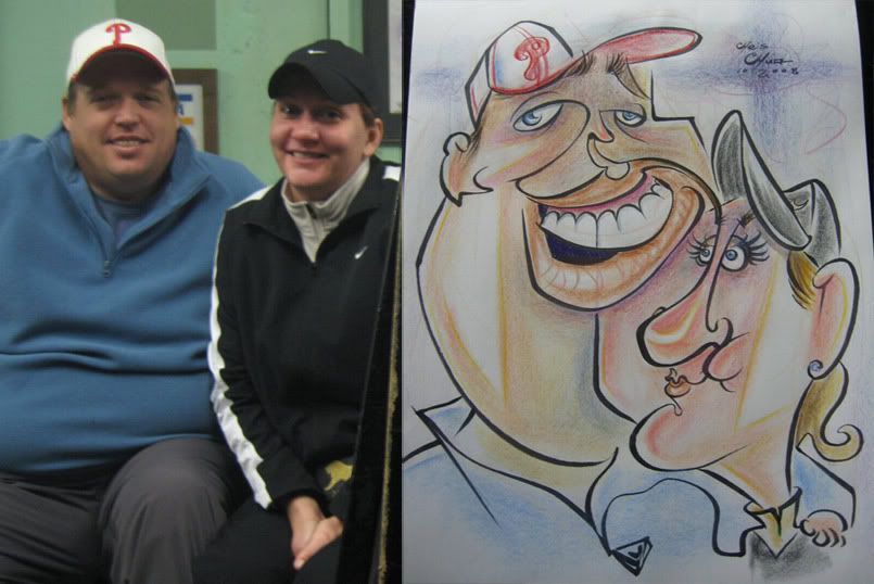
1. the swirl connect line from her eye to her teeth to his eyes and back to her eyebrows might be my most extreme connect line. I was pretty happy with that. but think I lost likeness on the guy who had more aggressive features and dont' think I got that across as much and didn't exaggerate as much as I could have either- he needed more chin and more neck mass.

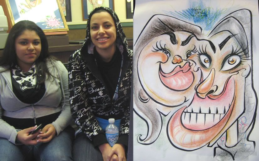
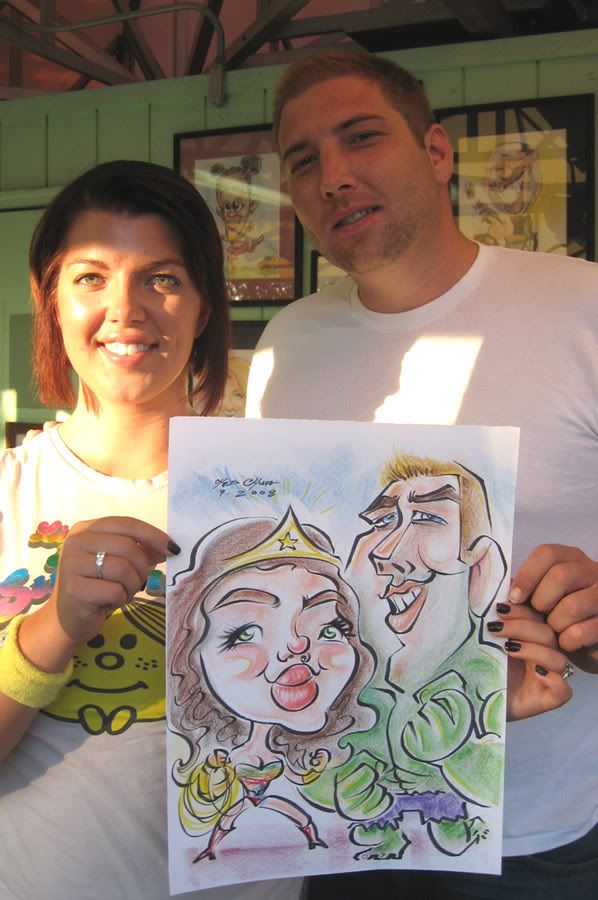
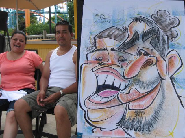
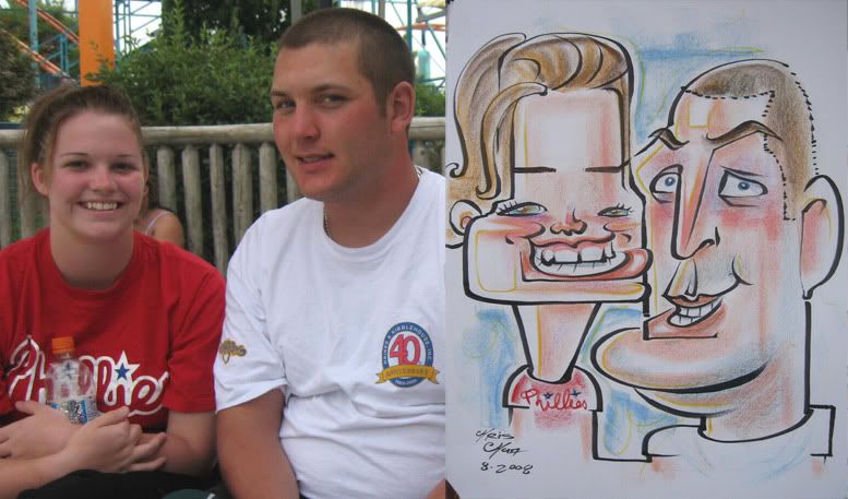
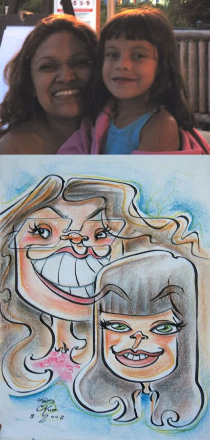
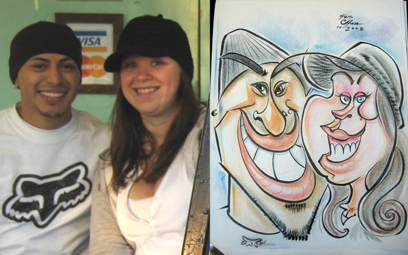
2. their friends watching me draw her said the girl on the right looked like Jafar from Aladdin. I could see that. I liked her teeth. she didn't like the sketch. girl on the left side did or liked her version of herself at least.

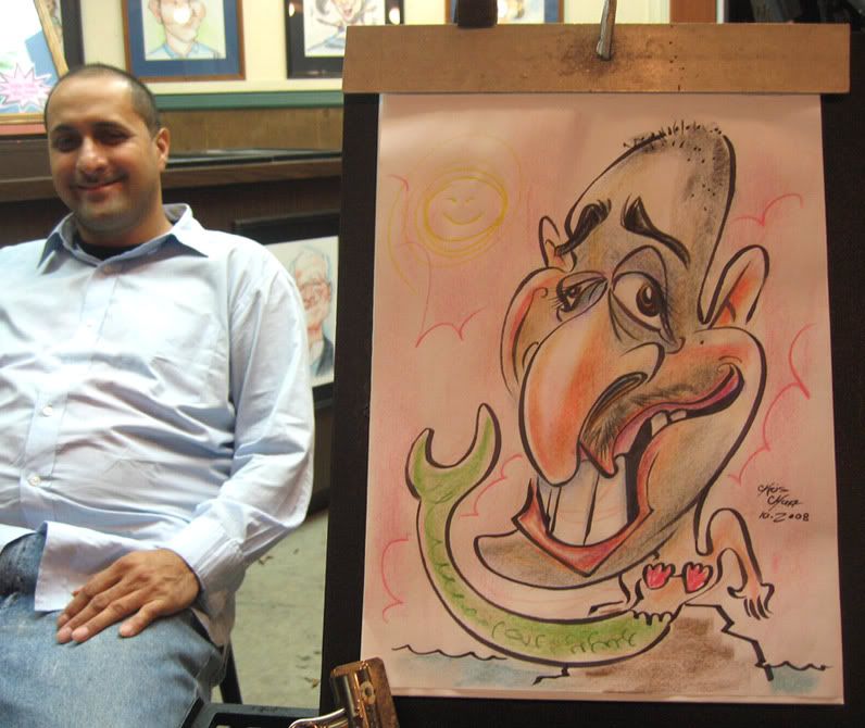
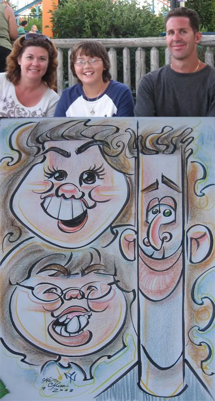
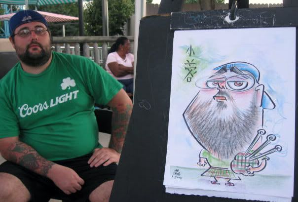
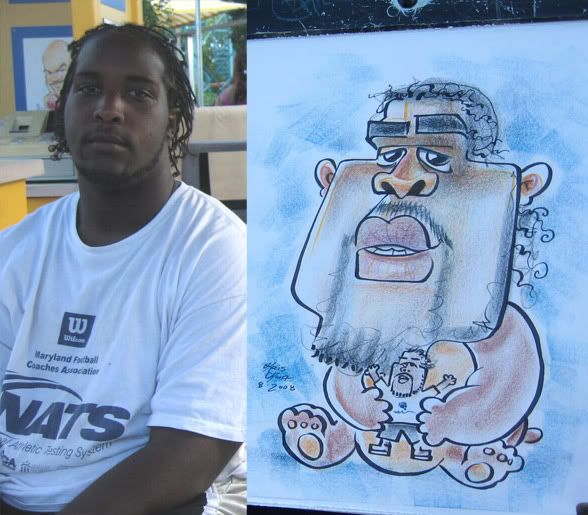
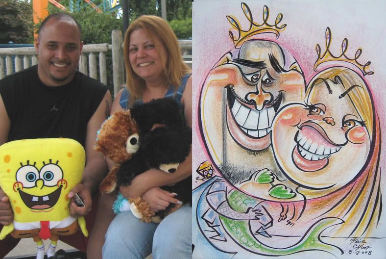
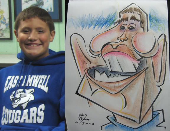
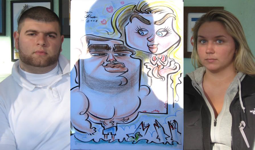
3. colossal choke, ugh. this is one of those times where the family wanted something really silly and were all about the funny. they even said to make it really funny, they requested him as a mermaid. so I pretty much could go as nuts as I wanted, he had an awesome face to got nuts on and I was drawing him as a mermaid. those kind of planet-aligning situations don't come across too often. I really wanted it to be good and tried hard but was just drawing a blank and didn't have a clear game plan and just winged it. Don't think it's THAT bad, and is kinda funny, but the likeness is off, totally chose the wrong things to exaggerate, the whole sketch is just unbalanced and unpolished. they liked it and bought a big frame, so at least it wasn't a total loss.

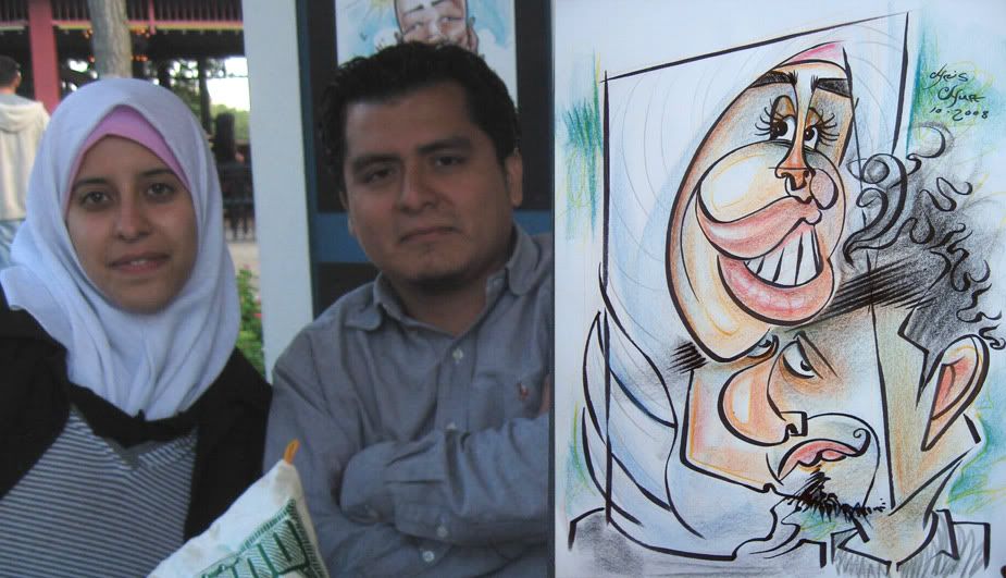
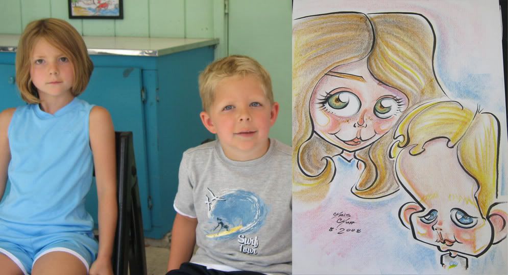
4. I like this one enough, the layout is a bit different, I like the connect line down from her right side head shawl to his right side face. and that her chin doubles as his eye.

5. was trying really hard and just came out kinda blah. there's elements of it that has potential but there's just no clear cohesion to the lines.

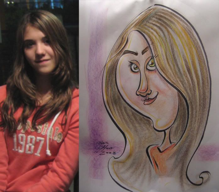
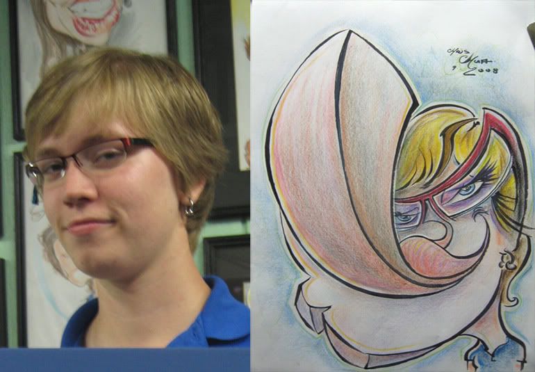
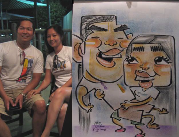
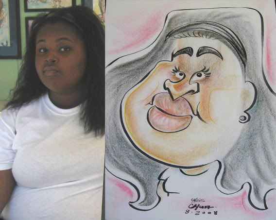
6. one of the few that I thought was all right. not too crazy but tried to go for a simplicity elegance thingy. the bottom of the hair is too undefined.

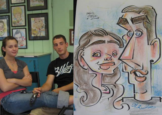
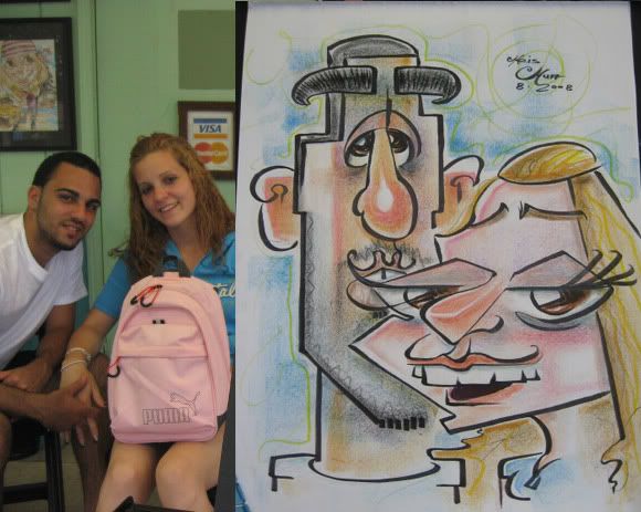
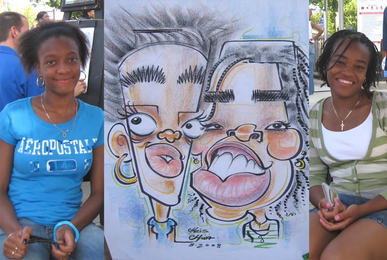
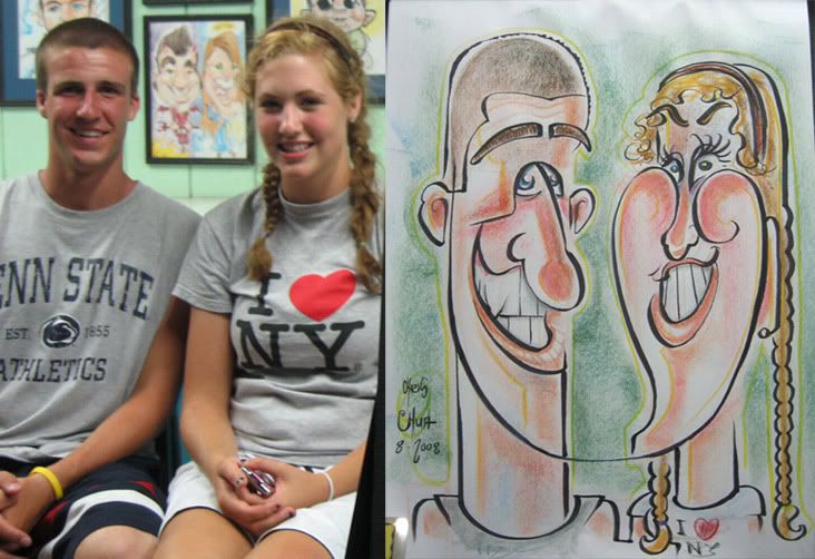
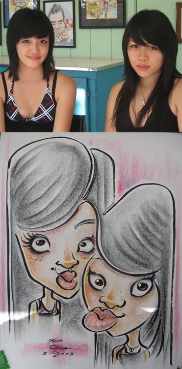
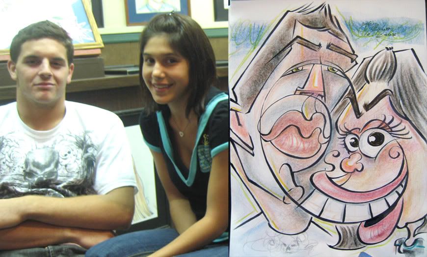
7. girl on the right said, "it looks nothing like me" *sigh...* connect line from her hair to her mouth.

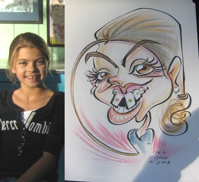
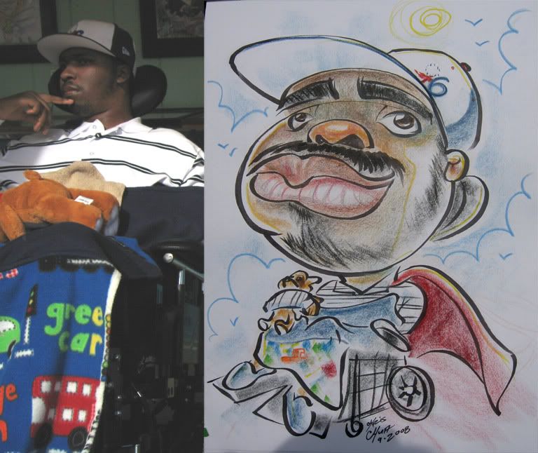
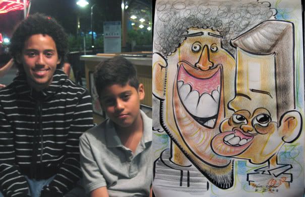
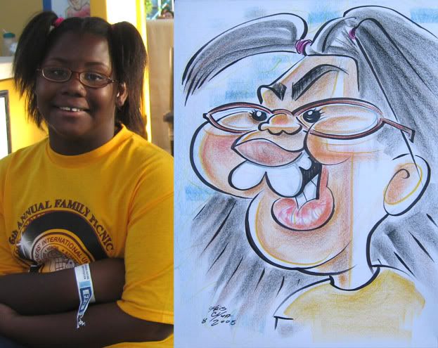
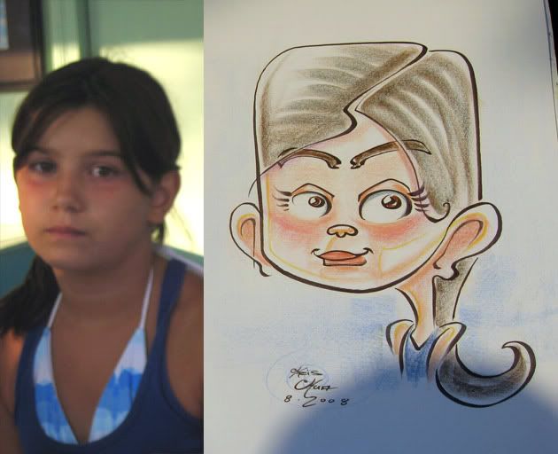
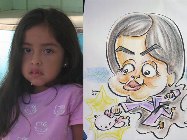
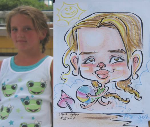
8. I kinda like this one, but man, it came out looking pretty vicious, which wasn't my intention. she liked it, so it's cool. my co-worker was drawing a woman next to me and when I finished this sketch and showed it to the girl, the woman getting drawn by my co-worker got a glimpse of it and was like "awwww, that's so cute!" and then oddly enough, my co-worker got a reject from that same woman and I had to redraw it. and the one she drew of her was way more tame than what I drew of the little girl. but I did just hack out a tame one for the redraw.

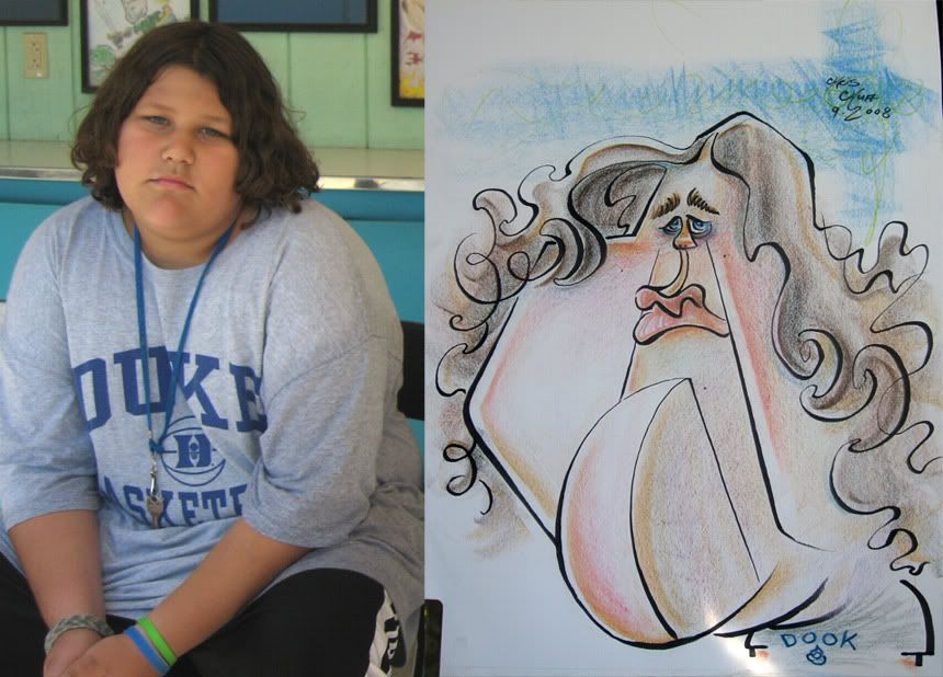
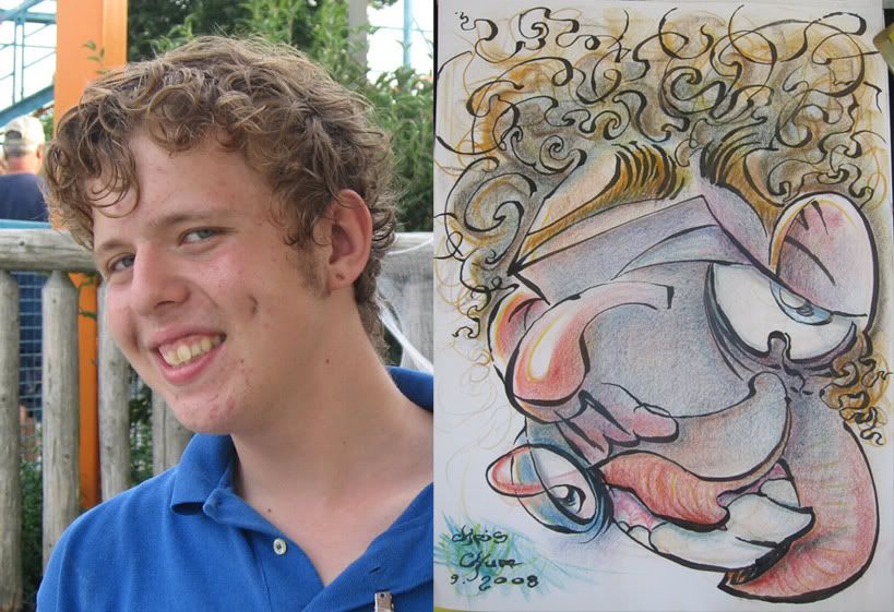
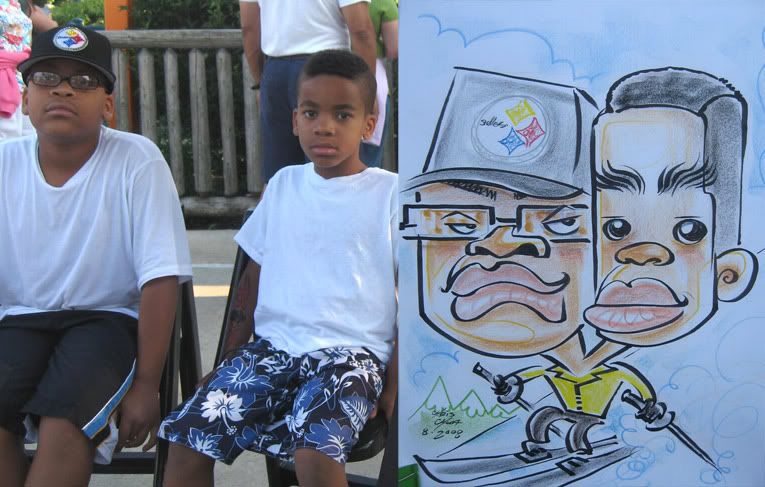
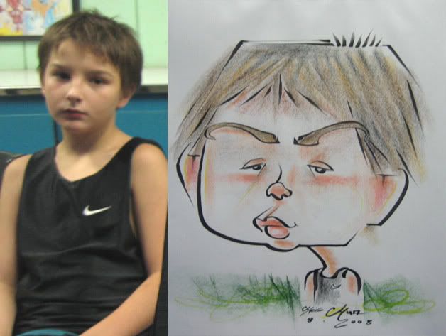
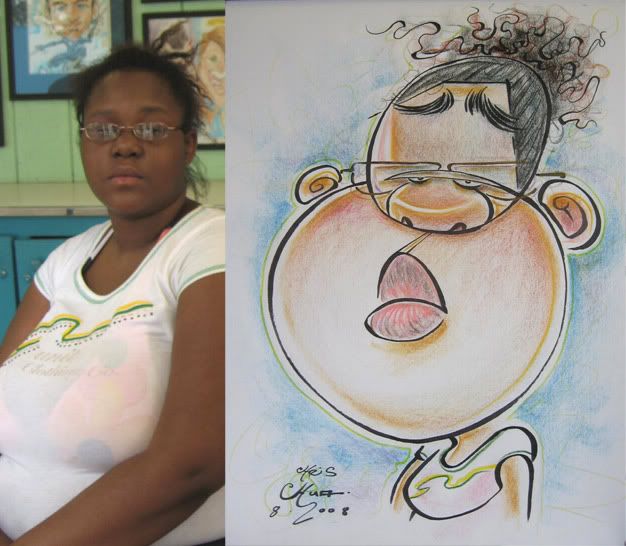
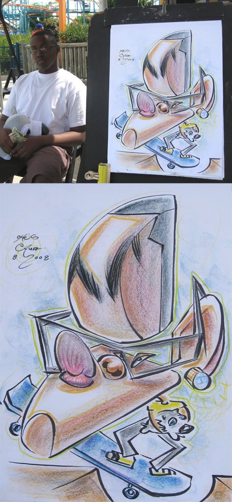
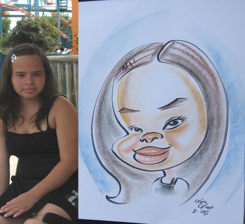
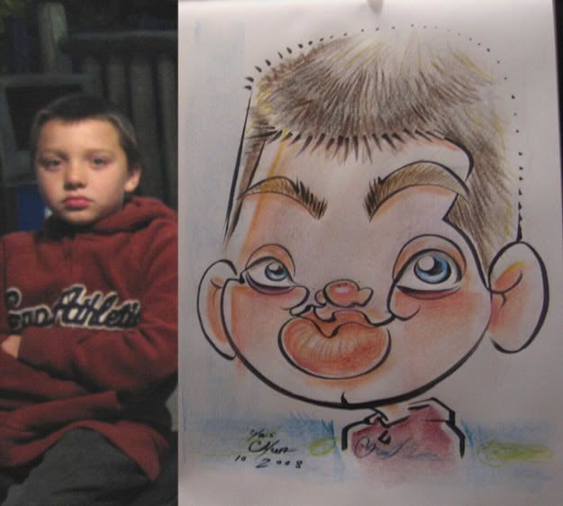
9. I really tried to push it and just came out kinda eh and lost likeness and looks older too. I was kinda surprised the kid liked it.

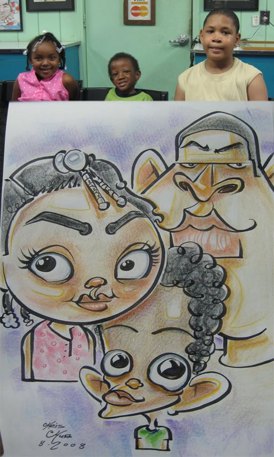
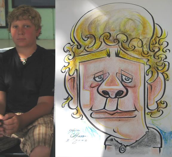
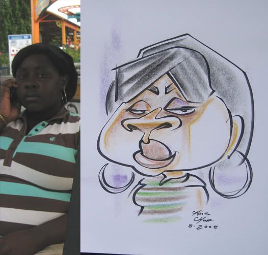
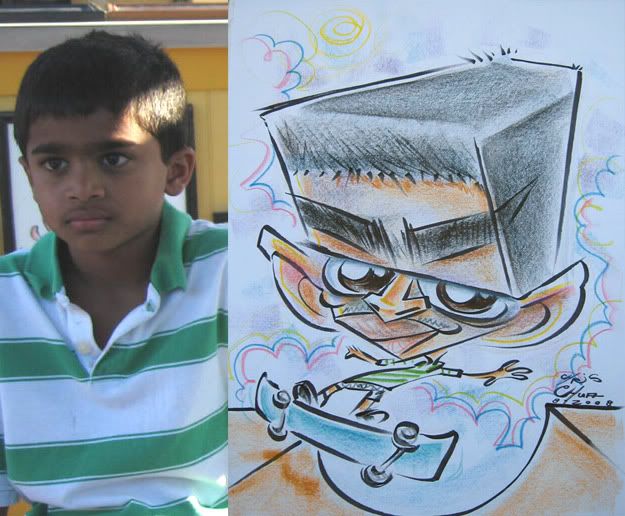
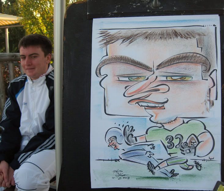
10. kid said it didn't look like him. man, I don't know what it was, but I've had a bunch of people during this time say that. at least his friends disagreed and said it did look like him...eh, prolly should have given him more sad/distant eyes.

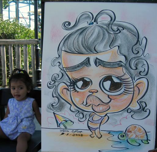
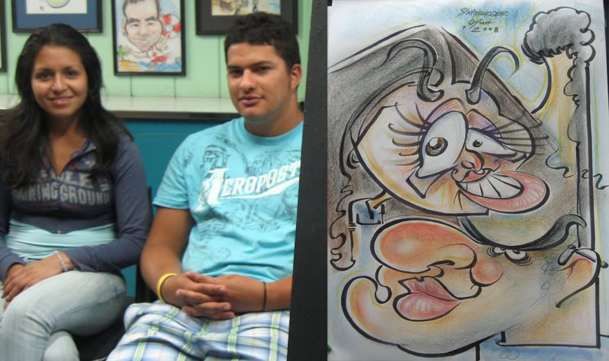
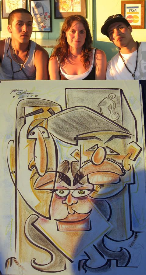
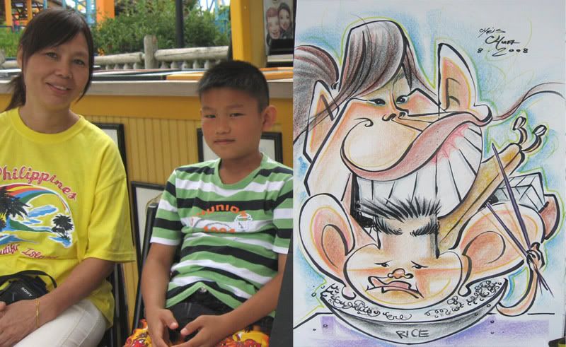
11. the girl came out weak, wonky and tame. guy is ok. I just like the turtle I threw in, grrowl! heh. oh and the shark bite mark idea my friend, Vanessa, suggested to me. not on this particular one, but another one I was working on.

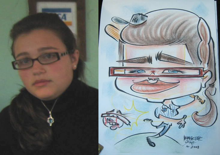
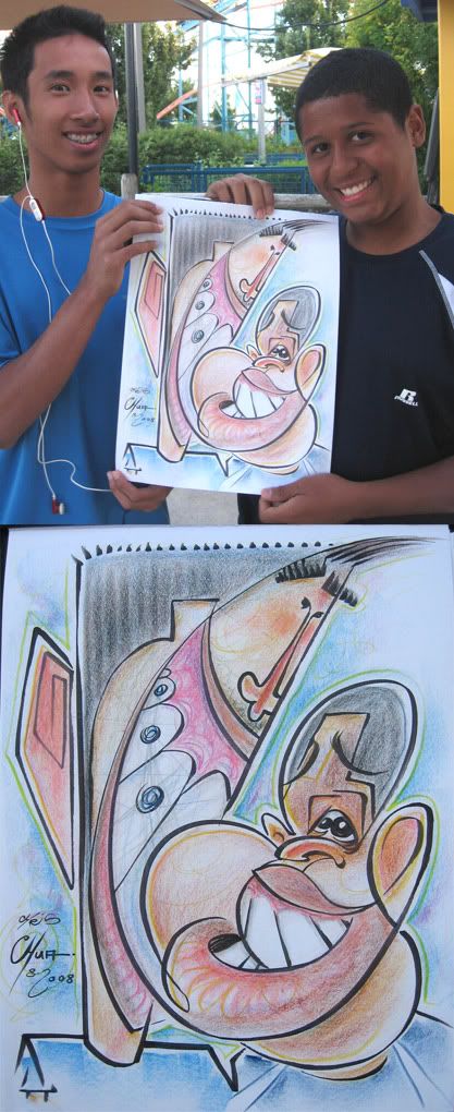
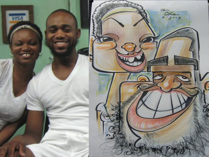
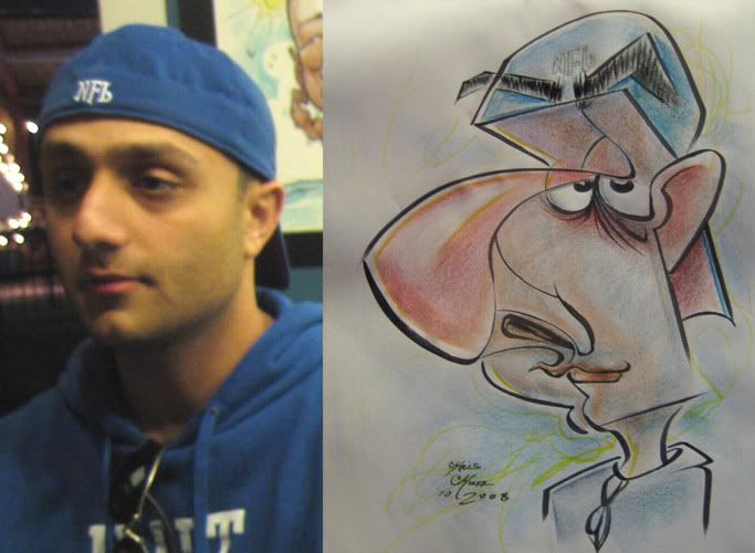
12. as I was drawing this her friend asked if I could draw a baseball hat on her, I was like, "sure!" chris chua draws THE best hats in the biz! heh.

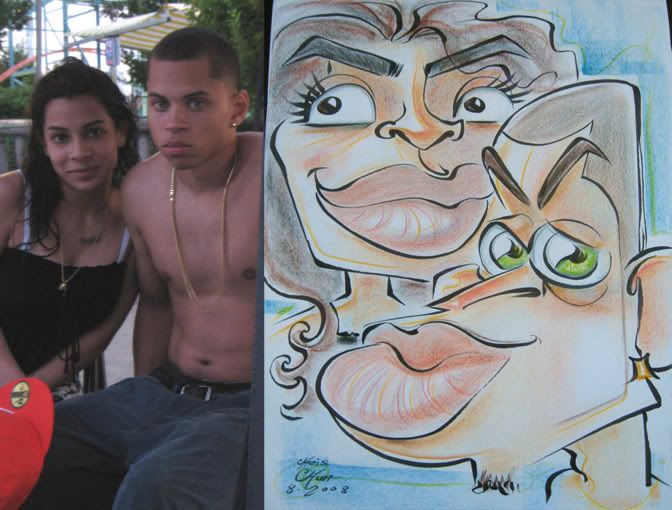
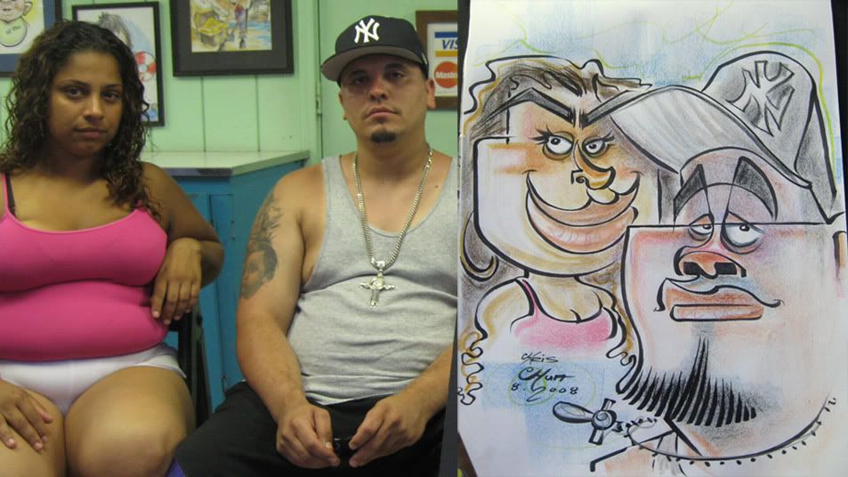
13. she said, "look, your eyebrow is attacking me" heh. they had a good laugh and were cool. I'm just glad people aren't too turned off by my connect lines that prolly only amuse me. hmm...y'know, I don't think anyone has ever asked me what's up with the connect line thingy or thought it was too weird.

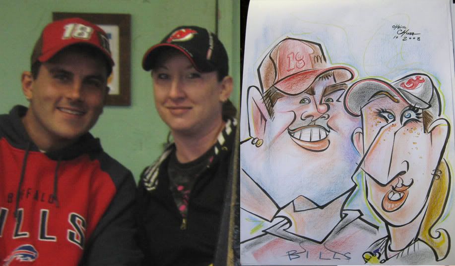
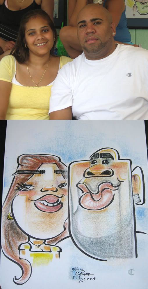
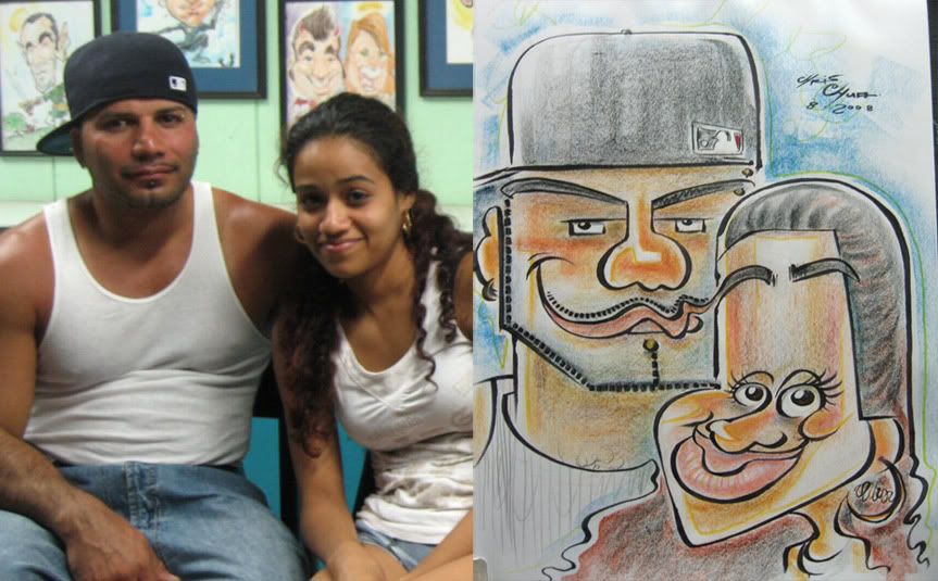
14. the guy was like "you made me look like a whale!" hmm, that kinda confused me...I guess I can sorta see the whale? I like how the woman came out and the connect line of her nose to his chin.

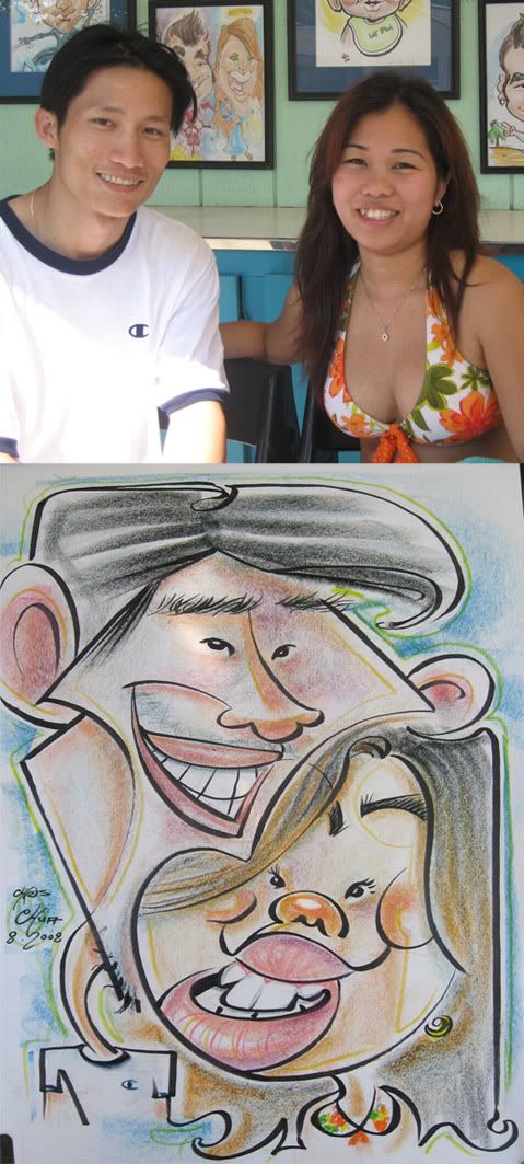
15. this was a nice couple. his mouth to her eyebrow connect line. his shirt line that flows into her really bugs me, just looks wobbely. hmm...just noticed that one line in the guy's teeth was suppose to imply connect to her cheek, that's kinda a stretch and weird, wonder what I was trying to go for at the time. even I don't know what I'm doing half the time! hah.

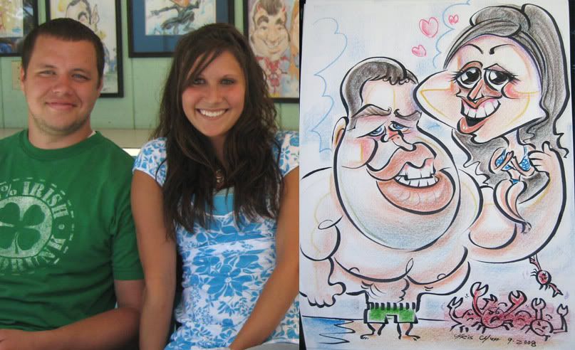
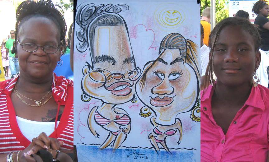
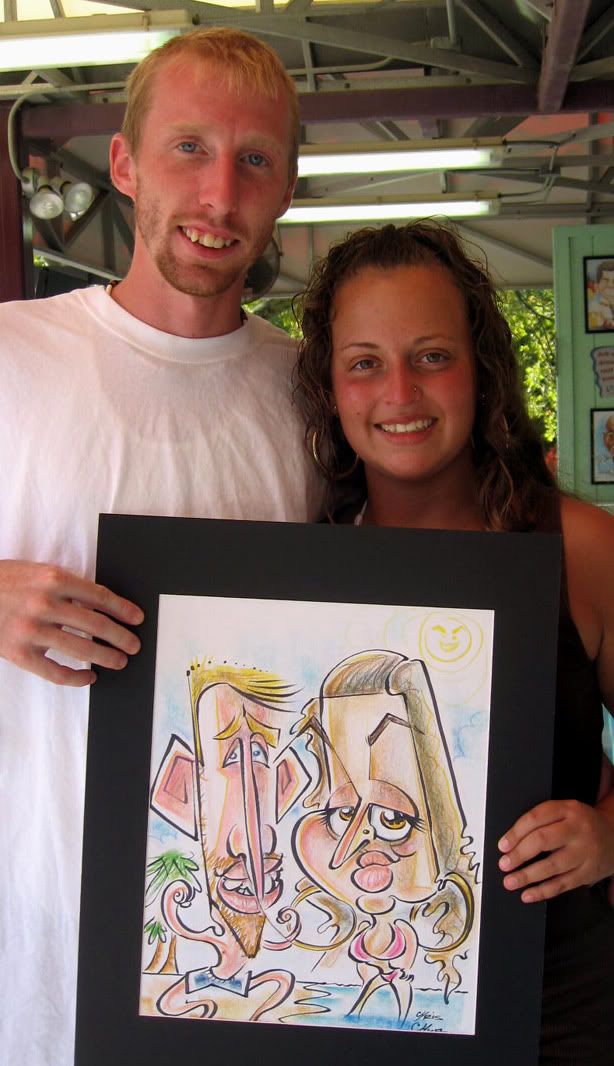
16. this was a really nice couple. she wanted to be a mermaid and I suggested him fishing her. 1st time doing one of these. I'm sure it's been done before. I wanted that connect line from her chin to the fishing pole but made it too vague. could have pushed this one more, both had fun faces.

17. box.

18. that connect line really bugs me that it's slightly uneven. grrr, I say, grr!

19.

and so ends the season.
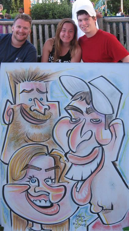
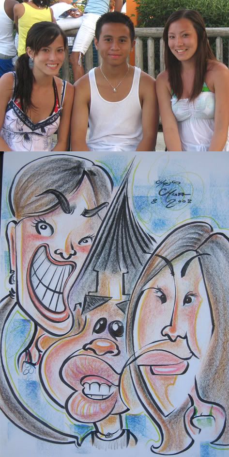
Caricature- [2nd Yr anniv.] Ninja/Samurai, Dook U, Super wheelchair (SEPT 2008)

drawn during the month of SEPTEMBER 2008 at Dorney Park, PA.

This month also marks the 2nd anniversary of me drawing live caricatures and also the month that started my drawing funk...

1. this is one of my favorite connect line situations I've done-- that big swirl hair to hair connect line. I guess cause it's pretty aggressive/pretty obvious. It's my 1st time drawing a ninja. and a samurai too. I was really happy with the connect line, and the layout is decent but their faces themselves aren't really that unique or crazy. So I hit on a great connect line that I like but missed on a lot of other elements that could have elevated the sketch. I really dislike doing double bodies, as usually it restricts me from experimenting with the faces more/gives me less room to play with but this one came out all right. I felt more comfortable drawing a ninja and samurai, I guess.

2. nothing earthshattering, just tried going really cute.

3. when I showed them the sketch, the dad goes, "wait, where am I?....no, seriously, where am I?" He couldn't figure out where he was in the sketch, heh. The mom goes, you're the skinny one and he goes, is my face really that skinny?! I like that I went for it more with his face, everything else is pretty tame. could and should have pushed everything more.

4. I lost the likeness on the girl-eyes too big. I like the silly crabs though.

5.

6. decent exaggeration but too piece meal, feels awkward, needs more cohesion. my favorite part of this sketch is the gag I drew on his shirt, hee hee. I'm still waiting for someone to wear a CAL university shirt for me to draw...

7. accidentally made him look a tadpole mean with the eyebrows. I always think it's fun to throw in any stuff animal or whatever people are holding. in this case, it looks kinda weird and creepy cause that's how they were holding them but I only hinted at it and it looks kinda weird like that because I didn't draw their arms holding them, looks like they're floating. should have made her face squatter and wider. her mouth line implies to his nose.

8. just a tame cute one. they were really happy with it though, so that's nice. should have made her face longer and more chin.

9. I was really trying to push this one and didn't turn out that crazy. made her eyes too big too.

So this month marks the 2nd anniversary of me drawing live caricatures. I think I've learned and evolved a lot. with this past summer especially. but I still have lots I want to tackle, I still haven't really put too much effort in my bodies and want to explore and experiment with crazy ideas. but I still feel I have lots I want to explore with just the faces and don't feel I'm quite "there" yet- still trying to find my style. I know that might sound weird as my stuff is already pretty stylized, but I'm VERY analytical and am constantly self evaluating my own work with a fine toothed comb and don't feel I'm hitting it fully. I think I'm getting closer all the time and that there's aspects to what I'm looking for in some of my sketches, I just gotta put it all together, to find the right order and priorities. My sketches are still all over the place and I think once in a while, I'll get it right more, but even I don't know exactly why or what that is...not sure that makes sense to anyone. A big part of it is knowing what you want in your sketch and coming into it having a clear game plan and since I like so many things it's always been kinda hard to pinpoint things and that's why I'm not as consistent with any of my sketches, which I guess can also keep it fresh. but it's also pretty frustrating. and it hit me more during this month and therefore I was drawing a majority of my sketches not having a clear idea and it showed. everything was just kinda there and not a definite statement.

Granted, during the fall, it's slower and we're only open during the weekends so maybe the lack of drawing had some effect... but still, I do feel it was mostly more than that and that I began seeing things differently and needed to reevaluate what I was doing and my process. these sketches above are ones that I thought were decent/ "happy enough" with but don't really feel any of these represent anything that is taking it to the next level or were as good as the ones I did in the summer months which at this point, looking at them with current eyes, I don't feel represent what I want either. maybe I'm just getting bored with my process and don't feel I'm challenging myself as much. It's that never-ending battle in that it's great to figure it out but then if you figure it all out it becomes boring and using the same solutions to solve problems becomes boring. There's certain aspects of sketches that I really like but it's usually one or two elements that I feel are successful and not the whole package of what I am looking for ...don't know if this is making any sense...I'm very much about seeing how far I can take things and to push the medium. I'm SO fascinated with the art form because of the fact that you are dealing with likeness and that puts a certain amount of restriction to how far you can push it but then that's the whole fun and challenge of it cause you want to see how far you can push it with those rules. when I look at all the stuff I've done so far since I started 2 years ago, I do feel that my best stuff has been the ones I've done this past busy summer months but even still, I think I can do much better... it's a combination of trying to improve on everything. I think prolly it's mainly to try to improve on consistency-- to try to have more of my sketches hit more of the things that I like-- better likeness, better exaggeration, better style, better crazy. ok, I guess I'm done rambling for now, heh.

Caricatures- Katie Lip, Kim eyes, Ian creepy, Sebastian, Kelly (SEPT 08)

drawn during the month of SEPTEMBER 2008 at Dorney Park, PA

1. This is Katie Stahl, a first year caricature artist who started out in body art and then transferred over to caricatures. she's super talented and caught on to it pretty quickly, like scary quickly...a lot quicker than when I started out. If she keeps up with the pace of her artistic growth, she's going to be turning out some seriously sweet sketches. I'm kinda ify about this sketch of her, I like the idea behind it but it's just off, some of the curves aren't quite curved right (the middle lip line one) and that bugs me a lot as usual. and the whole thing doesn't scream as crazy as I should have went. It's just not up to par to what I know I can and should be doing-definitely a let down--still in that artistic funk. I think she expected me to really do a really crazy one and I let her down, which always sucks. going to have to do a real crazy one of her next season.

2. this is Kim Martel, another 1st year caricature artist, who, like Katie, is a body artist that switched over to caricatures. and like Katie, is really talented, and picked it up uber quickly. this one came out all right but it's a bit too sporadic, and not in a good way, needs more focus. has some decent flowly lines but it's just not that crazy. I think she was expecting something crazier as well too and was let down.

3. another Ian. this one is pretty vicious looking--even I'm going, yeah....that's kind creepy, heh. going in the right direction but again, needs more cohesion and a consistent structure or more inconsistently consistent.

I did this at Putin Bay, OH, where our annual get together party is with other people from the company I work for. This is Sebastian, a cool fellow Kamans'er I met there. it was really dark, bad picture. I spent a decent amount of time on this and eh, it really isn't too crazy either.

This is Kelly, another fellow caricature artist and cool chap from the Putin Bay party. I actually like this one okay. feels more of the essence of the person. I think I had a clearer idea of the vibe I wanted early on. I like the hat connect line to his nose.


I feel that I have all the pieces in my head and it's just a matter of sifting thru and figuring out which ones to use and/or which ones to focus on more, and then I think I'll be closer to where I want to be or at least be on the right track. otherwise most everything this month and next lack a clear vision. they look more like 8 visions that are in a royal rumble and no one is the clear winner yet. October sketches coming up very very soon. there's only a few sketches as the season winded down.

Tuesday, December 02, 2008

Caricatures: Teeth cheek, "goes right in the trash", Zelda, Trekkie vulcan, hello kitty punch, eggroll (AUGUST 2008)

drawn during the month of August 2008 at Dorney Park, PA

1. they were shocked a bit when they saw it, but I think it was more of a shocked in a good way, it wasn't what they expected but liked it, at least that's the vibe I got. they were real nice people. I was happy that I really pushed it on the guy with the floating shapes. I really enjoy doing that kind of stuff. I messed up his lower jaw area- needed more chin and made his eyes too close which lost some likeness points. the connect line from her jaw to him bugs me in that it's not perfectly straight, grrr.

2. they had a good laugh and were appreciative of the sketch which is cool cause I could see this one being more jarring. I was pretty happy with it, I liked that long slanted connect line and that one of her teeth sorta morphs/doubles as his cheek. they bought a frame with it too, yay!

3. usually, I like having couples face each other, when I asked her to turn her head the other way, she said she'd prefer not to, it's not her good side. hm. ok. I guess I should have just asked her to switch seats with her husband...but at the time, I was just like, ok, haven't done a double same sided one in a while, so why not. Now I wished I had told her to switch. it looks like he's got a ponytail, I should have prolly left it out. I wasn't sure to leave it or put it in, cause it's one of those situations when goils have their hair pulled back tight and it could look like she's got very little hair if you don't hint the ponytail or hair cinnamon bun. that mouth connect line seems kinda distracting. glad I got a pic of her laughing like that cause she did that a lot and that's what I wanted to capture in the caricature.

4. these people had said they got a drawing of them done in NY city before but it wasn't a caricature. The woman was laughing pretty hard when she saw it, but it was more like a "what the hell is that?! are you kidding me?" kinda laugh and not a "that is hilarious, I love it!" laugh, the guy didn't laugh, he just had a very disgruntled confused facial expression but they didn't complain directly to me about it or say they didn't want it...as he was paying for it, he says to himself, but obviously loud enough that I could hear it since I was 2 feet next to him-- "yup, that's going right in the trash" oh well, I liked it, especially his. little stuff where his mustache line just hops over to her cheek and his ear line to jaw line amuse me.

5. she said it looks NOTHING like herself. I don't get it. It might not be THE greatest likeness and I tried not to go too nuts too, but whenever someone says it looks NOTHING like me, and I think I have good enough likeness radar to know when I get a likeness or not and I feel I got enough of her features that at the very least I'm in the ballpark and is a decent likeness (and usually, when I push it more, I get a better likeness, but I didn't cause I was trying to be nice, and that backfired) so for her to say that, especially the words "nothing" baffles me. or am I nuts? and added that she said that his DID look like him, so she does have enough ability to recognize some likeness. but she wasn't mad either, just kind of casual, so it wasn't like she just said that cause she didn't like it. anybody think I really missed on her? I don't know, maybe my radar just sucked for this one. I know this happens all the time and lots of people will say it doesn't look like them...it's a common thing for caricature artists to get...guess just in the mood for venting (again) on this one, heh.

6. He didn't speak much English. He pointed to a Zelda demo we had on the wall. I assumed he wanted that. my intention was that I wanted to make the shield he was holding double as his other ear, halfway thr it, I didn't think it'd work out quite right so I didn't go thru with it fully and left with that weird shield shape. I wanted to make the most plain pose/figure, sometimes really simple is funny. not sure how funny this one is though, heh.

7. he had those Chinese letters tattooed on his arm and wanted it on the sketch. It translates to "blue hat. green shirt wearer" ok, not really. He was a cool dude to chat with. ok, not really, heh. naw, he was cool.

8. she wanted to be carrying him. don't know why. I didn't ask. I was trying to make it more cute on this one and was happy in that regard. I thought they'd like it more than they did. I thought it was fun and cute. they were sorta neutral with a side of satisfied.

9. I liked how she came out. I was trying to do a combining thing with her eyelash making up his mouth swirl but it was a bad idea and just looks convoluted and weird in that area.

10. too bad he wouldn't smile for the pic.

11.

12. this one came out looking kinda weird, kinda tame and yet not really and still stylzed...not sure what it is exactly, just different-y. sometimes it's fun to vary it up and go more realistic, just to keep yourself in check. well, not that this is really THAT realistic, but just saying...I think sometimes people think that I can't do more realistic kinda stuff and part of me wants to do that type of stuff once in a while just to show them that I can, and prolly surprise some folks that I can do it pretty decently too. but then, do I really need to prove to someone else's falsification of my range and ability, just cause most of my work is highly stylized? yeah, I have no idea what I'm talking about. words are pretty! ooh a butterfly, must chase!

13. he was deaf, so I had to write down everything but we communicated fine. He was happy with the sketch. this sketch is very curvy loopy connecty. lots of lines flowing together- I like his nose line into his glasses, it's the wrong shape of his actual nose but it's fun. sometimes you gotta bend the rules a bit and it's ok as long as you hit enough of the person.

14. He came out funnier. fun implied connect lines from his bottom lip to her hairline line and his chin to her chin.

15.

16.I like the flowy-ness to the lines here.

17. This guy didn't know what kind of body he wanted to get, then he asked if I could draw him as a teddy bear, cause that was what his nickname was. At the time, I thought it'd be ironic and funny if I drew him holding a human of himself since he was a teddy bear, the ol switcheroo...after I drew it, eh, not sure if people will get it? or if it really makes sense, it's too strange, me thinks, heh. not a very good caricature of him too and I drew him more as a real bear than a teddy bear, I couldn't figure out just how to do it right. I just posted this cause of the human bear thingy which is strange and the oddness of it I think is worth posting, heh.

18. I like drawing people with dot eyes and so when the siCHUAwachion arises I try to do it. and to make bad puns with my last name. but actually, I think this prolly wasn't the right time to do it, she had more distinct eyes that I shouldn't have simplified. but overall, I like the silly fun expression that I sometimes don't do enough of.

19.I really like this one. I like the connect line from the top of left dude's hair and swoops around to other dude, swooping around his ear. there's lots of swooping connect line stuff all over. I really tried pushing it on this one. These kids were cool and dug it. maybe not as much as I dug it, but they were really cool nontheless.

20. the guy had cool eyes. like a snake. sssss! (I know the added snake sound effect really made the commentary on this one shine. good job, chua. thanks...weirdo. what did you say?! I said, you're a baseball bat short of a picnic. oh...I see than- wait, that doesn't make any sense! yes it does! no, it doesn't. hmm, good point- touche', you win this time, me!)

21. y'know, this one is cute, and I was trying for cute, but looking at it later with that photo of the kid, I lost likeness cause I tried too hard to force the big eyes. It's one of those habits that I sometimes do and should break. the kid's more cheeks and forehead, less eyes. the dad didn't know what kind of body he should get for her, so I suggested this since she had a hello kitty shirt on.

22. I like this one. It's simple, graphic and silly. I should have moved the girl on the left over a bit, she's a bit too much overlapped but overall, I should be doing more stuff like this. fun contrasts between the two too. I was trying for a more subtle connect line with left's chin line sweeping up to right's nose.

23.

24. she wouldn't smile for the camera :(

25.


26. 2 heads, 1 skiing body. the sketch came out kinda lackluster though. could have been much cooler. I like the right kid's eyebrows.

27. this is an ok one. kinda ran out of room for the top left dude. when I showed them the drawing the guy on the left(who reminds me of actor, Donal Logue) gave me a blank look for a couple seconds then started bursting with laughter and kept laughing for a bit. I enjoyed that. don't think the girl liked hers too much though. I like that nose line on her going into her eye.

28. this one's kinda tame but if I do something graphicy or designy I'll usually like it more. I just like the line that starts from the left side stray hair and goes around her hair, down her cheek, into her ear and down. So sometimes when I don't jack someone up or "can't" cause it could lose the sale or make the customer cry (heh) this kind of stuff keeps me sane and more interested.

29. I was pretty pleased with this one, too bad this is one of the worst pictures I've taken, crappy sunset lighting. lots of interconnects--the one I was happiest is was her eyebrows become both of the guy's lips. others include-- left dude's lips to her eyes, left dude's chin curve continues into her mouth, and left dude's eyelid into right dude's hat. I liked how the right guy came out, I went for the simplification of this nose and was happy with it. it's silly. I didn't exaggerate as much on her, I think I spent too much of my focus trying to get those connects to work, that's what happens a lot of times. There's only so much time I have to figure everything out. hopefully the more I do this stuff, the more it'll become second nature and I can hit all the things I want to do in a caricature. I also liked that I implied her right side face.

30. I thought this one came out nice. the girl was getting nervous in the chair about what she would look like, then I showed her and she was pleasantly surprised. cool. happy customers. I liked her nose to her hair connect line.

31. Each of these kids had a completely different shape and vibe. It was great! I don't think I did it justice though. I tried to really push the different shapes each had, and I think the only more successful one is the round headed girl. the other two are just passable, they had more potential for stylized shape. I don't have as much experience with 3 faces too and don't think this was the best layout.

32. these were the parents to the kids right above. I like the guy one. Her teeth and gap look unconfident and not stylized, they should have been drawn more like the guy's stylized teeth. Connect line from her chin to his eyes. sometimes...actually, a lot of times, when I look at these caricatures again after not looking at them for months, I don't even realize all the places I do connect lines and stuff, it's actually kind of fun to look for them. Me writing it down is as much for me to note it, so that I don't have to look for each one every time and can just refer to the commentary, heh. anyhoo, they both had a good laugh and were really cool.

33. I thought I went for it more by making that line across his eyes. connect line from her eyebrow to his hat. The guy had that same neutral expression throughout, but did smile once he saw it.

34. I think this is one of my more successful baby drawings. been trying to work on not making them look older than they are.

35. a decent fun one. I like the way the left girl came out, I like drawing that kind of spikey rabbit, I mean, hair. connect line from spikey hair to right girl's chin. made right girl's eyes too big.

36. I mostly like this one for the opened left side face and that the chin line goes into the hair. and the nose line going into the eye, and not drawing the bottom. well, maybe I like this one more than I thought, heh. it's simple, few lines, filled most of it in with color, I should do more of that.

37. 1st time I got a star trek request. wasn't quite sure what to do, if only my buddy and fellow caricaturist, Alex Clare (a big fan of Star Trek) was here, he'd have done it right. He just started a blog, which was LONG overdue. He does some awesome work! go check it out.

38. this was a fun one. prolly shouldn't have lined up their eyes though.

39. I like the lines on the figures.

40. simple one. the guy is funny.

41. I was happy with his cheek bone line doubling as her left face contour than going all around her face. I also liked forcing her hair and lips into that shape.

42. I told them I was going to go crazy and they were cool with it. those gem moments where you have the go ahead to go for it are the best and when you have cool faces to work with too. BUT those times when for whatever reason you start it and have the best intentions to really jack someone up and for some reason it's not working out/ your exaggeration skills just aren't working or whatever, that REALLY sucks and is just the worst. This was one of those instances, as I was drawing them, I just wasn't feeling it, stuff was just tame and looking awkward. I was barely pushing it for some reason, even though I intended to. A few minutes into it, I decided to tell them that I was starting over, which I have never done before. I feel that telling someone that you started over makes you seem like you really don't know what you're doing, even though, everyone knows every sketch can't always be your best. it just feels bad to do it, so I try to avoid it at all costs. most of the time, I can salvage it. But I really felt I could do a really great one with their faces and I decided that I should start over. so I did. I think the redo( the one you see here) is much better. still not the most exaggerated, but I spent most of my time trying to connect a lot of lines--his hair to her cheek, his cheek to her lips. I started over mostly because I messed up the right girl, I don't think this one is TOO much better, still don't think I nailed her likeness, but at least it's a more pleasing-er version.

43.

44. I love me connect lines, but in this instance, I think it's distracting. wasn't happy with the curve of the connect line either. they were cool and happy with it. I was happy with it at the time, looking at it now, I think I lost some likeness.

45. I soon as I saw the girl, I remembered that I had drawn her a couple months prior at Six Flags, NJ. She remembered too. I'm pretty good a remembering faces I draw. This time she got drawn with her dad. I morphed his lips into her eyebrow.

here's the one I drew of the same girl above, ^drawn last year 2007, it's not often that you get a chance to draw the same person again, and is a cool opportunity to have a second chance to do anything that you wished you had done in the 1st one, or to see how much you have improved(if at all) and looking at both...I actually like this one over the newer one, which is sad to see, as I'm VERY much about improving and work hard at it. I like the older one better in that it's a clearer focus on my statement on the caricature, the newer one seems more tame, decent, but tameish...I do remember at the time I did the older one, that I was feeling good and letting more loose in going for it. The newer one, I was more conscious of trying to make the technical side very slick and think I lost some of the fun. although I was happy with how the dad came out and think the chin in the newer one is more accurate of the girl.

46. She was with her older sister (at least I think it was her sister) and they both didn't know what kind of body she wanted. I suggested her riding her stuffed animal and they agreed. end of story. that's it! what else do you want? nothing else to see here, peeples! vamoose! or vacattle! vahamster? vaturtle? ah yes, the old turtle creeps it's head once again in the verbiage of chua dialogue. how original. oh and the stuffed dog isn't running because if you look at the positioning of the legs, none of them are facing back, which would be the case if running. nor is it flying because nothing in it's right mind would fly with legs positioned downward. that's just anti-good aerodynamics! SO, the answer to what is happening in this doodle is that the dog is floating a few feet in the air and the girl flew and grabbed it. I have established in my brain that that exact moment is of utmost pure super excitementocity. That snapshot in my mind was recreated on the page thru skill for all eyeballs to see. and the reason the coloring on the dog is striped isn't because I was trying to show it flying, of course not, because it would have looked so much better...the reason is, um. uh, because it is a gray and white striped dog. yeah, that's it. even though the dog she's holding and just happens to look exactly like the dog I drew doesn't have stripes. I, uh, took artistic license and made it striped. yeah. so there. hey, I guess there really was something more here. huh, fancy that. too bad it was a waste of your time, hah! sucka! well, I had to waste my time writing this so, I guess I lose too. boo hoo. boo hoo, I say! *ahem* anyhoodles...

47. a fun one. more connecties.

48. I like the different shapes around the nose/eye area. and the zigzag line curve of the mouth. she's not smiling either. usually, I try to make people smiling in the sketch, even if it's a slight one, but I just felt like not giving her a smile, thought it fit her vibe as she was sitting there.

49. this was a fun one too. the mom said it reminded her of some cartoon on TV, we never figured out who she was thinking of. I like the eyelids.

50. she wanted to be doing karate. I added her punching hello kitty. I mean I saw that she had a hello kitty shirt on, so obviously, with my amazing deducing prowess I figured that she must hate hello kit--oh wait. I got it wrong, dang it!...heh ;P. they bought a frame with it. awesome. I should have more karate bodies punching more fun things like that...hmm...punching goldfish or eggplants. oohh...potatoes! yeah, punching potatoes is what is going to be the next caricature display signs used across the country in selling caricatures. sharpen up those potato drawing skillz, fellow caricaturists! cause you're going to be drawing them a lot soon! well, maybe don't sharpen your skillz TOO much, you might julienne those potatoes into french fries and that would just make a very weird drawing, even though you would need to fry them 1st, but still! but yeah, you're welcome, world, you're welcome. *takes a bow, but trips and falls and is impaled on some julienned potatoes, but is still in a clear enough frame of mind to type this (even though losing precious thimbles of blood) *bows again* well, sorta. as much as you can bow from being impaled by thin sliced potatoes.*

51. this one had potential but I messed up her hair, just wonkiness. but I got a chance to redeem myself...

52. the next day, the mom came back and asked if I could draw each of them separately so I guessed they liked it, cool! I think this was my 1st next day request. and I was glad I got to redeem myself, she had a cool face too. I was much happier with this one.

53. I think this one is much better too. both this one and the last, I felt my line work was pretty on point. maybe it was a new marker too.

54. the whole having guy hold female in his hand, that aspect, I got the idea from fellow caricaturist, Brian Oakes, who's a favorite of mine and one of the best out there. He works in San diego, Sea World. I added the danger/sharks idea. I think one of my least favorite bodies to draw is the "beach body" cause it's boring and it's relatively popular too. but now I like doing it because of the danger aspect I came up with, so I can come up with different silly stuff. and I like doing the large contrasts of the sizes of the two. I like his jaw. I like cake too. and clam chowder. yeah, that came out of nowhere. I'm also standing right behind you. boo! like a ninja! and...I'm gone. amazing, am I, I know. but if you can hear me, then AM I really gone? huh? huh? creepy, I know. just like creepy ice cream. yup, out of no where, again! also ice cream is creepy cause that stuff gives me the chills....get it? eh? eh? alwwwrighty then...

55. this couple was in the same group as the above one. guess they liked mine enough to want one of their own too. cool.

56. these two were also part of the same asian group right above. they tracked me down the next day to ask me to draw them, which is always nice and ironically they asked me at the same time as the mom a few posts up that wanted me to draw another of the kids as well. pretty funny coinckydink. So, they liked my stuff already and then for their bodies, they said to do something silly, eeek! I was psyched! what's that french word that means you can do anything....oh yeah, carte blanche. just thought of it, wasn't quite sure the spelling, looked it up and found it. anyhoo, my idea got too busy (as usual) and it's hard to see what's happening. what it was suppose to be is she eating him with chopsticks- him being an eggroll. I thought what other opportunity am I going to have to draw some asians being all asian-y. I liked the idea but the execution was weak, oh well. good learning piece though--keep your ideas more simple and make them clear. sometimes trying to do a bunch of "cool" dynamic perspective or layering just loses your impact if no one can tell what's happening-which continues to be one of my frequent issues on my stuff at times. what the?! what is all this seriousness speak all about?! back to more silliness! waka-waka-waka, I'm pacman! get away from you, ghosts! don't make me gobble you up! and it's thanksgiving time and I'll gobble, gobble ya up, turkey-style!

57. he had a cool face. would have been fun if I went nuts on him.

58. argh. this one I don't know what happened. at the time I was drawing, I was happy with it, I thought I got their likeness and went tame too, cause I was pretty sure they weren't going to like anything too silly. and then my favorite part was the connect line that connects their hair. but then after I looked at it, the likenesses are weak! I missed the droopy eyes-- I think I was TOO much into taming up mode. and was trying to fix stuff which really just isn't good but at times fall back and do. and even they didn't seem to like it too much. so, lose lose. nice drawing, weak bad likeness. boooo!

59.

60. this might be one of my all time favs. I really went for the shapes on it. this might be my most ambitious shaped sold sketch.

61.

62. I don't know, I went for it more, and it turned out funny, I guess, but felt I could have done more with it. just seems kinda off all over too and eyes too big, although I remembered at the time, his eyes seemed really big to me.

63. I was happy with this, I think I really got the likenesses, especially the little girl. mom lip morph to girl eyebrow connect line.

64.

65. needs more forehead, and likeness isn't as much there, but I like the bold round head.

66.

67. I liked this one a lot too. heart shapes fun- heart eye reflections, heart rosey cheeks on woman. spongebob makes a cameo too, heh.

68. I like the hat line into the glasses, and his face line connects to her hat too. don't think the guy liked the sketch too much.

69. I was pretty happy with this one except for that line of the girl's lip, it's wobbley. that stuff really bugs me. bugs bug me too. and bugs on bunnies bug me as well...especially, bugs on bugs bunny bug me especialbrucely.

70. I decided to draw a sketch as fast as I could as there was recent talk that I draw slow--which I do, and I know I do, but it's by choice and not because I can't draw fast, and when I want to or need to, if it's real busy, I can draw pretty decently fast, and it'll be decent sketches too. that sentence was a mess, heh. this one must have taken me a minute or two tops. writing my signature prolly took up most of the time, heh. one line from face shape, around to bottom of hair.

71. I only like the way the guy came out, I missed on the girl- mouth too big, nose too big, wrong eyes etc etc, don't know what happened there, I think I was winging it too much and not coming up with a good game plan 1st.

72. fun shape demo.

73. the mom was watching me draw her kid and I don't think she really understood what a caricature is, but she was very nice about it, she said she was very curious on how I came up with what I drew. hmm...maybe she was just confused on how I do caricatures and not what a more "normal" caricature looks like. hmm. guess I'll never know. she was pleasant and still bought the sketch. not quite sure how I feel about the sketch, I was in a blocky phase.

74. another of my favs. I was into smooshing 2 faces into a streamlined shape at the time, as you can see from some of the others I did that month.

more posts coming up very soon!