Thursday, March 19, 2009

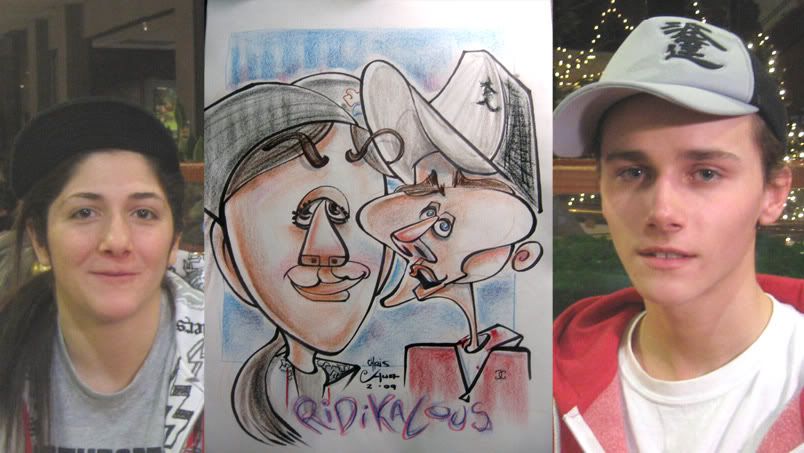
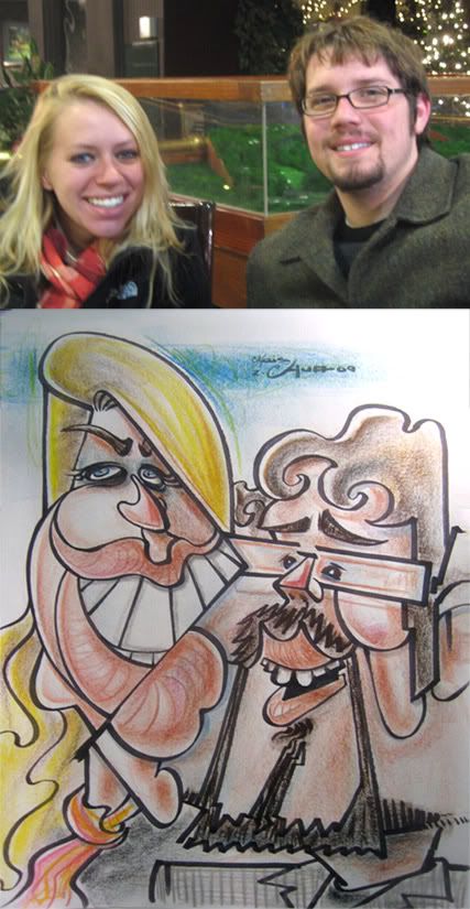
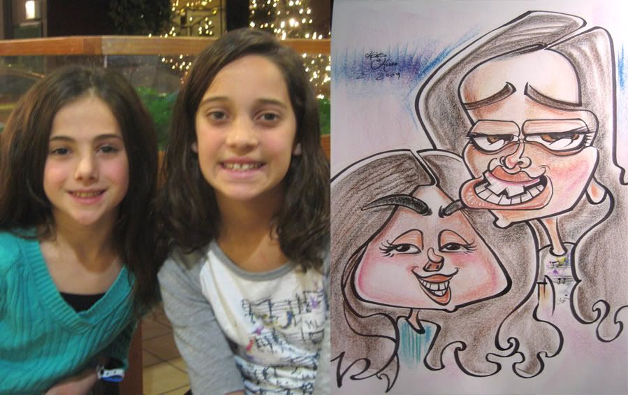
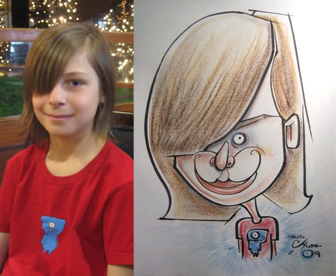
caricatures- NeckTeeth, Mr. T...shirt, zombie family, nose hair, etc. (MARCH 2009)

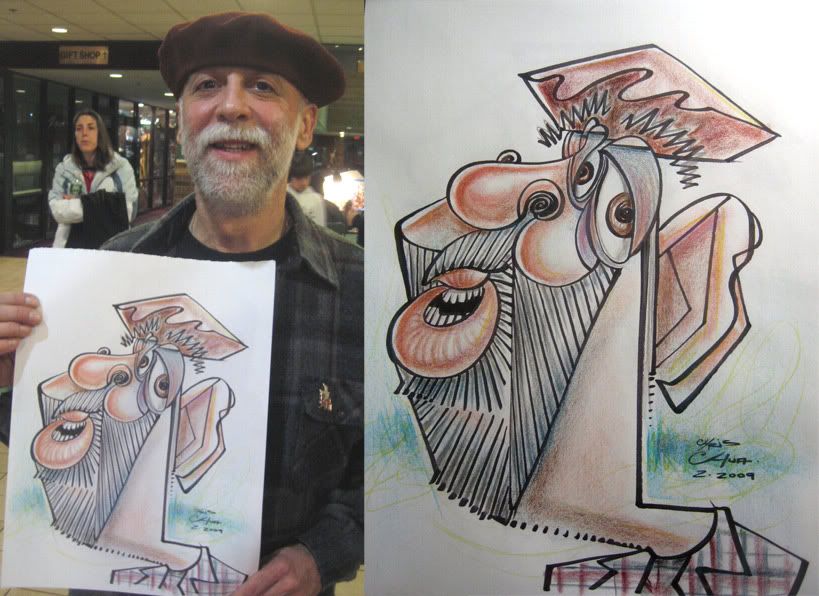
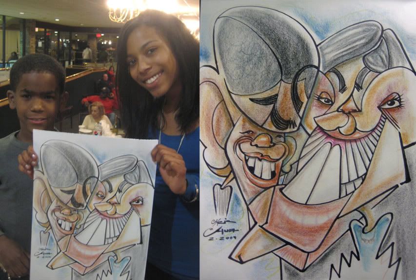
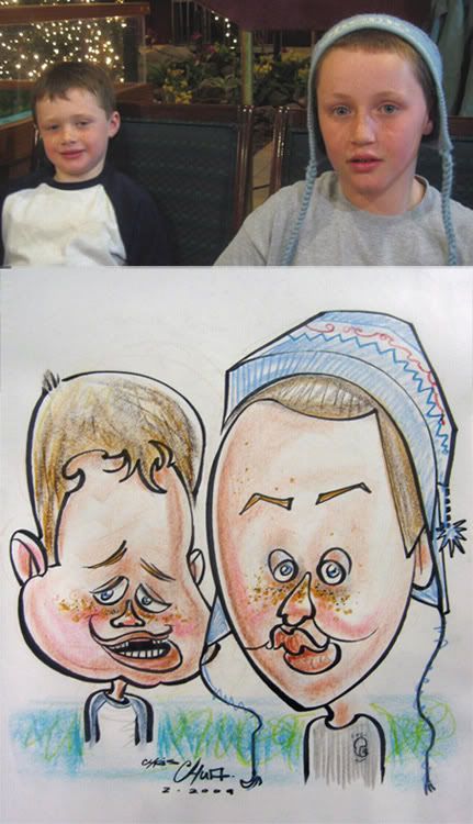
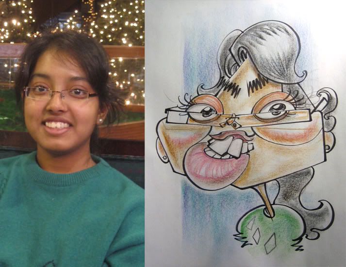
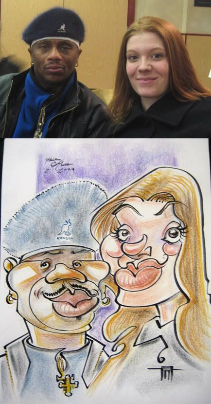
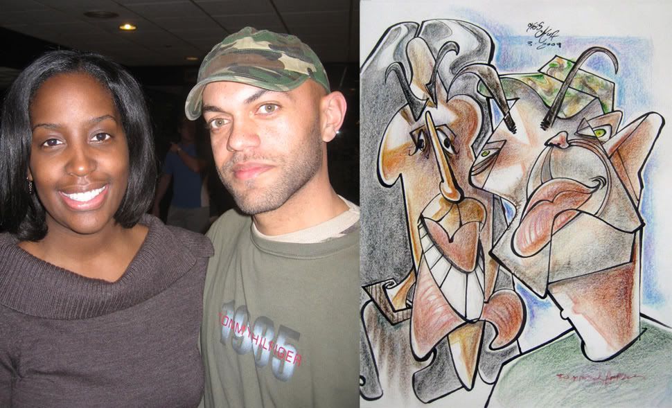
1. I redrew this couple for fun. the sketch I sold to them was just ok. and felt I missed their distinct features so I redrew it later on. this is sorta where I would like my sketches to be more of. aggressive yet simple. and less marker lines, more with colors.
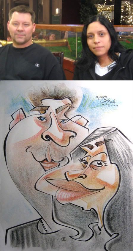
2.

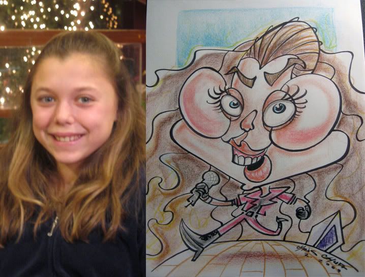
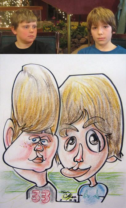
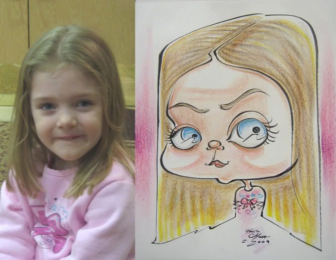
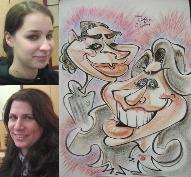
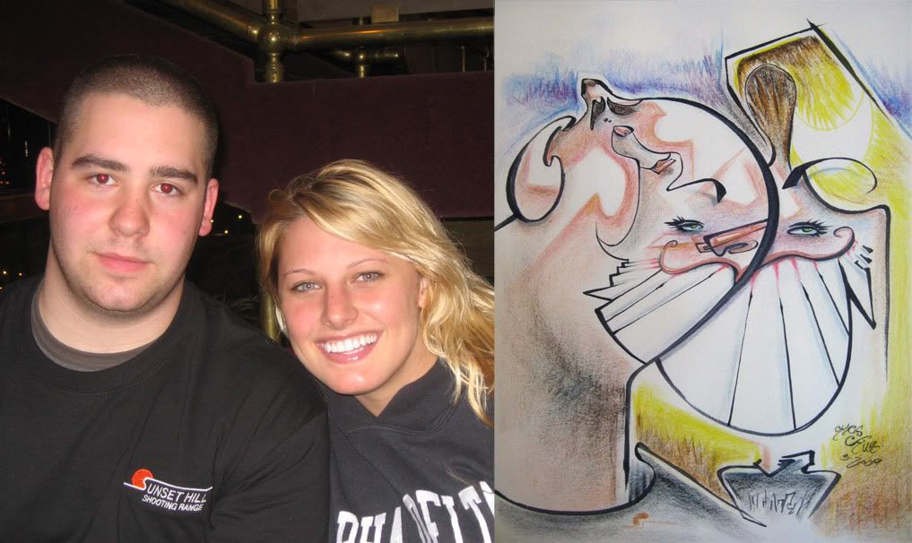
3. these were the kids of the pic right above, they wanted one after seeing me draw their parents. I liked the top kid more than the bottom, made his eyes too big.
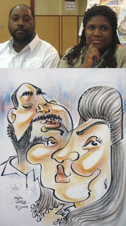
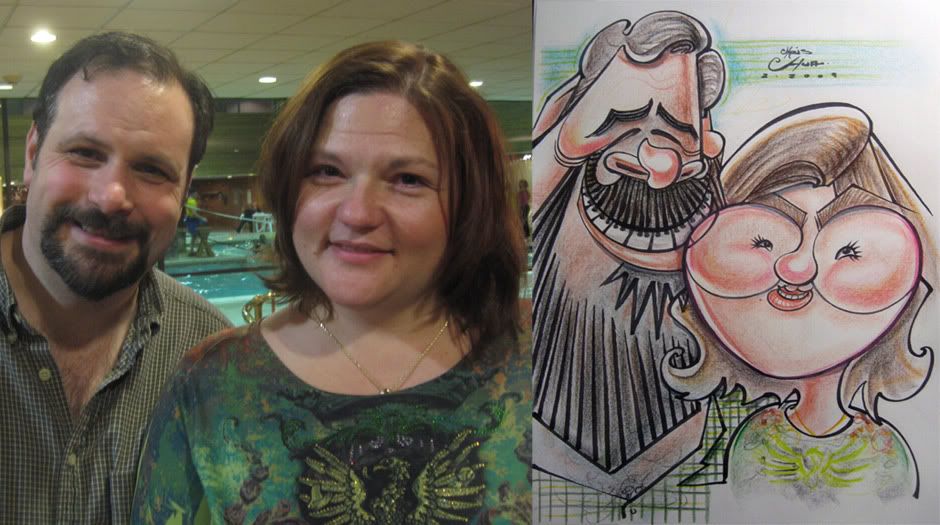
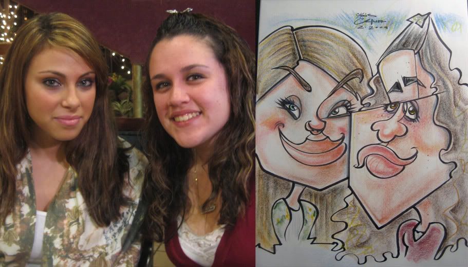
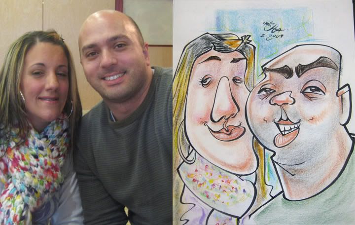
4.I like his cheek to her nose line. could have pushed the guy more. I liked the 1 line of the pupils of the woman.
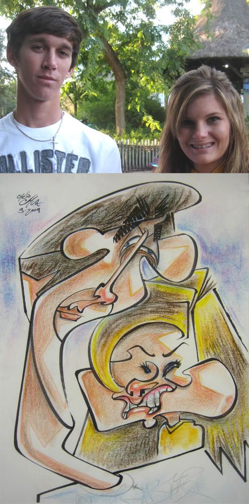
5. another redraw for fun of previous customers a few months ago at Busch Gardens.
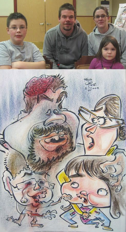
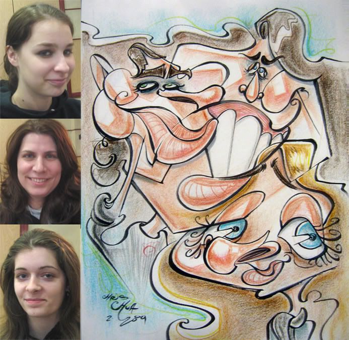
6.this was a cool family. they came up to me and said they wanted to be zombies, which is awesome and I've never gotten asked before. although the bad news is that I'm really not that good with bodies unless I have a clear idea. but at least it was a fun idea. as I was planning it out they said that the dad and son were more the big zombie fans, so I suggested that 2 of them were zombies scaring the other two and they liked that idea. so with bodies, usually, I'm using what little brain power I have trying to come up with something and on top of that I needed to figure out a layout for 4 people, so I didn't have much brain power to think about style and usually resort to a more tame (realistic-y for me) style. and less designy. I think it came out ok, I liked the ideas and it's fun, but stylistically a sort of step back from where I'd like to go. they liked it so that's cool.
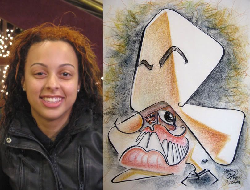
7.a redraw for fun. trying some things.

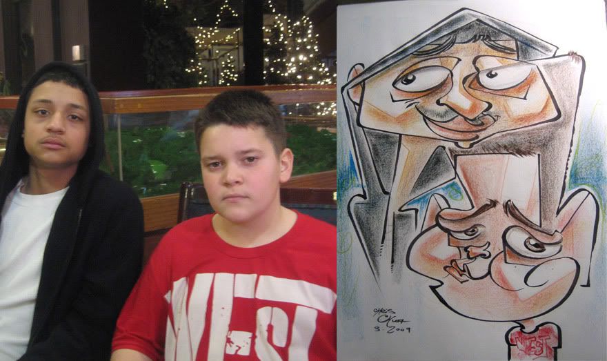
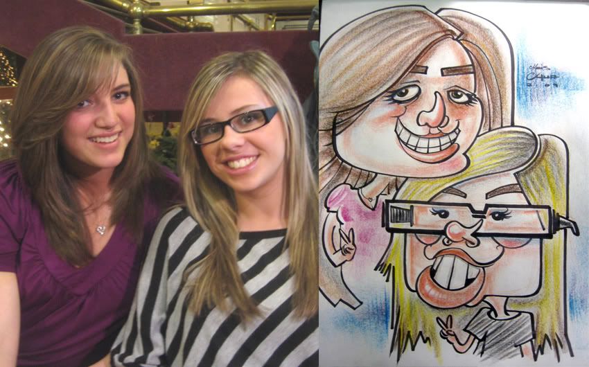
8. I like the baby's Mr.T...shirt. likeness on left kid needs some work, too much forehead.
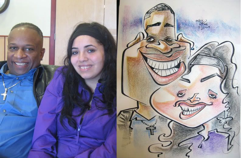
9. could have pushed it further but they were REALLY cool people, very chill, fun to talk to. and they really liked the sketch. the ideal customers really. oh and when they were about to get a caricature, they stopped by to say they were going to go eat first and then get their caricature done, the girl was psyched and gave me a high five. high fives rule, I like'm. high fours rule too if you're my friend, Gabe Hunt.
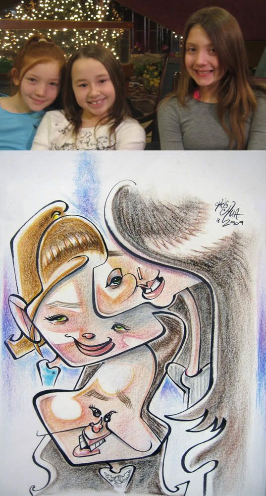
10.

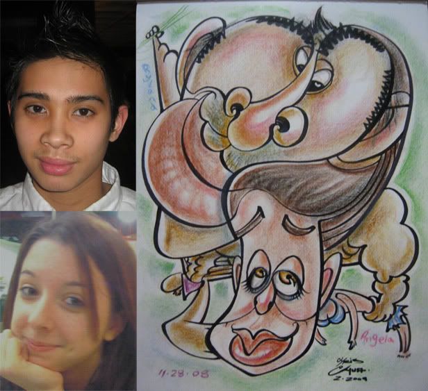
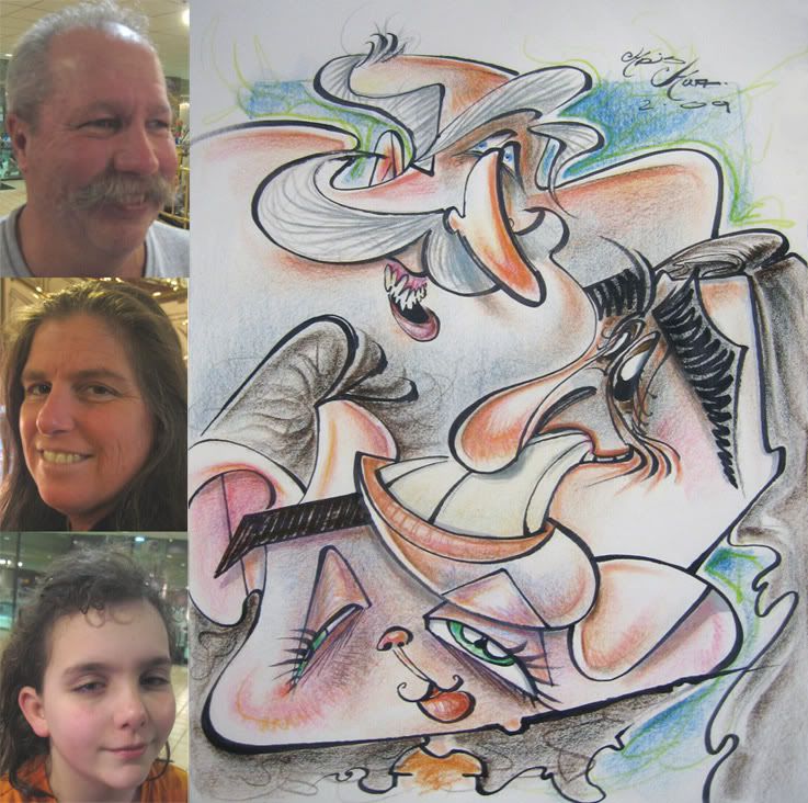
11. redraw for fun. I like the nose/hair and openness of the hair kid.

12. made the woman's mouth too low.
-------------------------------------------------
I saw Watchmen, it was all right. thought it moved a little too slow in the beginning, special effects, action and most everything else was decent. Malin Akerman (Laurie Jupiter in the movie), I think she's got a wonderful face. kinda unorthodox/unconventional (in a good way), distinct and very cute. hey, I'm a caricature artist, I look at faces, heh. I think she'd be fun to draw. I'll have to draw the cast sometime. oh and the guy who played nite owl, Patrick Wilson, he was in a movie called Hard Candy, GREAT movie, check it out if you get a chance, also stars that girl who played Juno. cool thriller.

caricatures- Marlon Huynh take 2 (MARCH 2009)

This is fellow caricaturist Marlon Huynh, who is the caricature supervisor at Busch Gardens, Tampa, Florida. I got to hang with him when I went down there to draw this past Christmas. I drew him and wasn't too happy with it, so here's another go at it. eh. a bit better. still needs something though and likeness could still be better. oh and the face creeping in there is my buddy and caricature/artist extraordinaire, Sean Gardner.

here's an oldie from this past December at Busch Gardens that I missed posting. not too crazy, I kinda liked the simplicity of it though and that they share the middle face line.

Friday, March 06, 2009

Caricature- Torqued baby (FEB 2009)

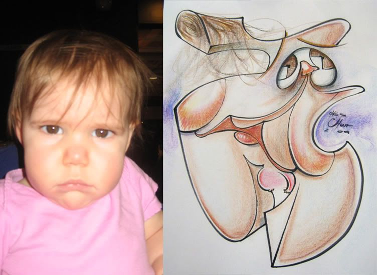
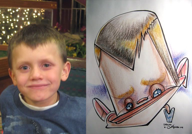
and one more from this batch. For fun and practice I redrew a previously sold sketch that I wasn't as happy with. I thought this baby had a great face to draw and the one I sold, I thought I missed on the possibilites and likeness so I gave it another go. 
btw, I just got an ephiphany on doing more of something in my live sketches that I'd do once in a while in the past and liked but never really did too much of it. I want to try bringing it back more...let's see how succussful I am at it. I'll have a day to test it out this weekend.

Thursday, March 05, 2009

caricatures- Tank kid, 1 eye kid, 10 person caricature and more (FEB 2009)

1. this was a cool kid, he would periodically come back to watch me draw and chat. I told him I'd do a really crazy one. A lot of times when I go crazier I'll get the usual passer-byers making comments like "what is that? or start heckling etc. which I'm used to and is expected. but sometimes like this time I was surprised that I had people commenting how much they liked it. hmm...especially when I go more in this wacky direction, I found that refreshingly nice. oh and the kid totally dug it.

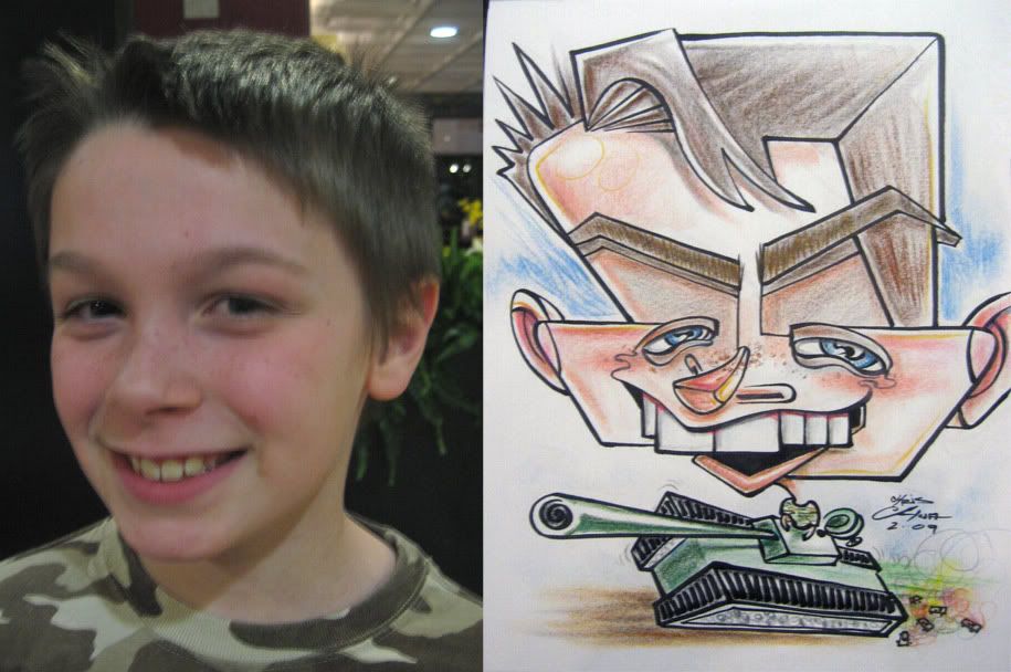
2. First time drawing someone in a tank. it's crushing tiny cars, heh. likeness isn't as strong, but I liked the graphicness of things. still in more angular shape-y mood, trying to get get back more into loosey goosey aggressive curvy, more of that as the post chugs along. chuga-chuga-chuga-CHOO-CHOO! hey! that's me!

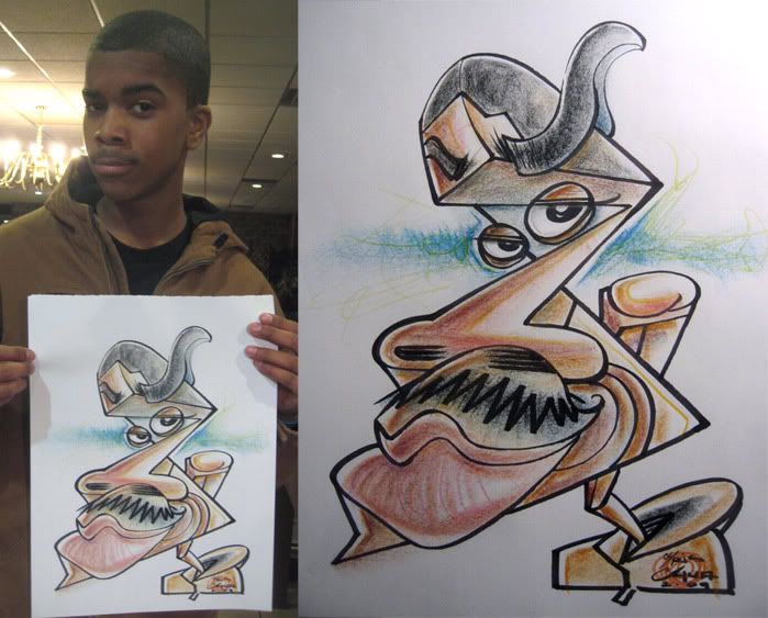
3. this was a very cool guy who saw the type of caricatures I was doing and was excited to get one. He was a fan of Ralph Steadman and I said I was too. this one was pushing it a lil bit too and oddly enough I got more sales from people watching me do this one as well.

4. jelly bean cheeks, yay!

5. the woman wasn't as thrilled about how I drew her cheeks, she didn't read it as stylization as much, I think. I tried to make her face a heart I thought she had a perfect face for it. the guy was cool with it all.

6. girl was drawn from a photo. I liked the idea of his face morphing with her hair, but I think it kinda made it a bit too awkward, in a bad awkward way, not a good awkward way. his foot to her cheek connect is a bit awkward too. I baked some flounder yesterday, it came out really tender and dechrisious, not awkward at all. just some random tidbits for ya.

7. I asked this kid what number he wanted on his jersey, he thought for a second and said "1000" heh. best answer I've gotten for that.

8. two cool kids that dug the funny. the mom came by and asked what's on his head. I said, "um, that IS his head" heh.

9. the girl on the right was really excited about getting a caricature, she said she was an artist too. She actually had gotten a caricature done before at Six Flags, NJ, where ironically, I help out from time to time. I overhead someone behind me, who I think was in their group, say "she's not going to like that." she DID like it. so THERE! random commenty person! I liked that straight line from right girl's eyes to left girl. I thought I might have trouble drawing the girl on the left, but I was happy with it, not too exaggerated but I liked it and that I tweaked her eyes so they weren't so symetric-y.

10. I liked the bottom girl. the top girl I could have pushed it a bit more. I like the layout, think I'm going to do more like this.

11.

12. hair and dress linework are pretty sloppy but thought it was a nice cute one.

13. the dad let me know that the smaller kid specifically wanted me to make sure I drew his shirt. dad didn't know why. yeah, me neither, it was just a plain blue and white shirt. oh well, easy enough.

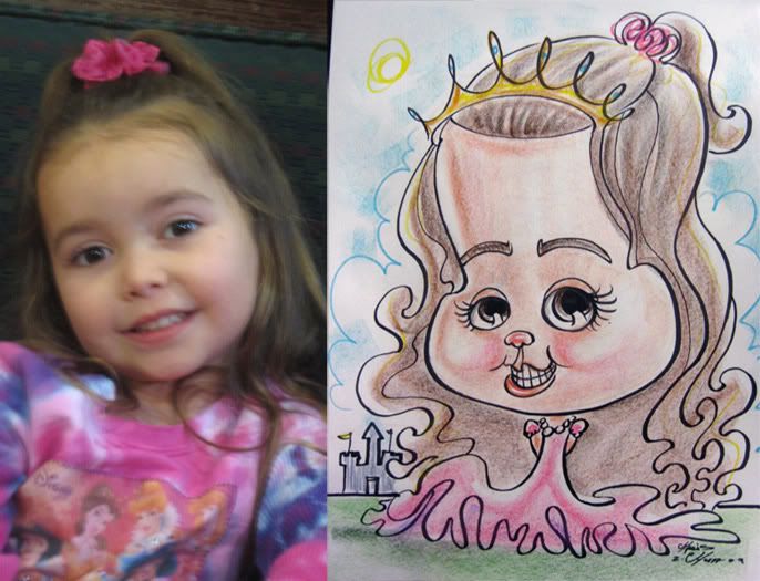
14. this one I didn't overthink it too much and just went with initial instinct, trying to push the exaggeration and flow. the mom was loving it as I was drawing it- her favorite the teeth kid. I like this one but think there was more potential. all 3 kids were GREAT contrasts and in hindsight, I prolly could have done something more designy cool.

15. I redrew this for myself after I drew and sold one that I wasn't too happy with, although they liked it. I like this one much better and think it's a much better likeness.

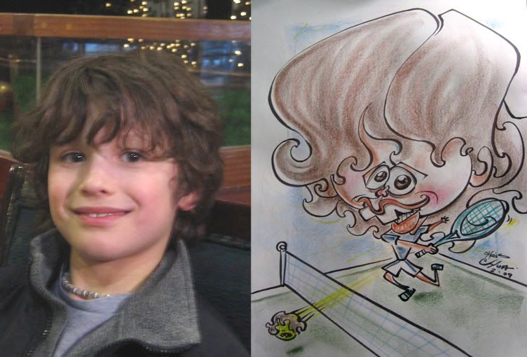
16. the tennis ball is the better likeness of the kid.

17. eh. ok. could have been pushed more. listening to the new kelly clarkson album for free on Mtv.com the leak. it's pretty good, a bunch of good catchy songs.

18. a fun couple. I watched "Date Movie" on a whim cause nothing was on. even the cute alyson hannigan couldn't save it. All I needed were some stupid jokes or something and really?! couldn't even find 1 joke that was funny? seriously, how do these things get made?! I miss the Naked Gun caliber classic movies.

19. the woman asked what "characters" did I drew them as. I replied, with a confused, "it's supposed to be you, but exaggerated and cartoony." I'm not sure she got what a caricature is/ recognized herself (I think it looks like her, albeit I drew her a bit mean looking) but they were appreciative nevertheless, so's it's all's good's. I was happy with that line from his face going down her face. her right side cheek is off, oh well.

20. I liked the top girl. should have pushed the shape of the bottom girl more and made it funnier. I ate a cherry pop tart today. I eat a decent amount of pop tarts. more random useless tid(cherry)pits for ya.

21. shirt-- "aber crummy"

22. I was like, seriously?! this is too perfect, he's got one eye just like his shirt monster. so I drew it round just like the shirt, heh.

23. she was a bit surprised with it, but was cool. I forgot to sign it, hmm. New "Red Jumpsuit apparatus" album is really good. another band just called "RED" has a new album that came out recently, it's a bit disappointing, not  "bad" by any means and decent to listen to but overall not as memorable and considering how much their debut rocked. they sound like old (good) linkin park + evanescence. check out their debut album called End of Silence. you can listen to both full albums on their myspace here

24. an ok one. I like the woman more than the guy- he came out kinda bland and something about it in the likeness is lacking. think too much nose to upper lip space. also, her rad scarf looks too wishy washy. they had nice contrasting faces could have been a better one.

25. I was pretty happy with this one except for the eyebrows.

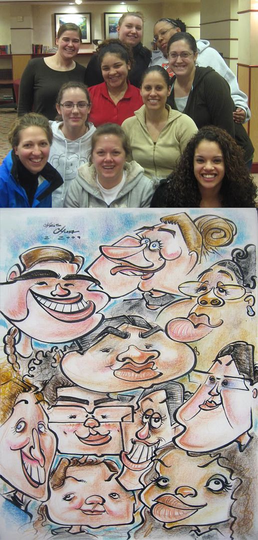
26. 10 person caricature. I think this is the most I've ever done live. I was excited about the task of squeezing all their faces in and planned on really going nuts on their faces, but the delimabean lies in that I was trying to fit each face in a relatively equal space to make sure I fit everyone in and therefore was restricting myself with exaggeration. what's funny, and yet not really funny to fellow caricature artists who get it all the time, is that some of the girls thought I totally missed on the likeness and others said I got it right on and could name who was who easily, which one did. and even when she did name who was who, they didn't think so. it's not like there was some cheat sheet. if your friend can guess who it is then maybe it wasn't as "off" as you thought it was, perhaps? always funny and interesting how people can't see likeness and some can...I think for the most part I got everyone decently. not the best caricatures but moreso the challenge of fitting them in successfully. I'll have to work on going for broke more with lots of people and see how it goes.

27. a nice couple. I like his furry hat.

28. I was happy with this. getting back to more aggressive coloring cuts, I used to do that last year and then kinda stopped, not sure why, I always liked it, think I'm going to get back into it.

29. mom and sis of the one right above. not feeling the likeness as much on this, was a bit stumped for some reason.

30. the mom initially wanted all 3 of them drawn together, but the 1st girl decided she wanted one by herself. for fun, I drew them together afterwards. likeness isn't as good on the bottom girl, but I like the more aggressive lines. am going to try to do more of it. as some of my stuff gets a bit too graphic-y stiff at times.

31. this one had more potential. the woman on the right could have been better designed and exaggerated.

32. I redrew them for myself later on. the one they bought was just ok. I've been doing that more--going back and redrawing past ones as finishes of what I should have done.

33. working on getting back to more aggressive flowy lines. oh, I watched the movie 1408 yesterday. good movie! had some really creepy moments. good stuff, I recommend it!

Caricature- Jon Young take 2 (MARCH 2009)

1. here's another of friend and fellow caricaturist, Jon Young. I drew a horrible one of him at Cripple Con 2 (see previous posts) and wanted to make up for it. I have some issues with it, but overall, I think it's all right enough. I couldn't figure out what to do with him, I don't think he has an overly difficult face to capture, but for some reason, I just couldn't figure out how to solve it the way I wanted. I think I have more sketches and rejected starts of Jon than anyone that I can remember in recent memory. and I still feel that I can do a better one, I'll have to come back and do another one.

here's one that I went and finished last month. eh.