This past December, I went down to Busch Gardens in Tampa, Florida, to draw caricatures for a few weeks. I had an amazing time, mostly due to all the awesome people down there. Big thanks to Dion Socia and everyone for having me and making my trip awesome-licious! also big thanks to my roomies- Ticqui, Kayla and Ben who all rock!
Business, however, was REALLY slow. It was said it might have been the slowest ever. Things only started picking up a bit after Christmas and even still, only about half as much business than usual. I did manage to get in some decent drawing time so I still had fun.
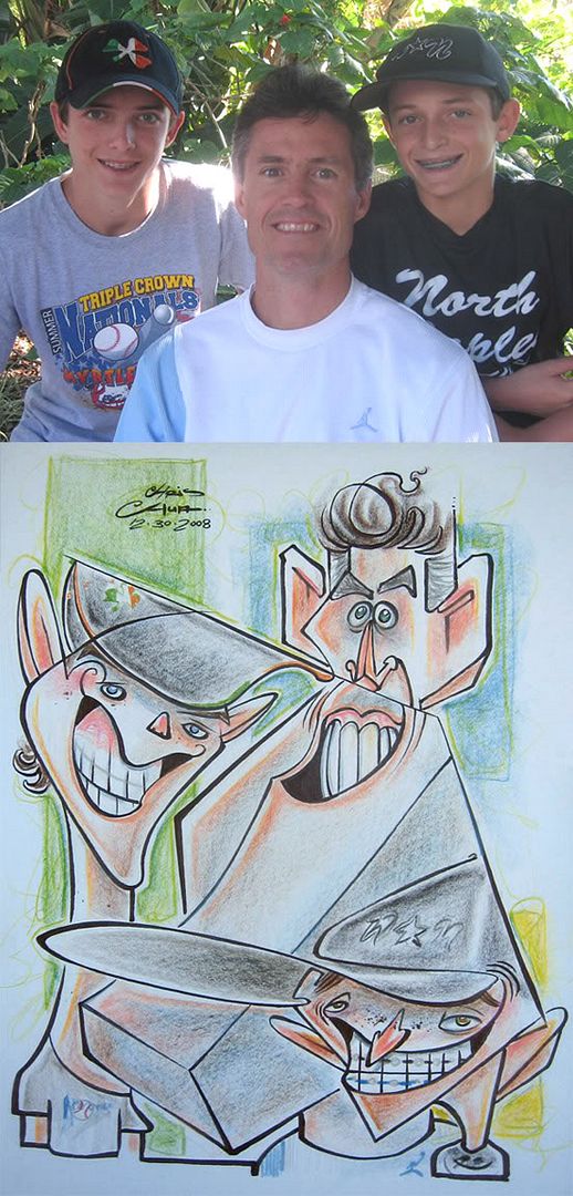
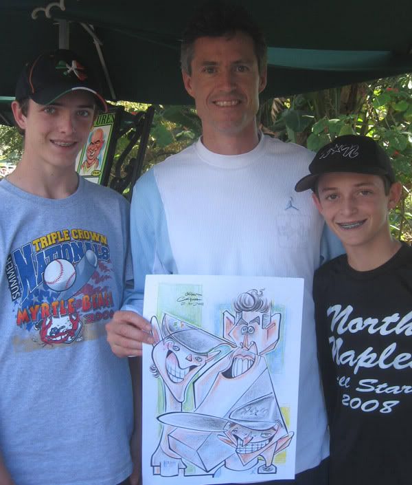 1. I was pretty happy with this one, maybe my favorite I did in Tampa. I liked the different contrasts of the 3 people and felt I was more loose with the lines and made for more bold interesting shapes and silhouettes. I liked the connect line from the kid's hat across to the other kid's hat but afterwards didn't like that it merged the bottom kid to the dad, killed the separation.
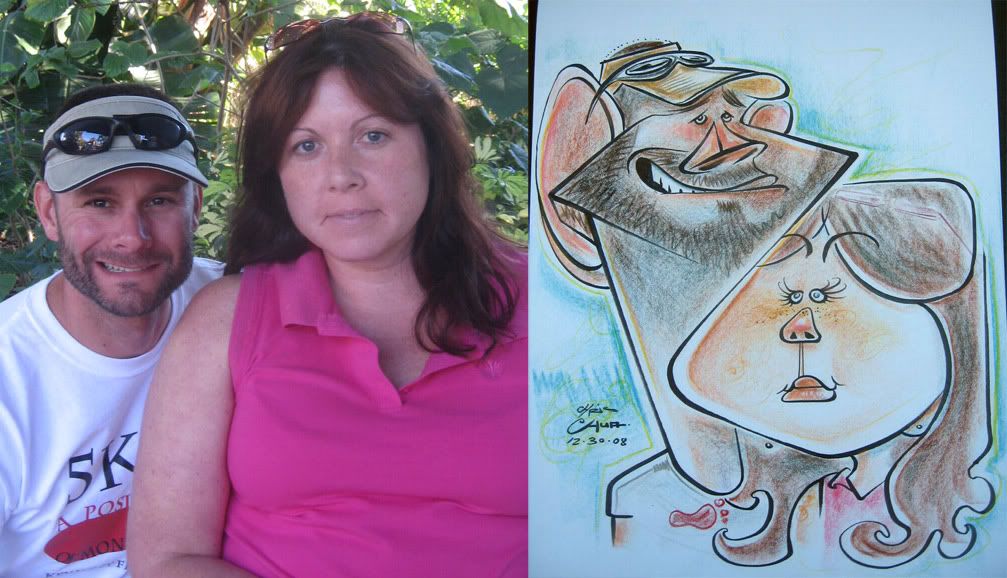 2. this couple was watching me drawing the 3'er above and said "wow, that's a cool style" and I was all in selling mode and said over my shoulder as I was continuing to finish that one, "you should get one!" they didn't say anything and I guess walked away. Later on, just as I got back from my break, this same couple came up and were talking to themselves "yeah, he's the one" they specifically wanted me, as I realized that they were the same couple earlier. they said they've gotten caricatures done before and that I had a cool different style. and it's always cool when I really go for it more like the 3'er one, and people like it and want one similar. It's very relaxing knowing I can just do my thang...unfortunately, I don't think this was as bold as I could have done. he had a great crooked smile and I could've went more for it. I don't know, it's one of those moments where I was sort of drawing a blank. I don't think it was bad, I think it's decent enough, but don't think I pushed it as much as the previous one. I think the likeness is off on the guy too. I do like that line from his face to her cheek.
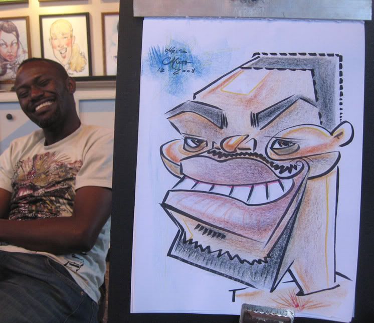 3. He was laughing pretty hard when he saw his sketch...partly cause it's funny, partly cause he's pretty shocked and confused at what he saw. He was cool and bought it, but a few minutes later had another one drawn by my co-worker. double sale! It's an all right one, I could have gone much crazier and it's a bit too neutral.
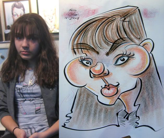 4. I like the chin to hair line.
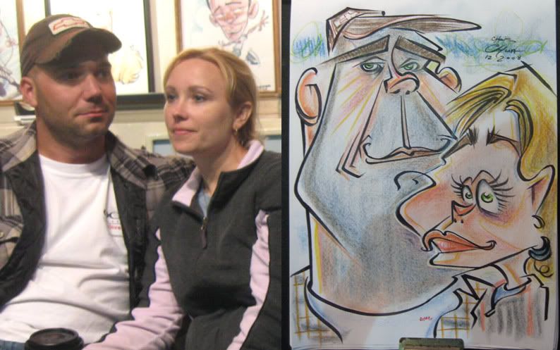 5. this one was kinda disappointing. this couple gets caricatures done everywhere they go, so there's some pressure to make sure they get a good one. I felt I messed up on both likenesses. I think it's enough that you can tell it's them but looking at it after wards, there's just some stuff that I did that's wrong. I do like his chin to her cheek line, that stuff usually makes me like a sketch a bit more, and keeps me posting it rather than not.
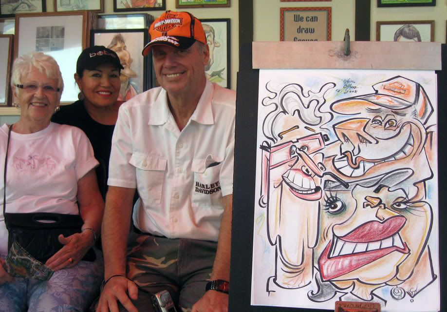
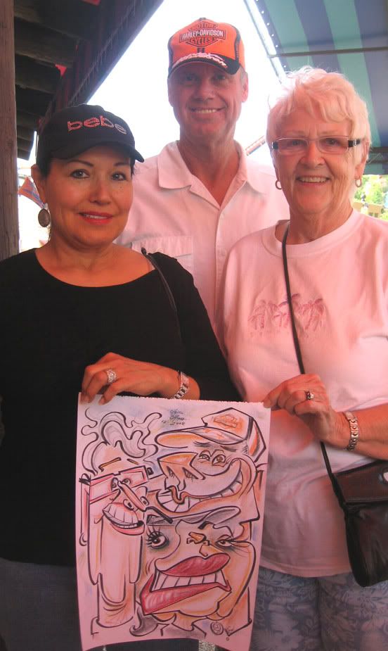 6. this could use more separation between faces but overall I was pretty happy with it. they had fun contrasting faces. I was really jumping around on this one, I'd draw a few lines of one person than jump around to another. I find that fun to do, and usually baffles any onlookers, heh. I was getting a bit nervous as I realized I might have run out of room for the guy's lower half/her hat area, but managed to squeeze it in there- still could have left more room for his chin. I gotta work on drawing a bit smaller to avoid those siches. I had to rush the coloring a bit cause they were getting antsy, but they were really fun and cool people. when I was ringing them up, the woman points to the nose hairs I put in on the guy and started laughing, hee hee.
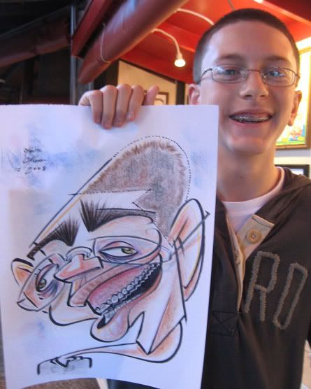 7. I was drawing some kids from the same family and this was the 3rd one. the previous 2 were more tame, but the mom (or aunt?) says, "make this one REALLY funny." I was glad she said that cause, obviously, I like to let loose more, this kid had a great face and third, sometimes when you draw a bit more tame, then that sets the style for any other ones, if there are people watching and waiting for you, which sucks. So this was a chance to break out of that slippery slope. (gotta learn to never draw tame then!) so anyways, everyone was having a blast and laughing at this drawing. I finished it and the mom says to me, "That one was REALLY cool, it had a cool style to it." she hadn't really said anything about the prior 2 I did. "hurray!" I think in my head. then the next one I draw is her daughter and the mom goes, "make sure to make this one really good, it's my daughter." she says that a few times to me. hmm. ok, so you just really liked the previous sillier one and that style, but now....it's back to tame? and after liking all the previous ones I've done (tame and the sillier one) you tell me to make sure this one is "good"? as if suddenly, I'm just going to suck and draw poopy? hmm. I can understand where she's coming from to an extent and yet it baffles me at the same time and I find rude. I could see her saying that before she saw how I drew, but after 3? c'mon. anyway, I just did a tamer one of her daughter and this is the only one of the group that I liked.
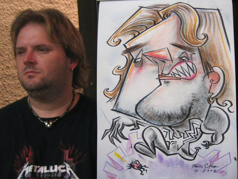
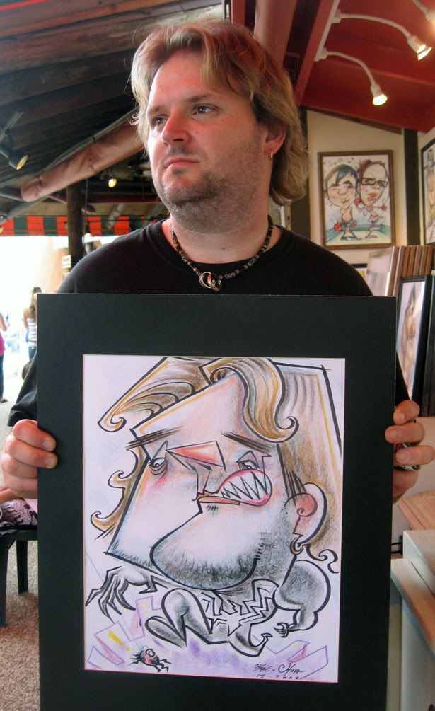 8. this is my first real Venom body. I've only drawn spidey in the black costume before. not that this one is too much different, but he's bulkier and has got claws. I was thinking about going nuts with the teeth but then thought this guy has a small mouth and I could loose likeness so I came up with a small yet big mouth, heh. I liked the connect line from his teeth to his eyebrow. I usually don't do too much of a gag on caricatures but I liked my lil spiderman spider. and if you look closely, there's an actual fly on the lower right hand side of the paper of the 1st pic, too bad spidey and venom don't see the tasty treat. wait, what?
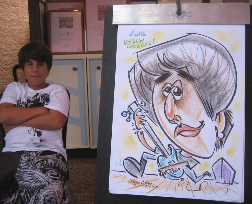 9. the venom one above got my this sale. His brother later came and got one too but it didn't come out as swell.
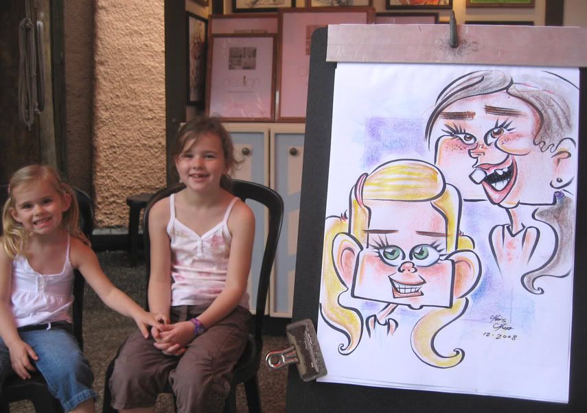 10. just a cute one. toof!
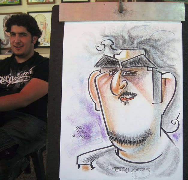 11. I liked the leaving the hair mostly to color.
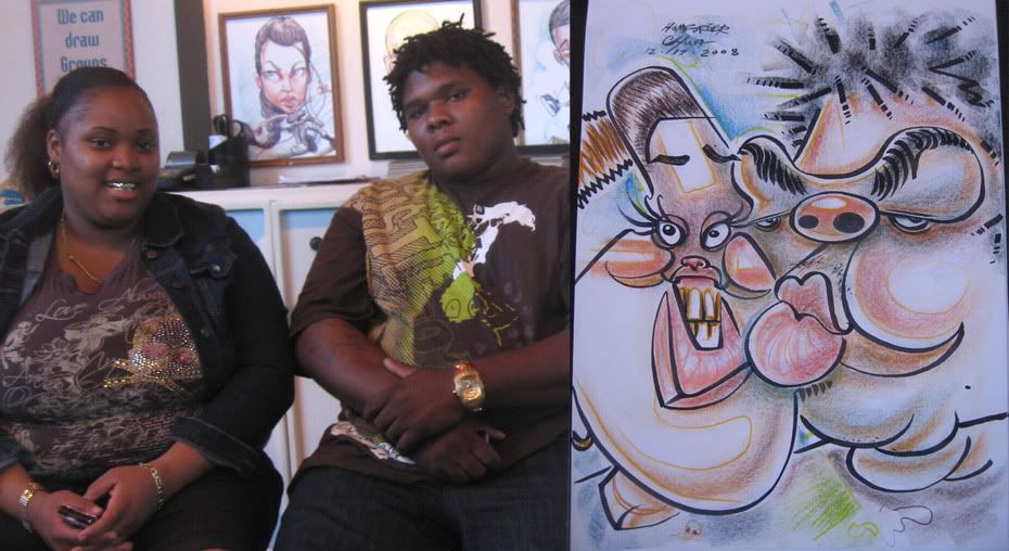
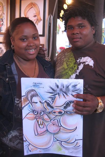 12. gold teef.
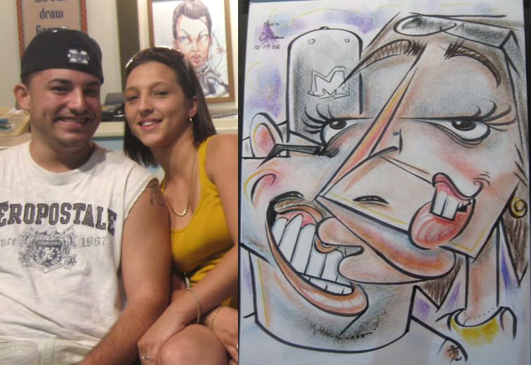
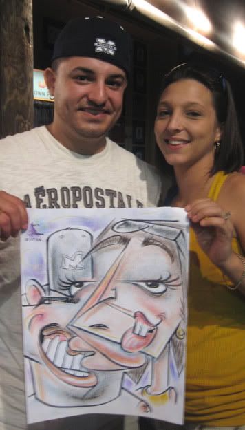 13. I really liked this one, this one is pretty pushing it with both faces kinda merging together as one. I was pretty surprised that they loved it, the woman especially, she really liked it and thought it was cool. and she figured it out right away (I could totally see someone looking at it and not knowing what it is) I drew this on my birthday so it was a nice birthday present for myself, heh. one of my favs I've drawn, I thinks.
 14. not too jacked, but fun and stylized. I like the connect line of his face to her cheek line, don't think I've done something like that yet. hmm, could have given her more chin.
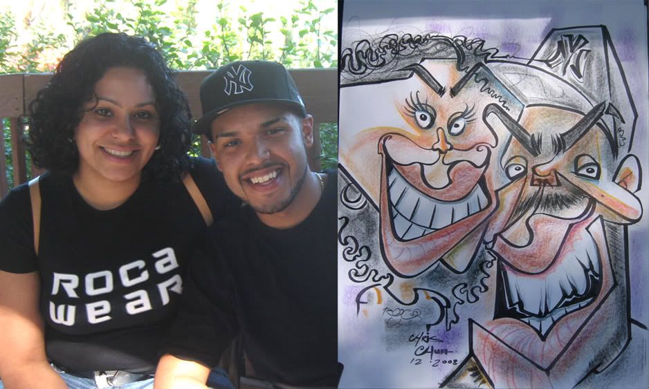 15. her eyebrow to his hat and her lip to his eye connect lines. they were cool and had a good laugh. think I made him look a lil too mean with the eyebrows.
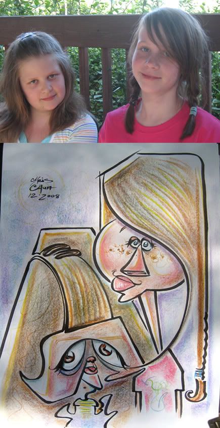
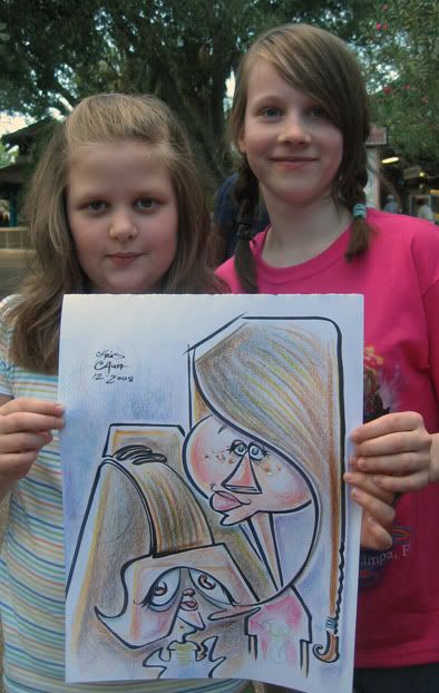 16. I liked this one a lot. that connect line from the left's hair sweeping around to her eye. and I think I got both their vibes.
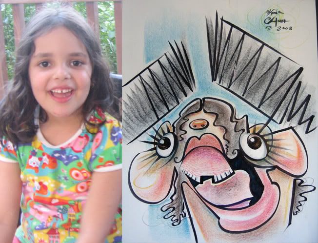 17. demo, heh. I think it looks like her, but my co-worker didn't think so, ha ha.
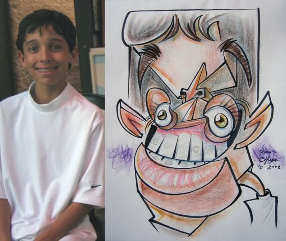 18. another demo. he didn't know what I drew though. he was like, "what's that?" but was still cool and appreciative as was his dad who thanked me. It's nice to get thanked for doing a demo, don't get that too often. I say that boy's gonna be a good chap when he grows up with that kind of parentage.
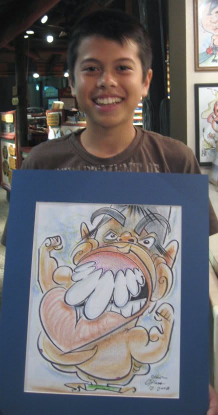 19. he came out too mean looking.
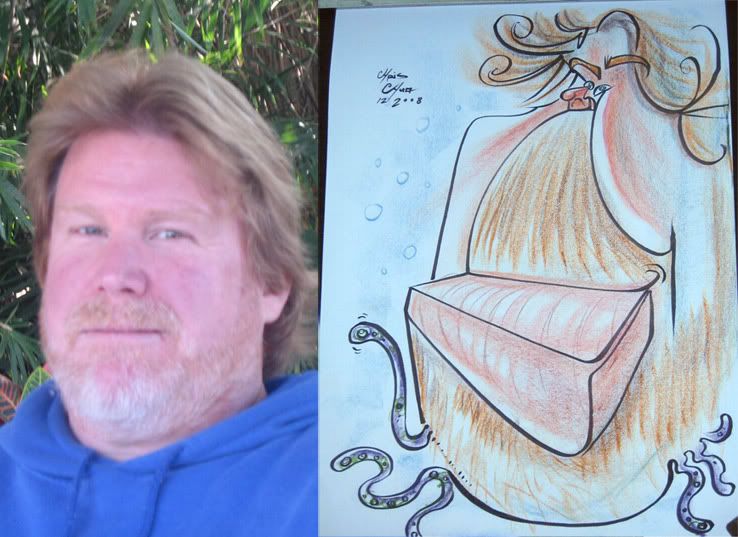 20. demo. his daughter said to make him a squid. just random. magnetic grilled cheese sandwich.
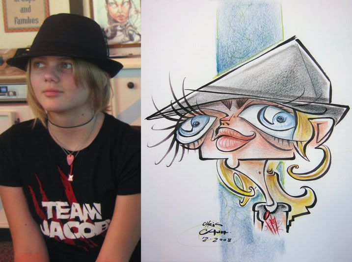 21. she reminds me of a girl I drew at Busch Gardens. oh wait, it was her.
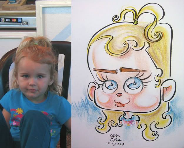 22. I was pretty happy with this except for the eyebrows, they just seem kinda there-too neutral. glad she stopped crying too so I could take a decent reference pic. That's always that fear with potential crying kids/babies, that you might do the best drawing but never be able to get a good pic. It's also always my fear that I'll get eaten by a magnetic grilled cheese sandwich. that's why I never attend any of those magnetic grilled cheese sandwich conventions.
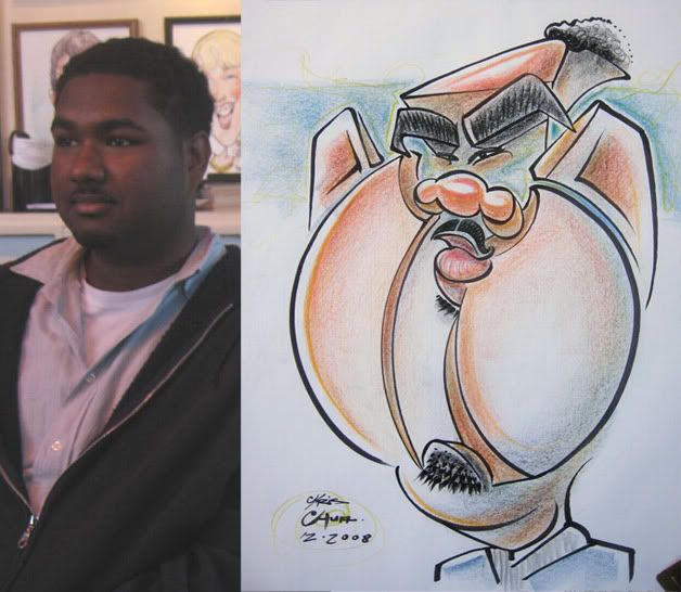
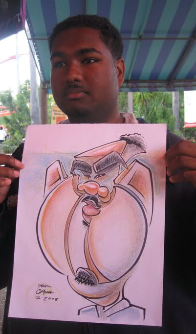 23. messed up his skin tone. I like the floatiness of his eye area.
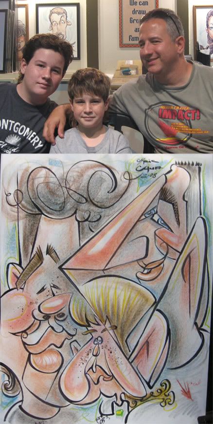
 24. I was happy with this one for the most part, I don't like that connect line from the dad ear to the little one's ear. distracting. I really enjoy drawing more than one person caricatures especially if there's great contrast in each person that you can really play off of. I actually got a chance to do a decent number of multiple people this visit. I did a 6 person family one but all their faces looked too similar and I didn't push it that much, added there were 2 twins in the bunch too!
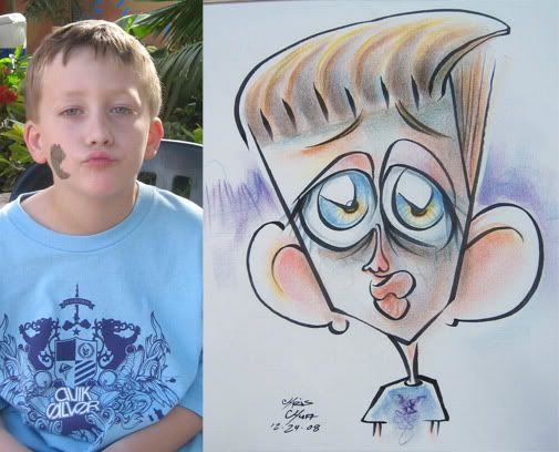 25. this kid was excited about the caricature but his aunt wasn't sure if he'd sit for it, he had a hard time waiting and was getting spidery, I mean antsy (he was a bit autistic too). I really dislike when kids ask "are you done yet?" yes, I'm done and just sitting here wasting my time, staring at your finished caricture like an idiot, thanks for asking, otherwise I wouldn't know when to notify you, I've been sitting here twiddling my thumbs this whole time then I ate a magnetic grilled chees sandwich. this kid must have won the lottery on endless supplies of that line. He didn't like the finished caricature, he said "next time, when I come back, don't draw it like that" heh, oh, kids. those hair marker lines are distracting, eh. trying stuff.
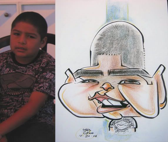 26.
26.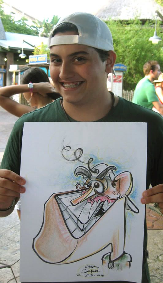 27. he did have a little piece of hair sticking out, but then his friends told him about it while I was drawing it so he fixed it. I liked this one more at the time I did it. the chin is wonky, I should have stuck to my initial guns and just made it a perfect box instead of shaping it, now it's wonky, in a bad way.
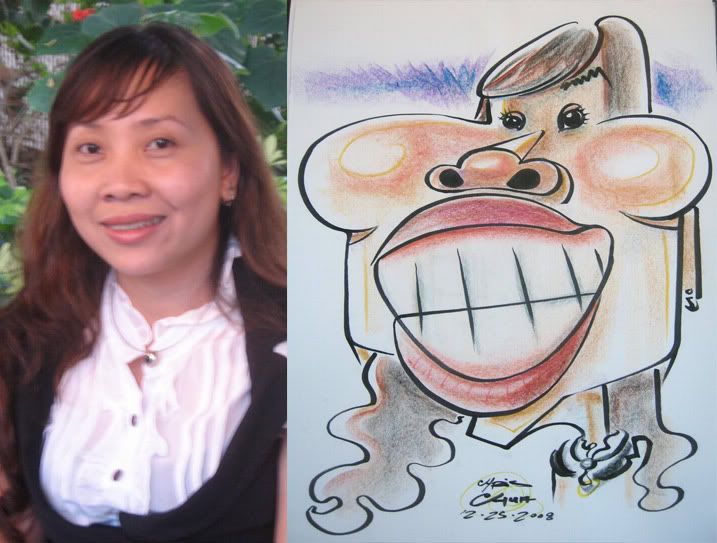 28. should have made the eyes further apart.
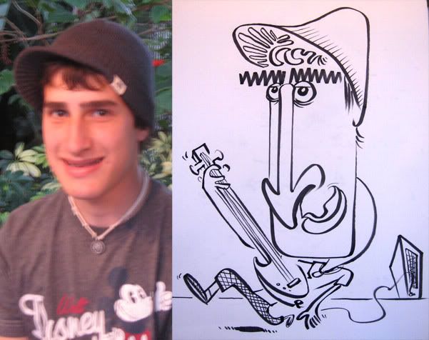 29. hm. forgot to sign my name. I usually don't like doing just black and white, but this one was a super quick silly. the neck is weird, heh.
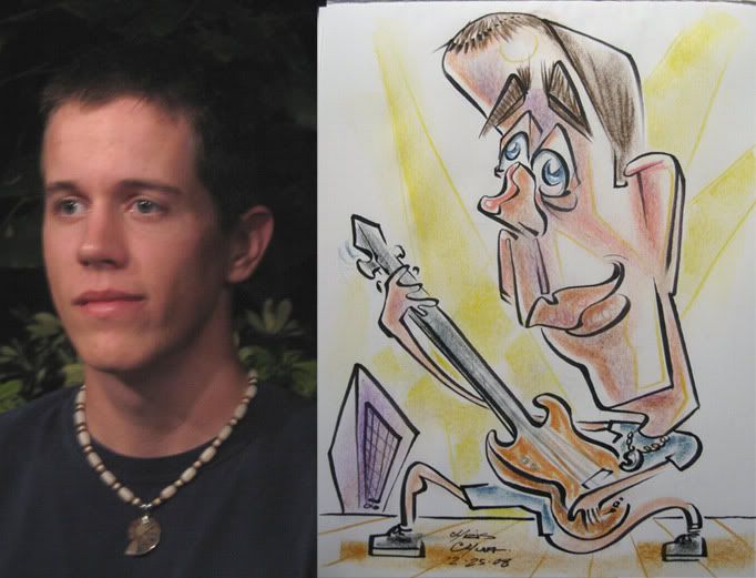 30. I got two guitar bodies requests close to each other. I'm not like Brian Oakes and have tons of variation for each body request. He's just unreal!
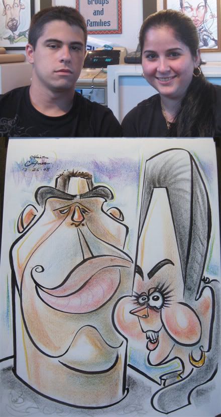
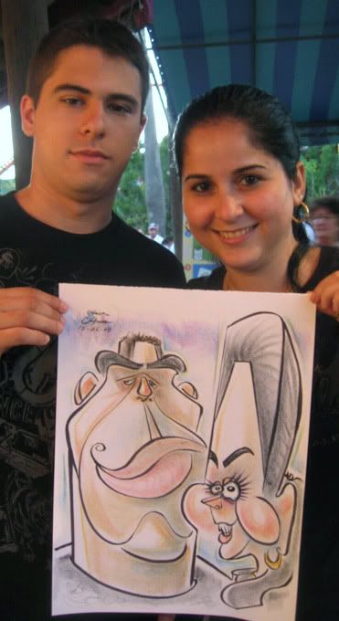 31. should have made his nose bigger. I like the connect line of her face to his neck. his mouth to her eyebrow connect is more subtle.
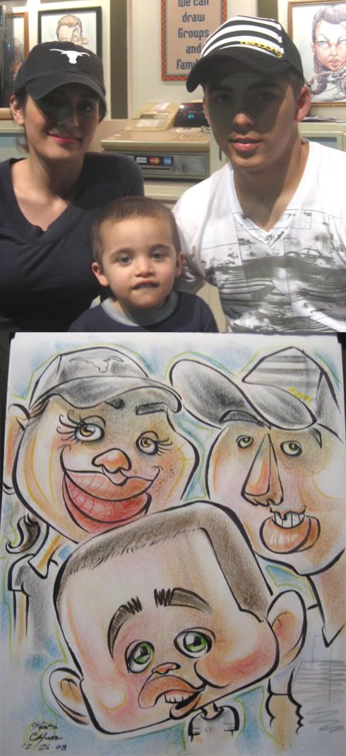 32. I drew the kid way too big.
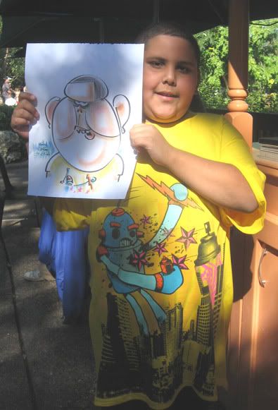 33. so my co-worker, Kayla, spots this kid who has the same shirt as I. I've never seen anyone else with it, so I said to her, I should draw him. but he was already walking away, she urged me do it. so I ran after this kid a ways down, told him I had the same shirt and asked if I could draw him as a demo. the family agreed. He was fun to draw too. it was weird, I thought I got his likeness early on and only when I was about to finish it all up, did the mom go--oh, now I see it looks like him. his family all loved it and they ended up buying it. hurray! the 1st line I drew was that oval forehead.
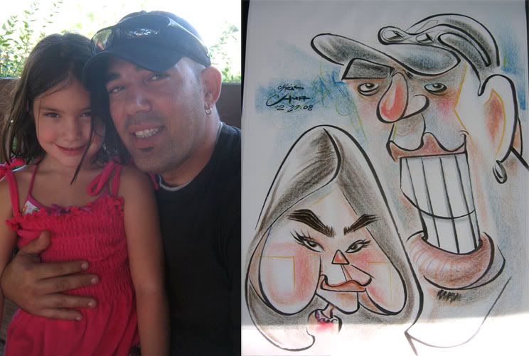
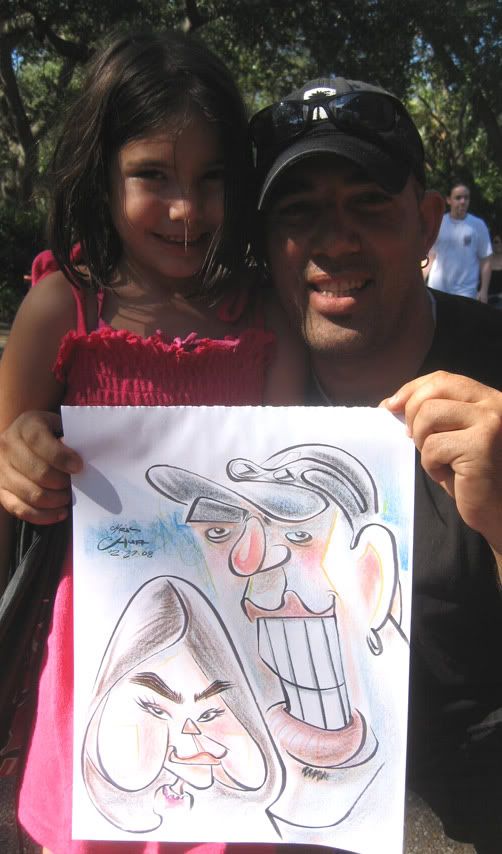 34. I was happy with this. I liked the leaving of the left side face of the dad open and implying it with color. at the last minute I decided to add that extra top tooth on the dad, should have left it alone. could have gave him a bit fuller top lip too.
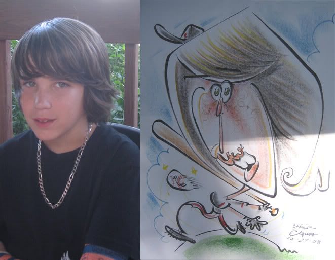 35. eh, I like the lines here but think the likeness got away from me and the body pose doesn't really work. I tried pushing the lips a bit. the dad didn't seem to like it and did one of those "do you like it, son? I don't like it, but if you like it, we'll get it" they bought it. I bet my awesome hats prolly made the difference, heh.
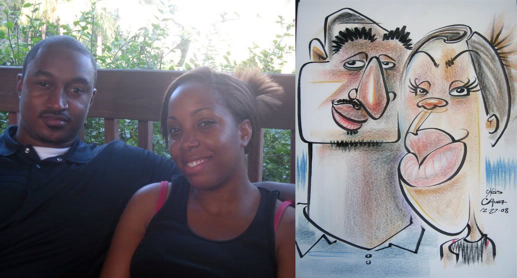 36. more leaving the face open.
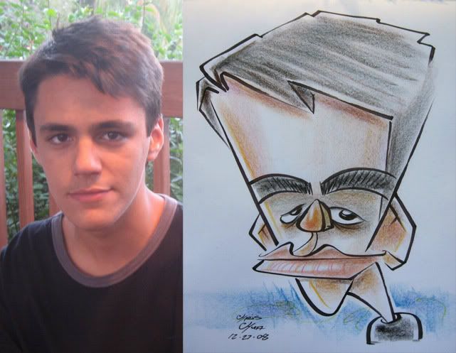 37. the kid was like "aw, c'mon!" after he saw it. heh. still sold! needs more chin.
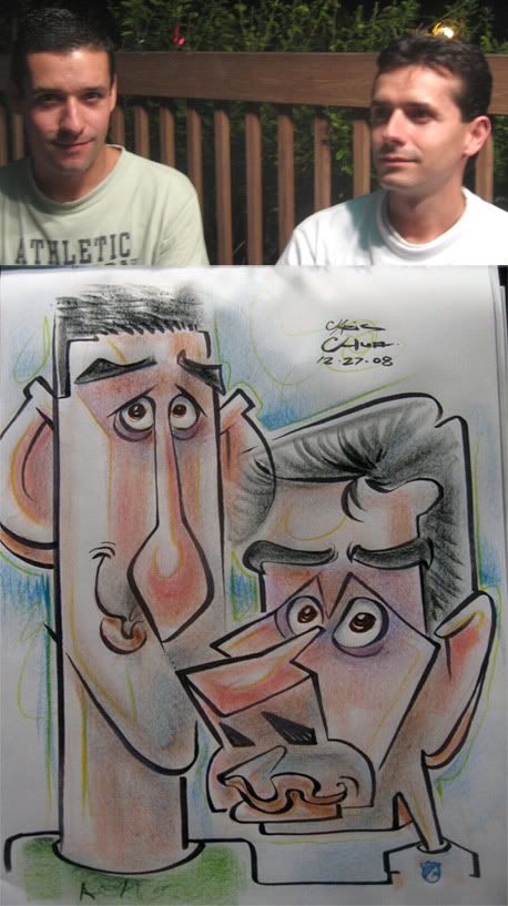 38. they waited to get drawn by me and they were happy with the results but wished I had pushed it more. I like the tall one's ear/other bro's hairline merge-ance. hey, I just merged a new word with merge-ance. hooray!
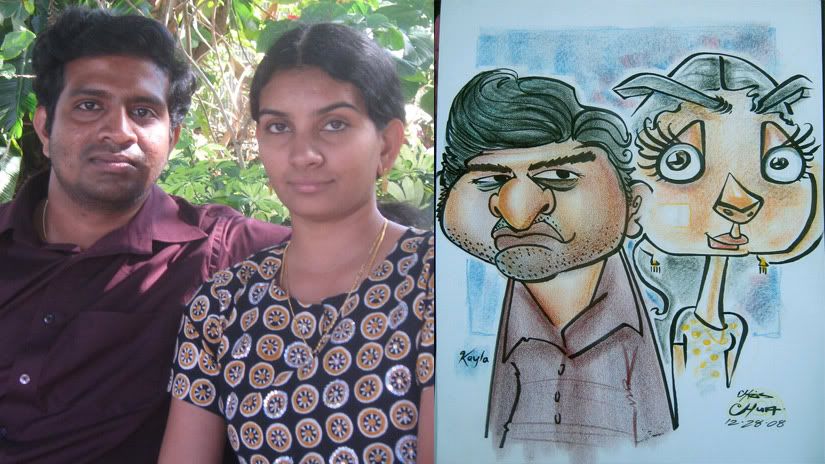 39. this is a collab between Kayla Gales and myself. Kayla went 1st with the guy and I drew the woman. I did a collab with Ben Bloss too, I don't have a picture of it, I know he took a picture of it, I'll try to post it once I get it. Ben's got an awesome style as well. yay, shapes! those two need blogs to post their sweet caricatures!
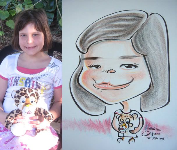 40.
40.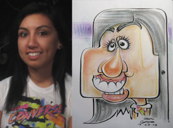 41. after I drew this one, and she went on her way, a family was getting drawn by another artist. I was free and it seemed like there were more people needing to be drawn from that family. they didn't speak too much English but didn't seem to respond to me asking if anyone else needed to get drawn and that I was available. they kind of just ignored me. then another artist at our stand started drawing another one of their group. oh well, guess they just didn't like my style, which is fine. at least let me know, so I'm not standing there wondering. finally this little boy in their group wanted one done and all the other artists were drawing and I was just standing there. one of the kids in their group who spoke more English comes up to me and said that I wasn't going to draw him as a box, right? referring to the one I just did. I assured them that he doesn't have a box face, so no boxes. the younger kid then translated to the mom, who had the issue, that that's what he had thought. I guess they were discussing it before. So I went really tame, but still solid on the kid, just to show that I could do that sort of stuff. they had no issues.
on a side note, well, really the same note- I really like it when I'll be doing a really crazy one and then someone will see it and when I ask if they want to get drawn they'll say that they are waiting for another artist or say my work is too crazy. Then I'll get another customer and I'll draw really really cute and fun and cartoony just to stick it to those that think I only draw crazy. yes, I'm a jerk that way sometimes, heh.
 42. fun face.
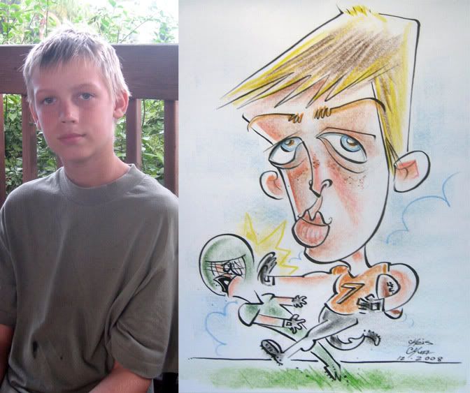 43.
43.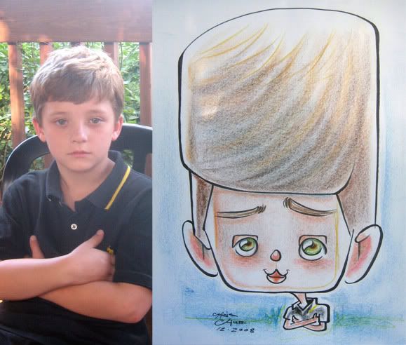 44.
44.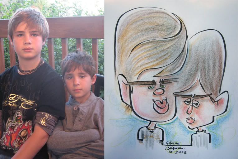 45. open face...turkey sandwich.
 46. needs more chin.
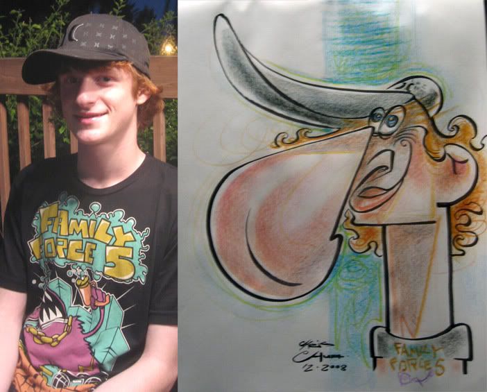
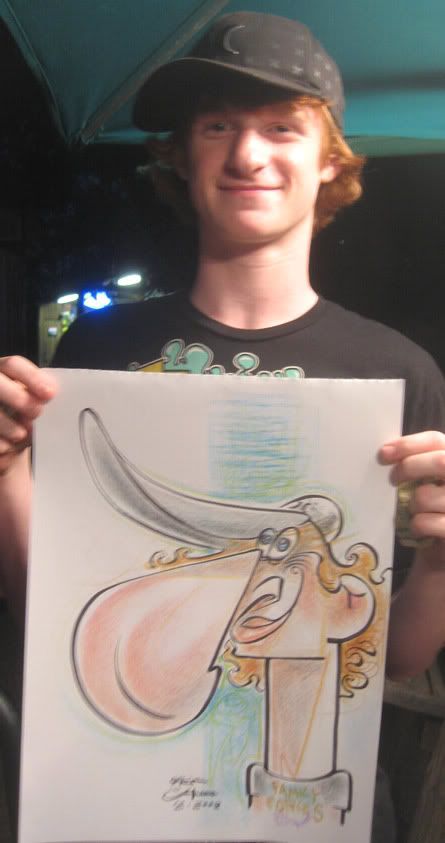 47. eh. I really tried going for the nose, but lost likeness with the placement of the eyes. he had on a Family Force 5 t-shirt, great band!
 48. this is the brother of the one right above with the nose. as he was watching me draw his brother he didn't seem to have any real big reaction. He said that he was thinking about getting one but wasn't sure. I thought after seeing what I did to his brother he might be kind of hesitant, but he was like "what the hell, I'll get one too" after he saw his, he wasn't sure what it was either, I had to explain it to him. both of them were real cool kids and pleasant. I was happy with this one and really pushed it the way I should be pushing it more.
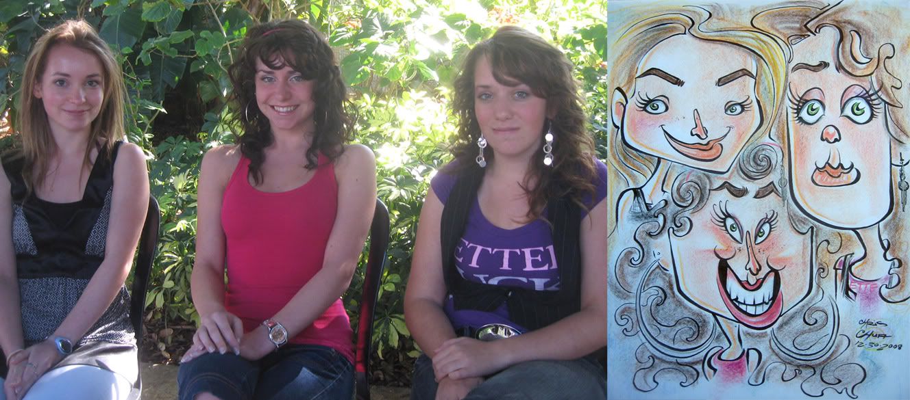
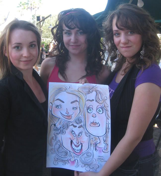 49. so this french dad comes with his 3 cute french girl daughters to get drawn by me. hooray! :) they all had their own distinct looks which is great for contrast too. I like looking at family and seeing how they are similar- two of them had similar eyes, two others had similar mouth shapes. If I saw both parents enough, I bet I could see where everyone got all their features, I really enjoy looking for that kind of stuff. As for the sketch, I didn't really go for it, just tried to get a good likeness and push the cartoony enough. I gotta admit, I was a little taken back by the middle girl. I thought she was really striking. and she was staring directly at me which was making me nervous a bit, heh. I think I could have made her cuter but was thrown off my game a bit. she was the first girl I drew and the dad was right behind me watching intently. they were all cool and seemed to like it so it's all good.
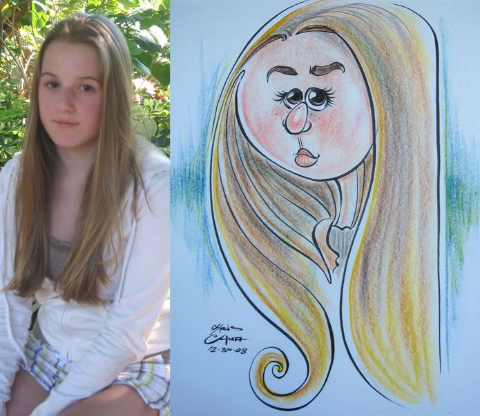 50. I like the hair but made her face too round, accidentally colored her jacket flesh color and not enough chin.
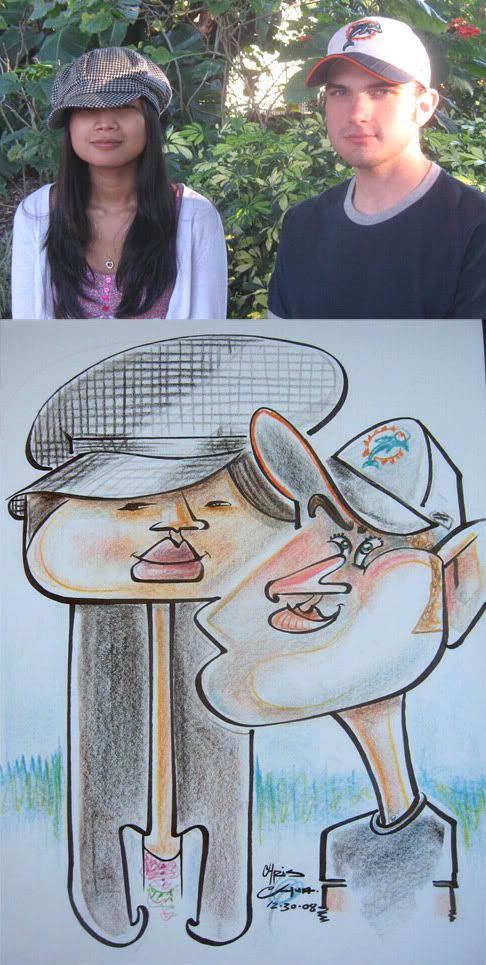 51. I like this one and their merging faces.
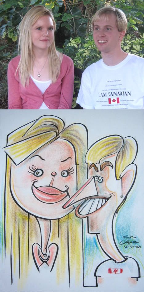 52. this is one of my favs that I did during my visit. they both had fun faces and a fun couple. I just shouldn't have put that line for her chin.
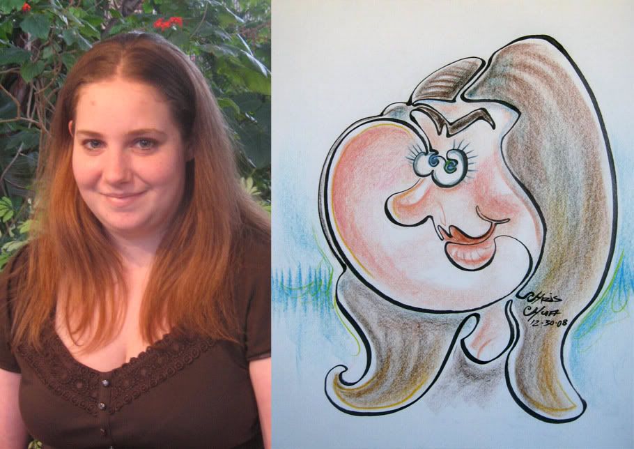 This is drawn with 1 continuous line.
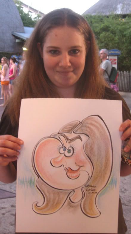 53.I started at the nose. my friend was drawing her friend at the same time and he had an awesome face and I was jealous. I didn't really see anything to go crazy on on her so I thought I'd try the one line thing. my friend jacked up her friend and got a reject, it was an awesome drawing. the dude was pissed too, heh. my caricature, she just bought and went on her way, pretty uneventful.
 54. weeeee!!!
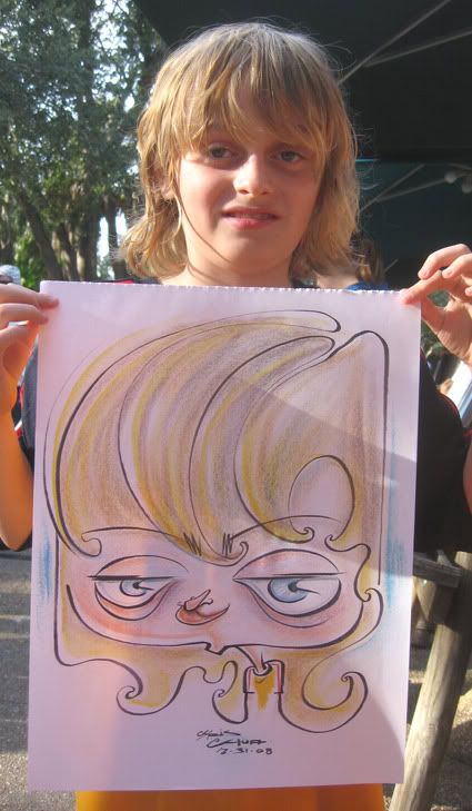 55. the family of this kid was talking to my co-worker and asked her if I knew that this was a boy. she said that I did, heh. hey, he's got long curly hair, just drawin what I'm seein!
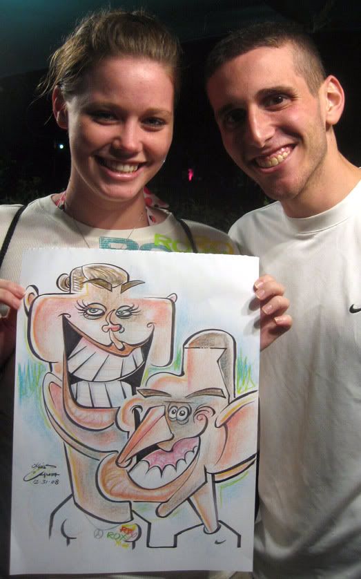 56. hmm, I feel like this one could have been pushed better. his left side ear gets lost too, it's under her mouth.
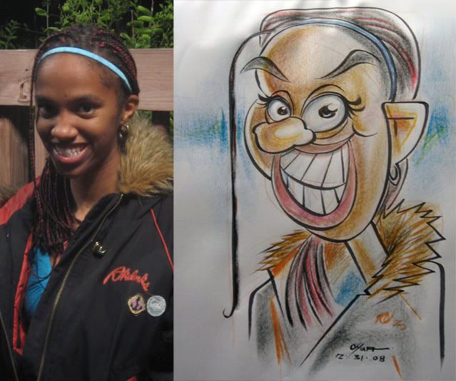 57.
57. 58. these kids are just too exciting! tooo muuuuch exciiiitemeent! I can't staaaaand it!!! ahhh!!
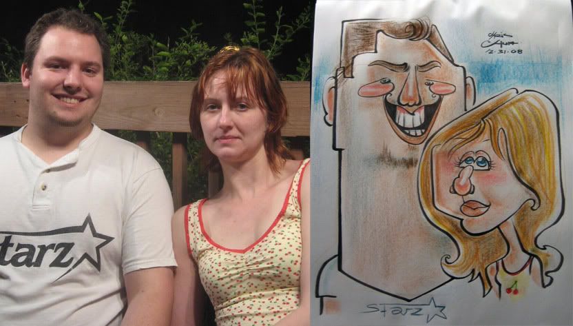 59. these folks were from Alaska. the off shape of his mouth bugs me
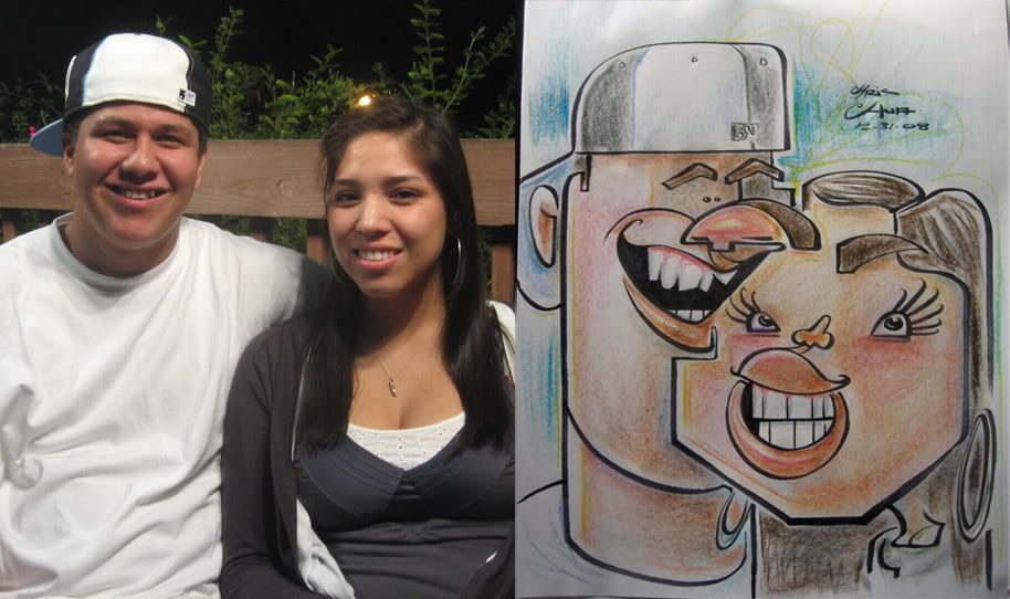
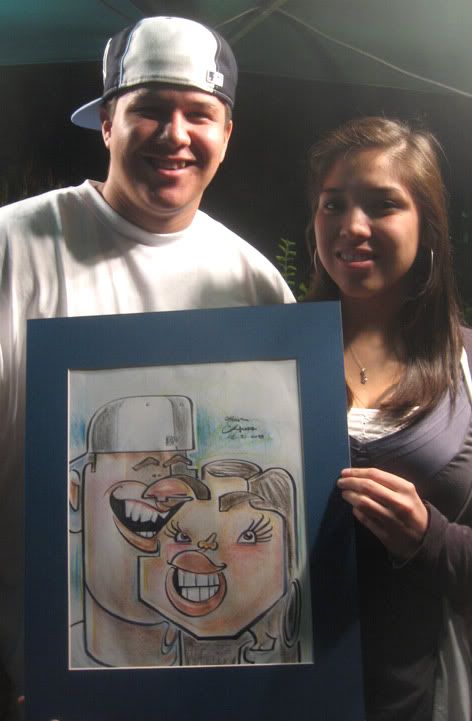 60. I like this one. both had great faces, great attitudes and they both loved it. success!
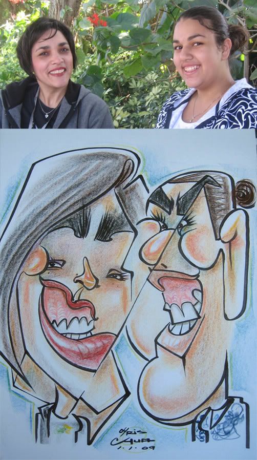 61. I was intending to go all out, but ended up with just sorta all out.
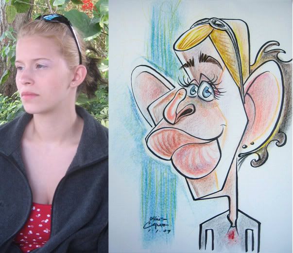 62.
62.
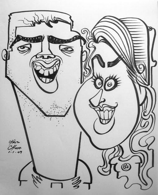 63. their friends were laughing hard as I was drawing them, mostly cause of how I drew the guy. they were really good sports. they wanted black and white and then they got it in color after. that's why the black and white has a lot more line work. usually I don't do that much line work when I know I'm going to color it.
 64. this was my last one I did during my stint. I was happy with it, they were a cool happy couple. I got a good vibe from them as soon as they sat down. prolly should have made his eyes bigger and wider apart though.
well, I still have issues and things I still need to work on with what I did during my visit but overall, I'd say I was pleased enough. I was in a funk and ended my season at Dorney with disappointing caricatures and the work I did at the NCN con was subpar. but I think I'm back on the right track. I have new goals I want to tackle after looking back at this work. I liked that I pushed the graphicness and the shapes but think I forgot about flow as some of these are kinda stiff and could use more movement and energy so that's what I want to work on next. Cripple con 2 is next week so I should have some more artwork from that then!


6 comments:
You're definitely back in the saddle again, Chris!
I could see what you meant about the con and the past few posts. But I'm glad you're still trying new things--it's inspiring. These are hilarious!!
I like your black and white just as much as your color.
thanks, Fran! yeah, I'm feeling good again and am excited about using this experience as a springboard for pushing things even more.
your work inspires me too!
interesting you like my black and whites, I still think color looks much better, especially with my work. brings a lot more clarity to it.
I guess it's just that sometimes your colors can get slightly muddied, but your line quality stands out more when it's just black and white.
hmm...yeah, good point. I do sometimes overdo it and things get muddy. actually, I tend to overdo it with too many colors. I always admired those that just go in with 1 or 2 colors. I'll try to be more aware of that. thanks!
These drawings are really fun!! I love the way you handles the noses!!
thanks, Heidi! your work rocks!
Post a Comment