drawn during the month of JUNE 2008 at Dorney park, PA
lots of ones I like drawn during that month
lots of ones I like drawn during that month
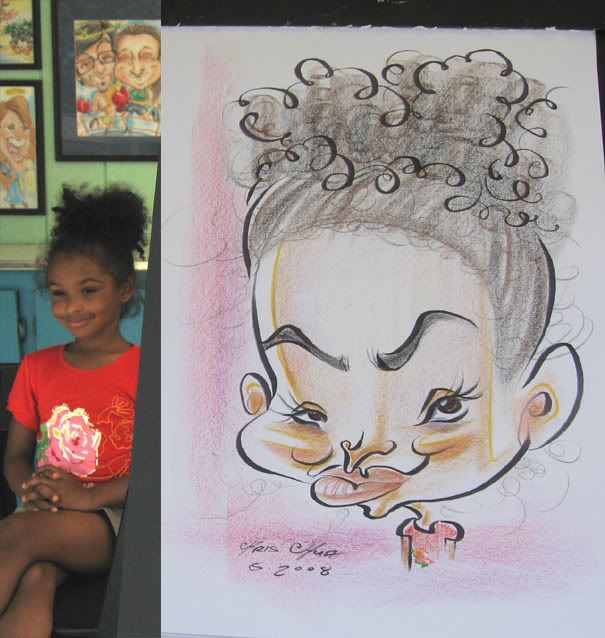
 1 she was deaf as was her friends that were watching me draw her. her friends were cracking up laughing in high pitch squeals as I was drawing her. she liked it as well. the caricature, not the high pitch squeals. cause she's deaf. good times. that she liked it and her friends enjoyed it, not that she's deaf. cause that'd be wrong to say. ok, moving on...
 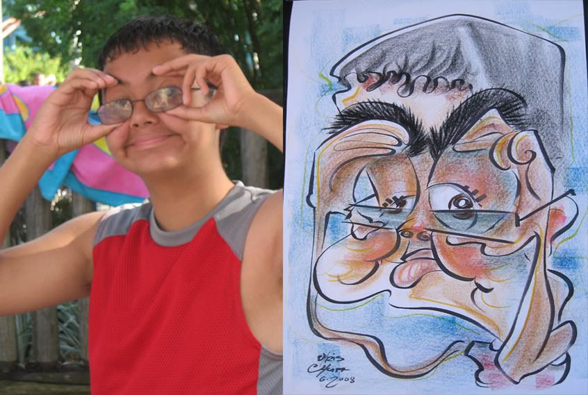 2 this kid asked if he could do that face, usually when people want to do faces it makes it harder to get a likeness and can throw things off. this one came out all right, me thinks. could have exaggerated the cheekage more and that's a weird hair highlight.
 3
3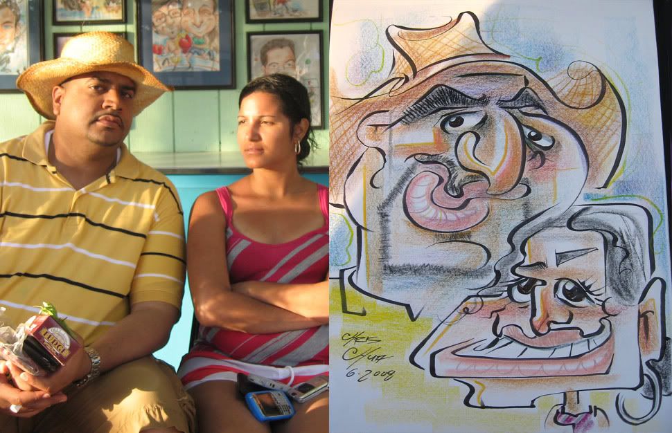 4
4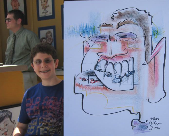 5 look, it's Matt Zitman in the background. He came to help out one day.
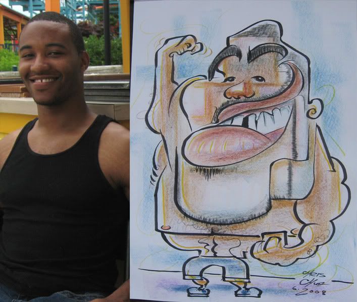 6
6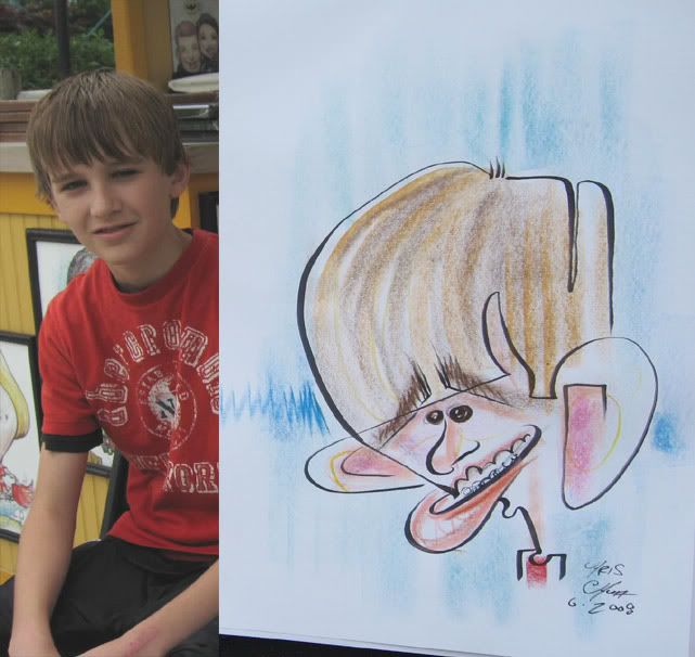 7 demo. not a good likeness. I just like the line play from the hair to the gums and the ear to the other ear.
 8
8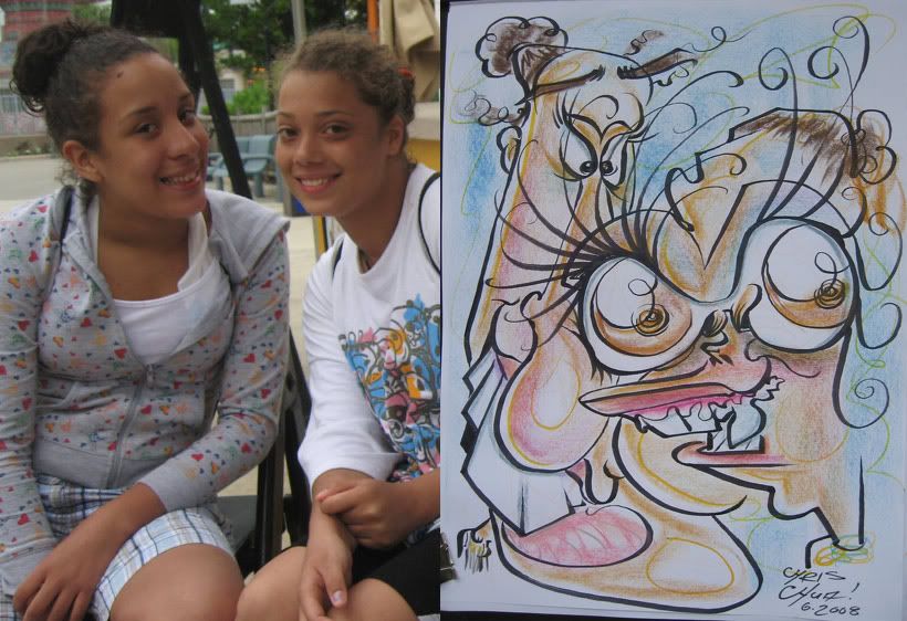 9 a bit too much/distracting, but thought it was fun. I like that the eye is pushing on the nose. should try and do more of that stuff.
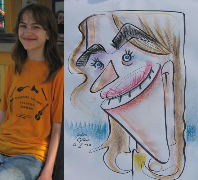 10 demo. I like the mouth part.
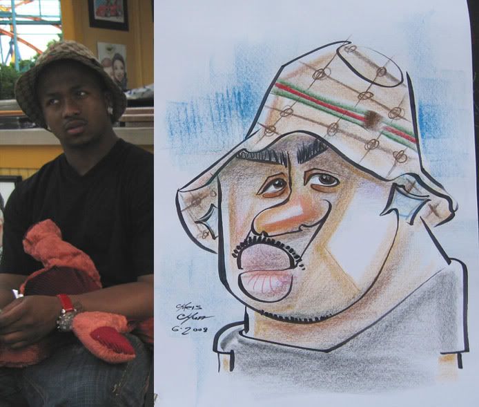 11
11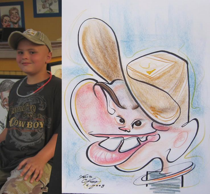 12 this kid was really excited to get a caricature done. then he saw his sketch and his joy wasn't so much. they still bought it. I always like drawing hats with that continuous line swoopage.
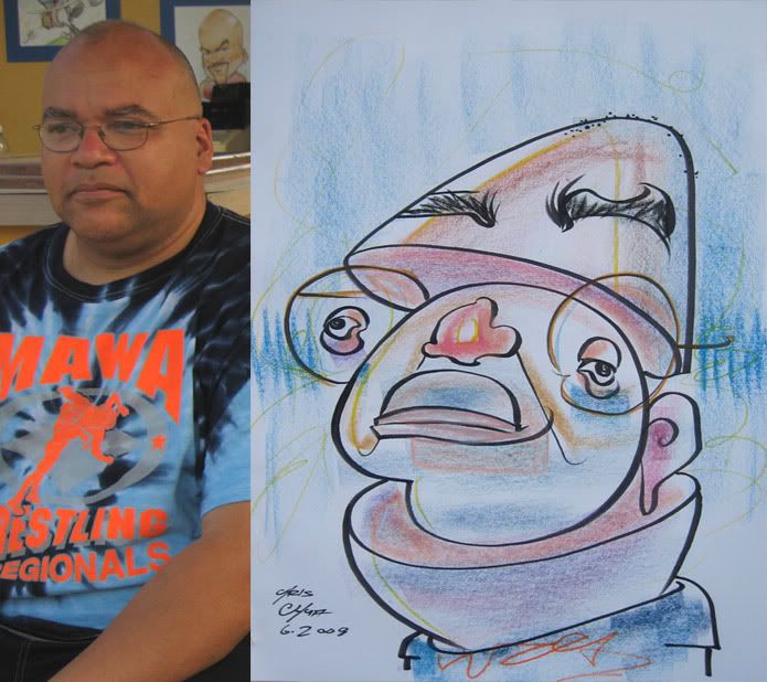 13 demo. I like doing this kinda stuff.
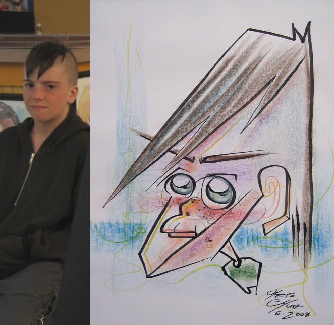 14 demo.
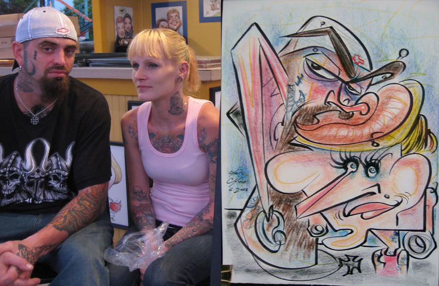 15 I like this one except for her hair being too similar in curve to his lips. ergh. that stuff bugs me.
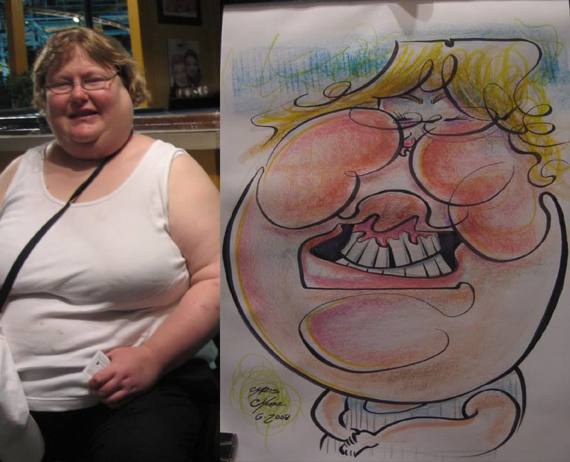 16 too much nose to upper lip space.
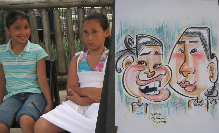 17
17 18 I liked how the guy came out all shapey, and his cylinder neck. the girl was more tame.
 19
19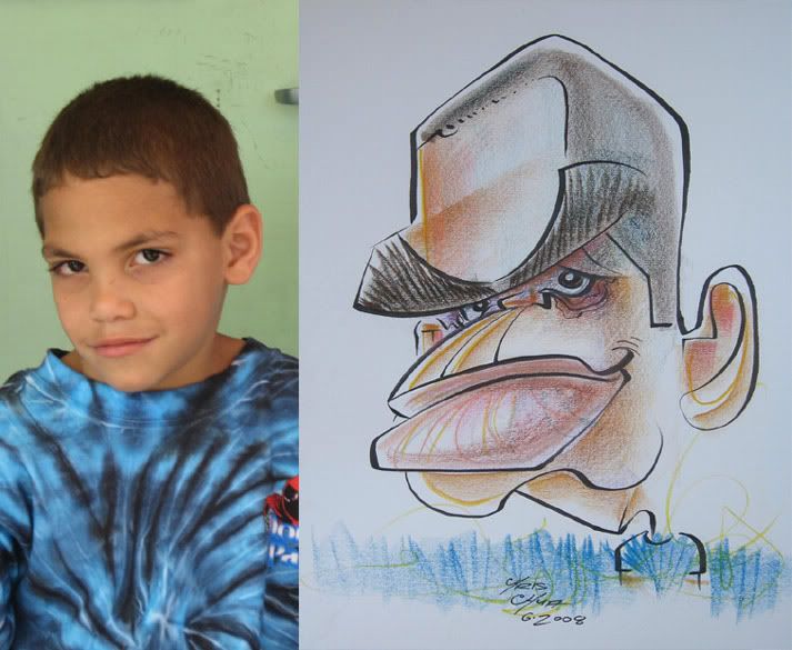 20
20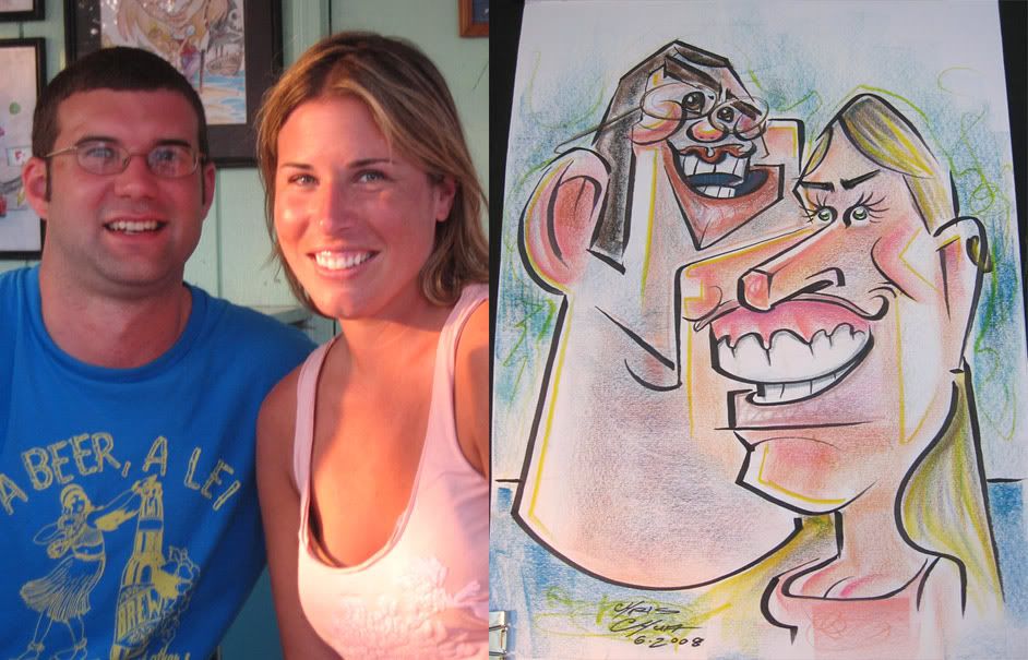 21
21 22
22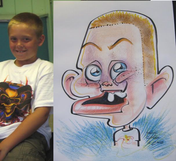 23
23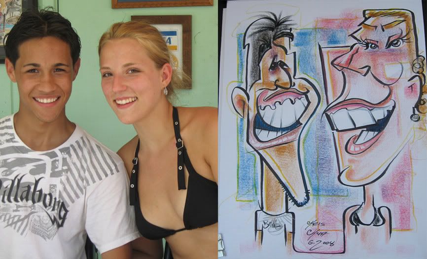 24
24 25 I drew the head and realized I left pretty much no room for the skateboard body. that was what I impovised. not really the best likeness and looks more vicious, I thought there was a good chance it'd be a reject, but when the mom came back she laughed and liked it. the kid didn't seem to be as thrilled, but the mom was cool with it and was trying to explain that that's what a caricature is.
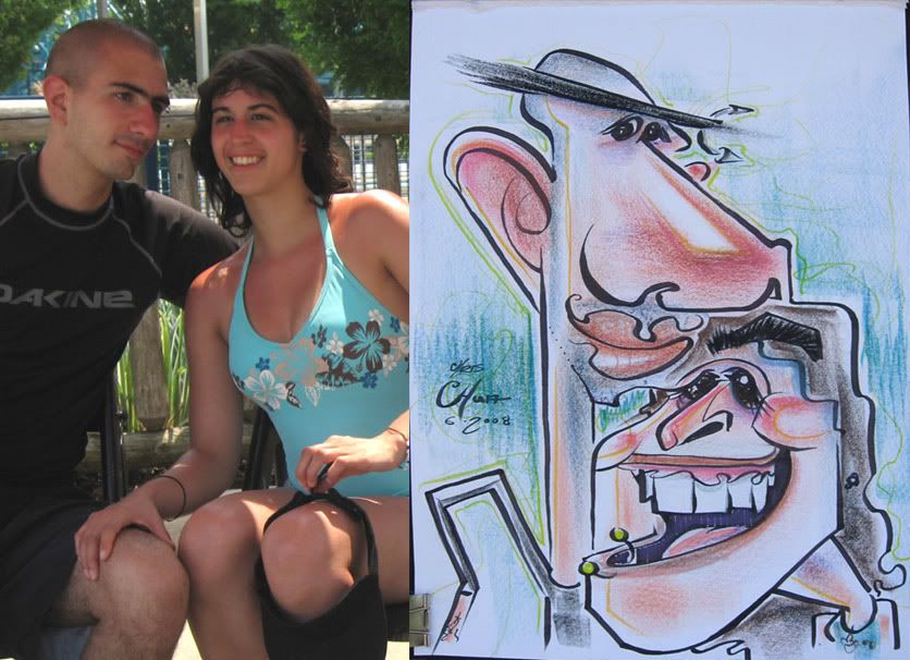 I really like this one. I like how his nose connects to her hair, how his neck forms the same line as her cheek and how his chin flows into her eye. not sure about his arm though. I liked the idea of it, but think it could have been planned out better, doesnt flow with the overall design of the layout as much.
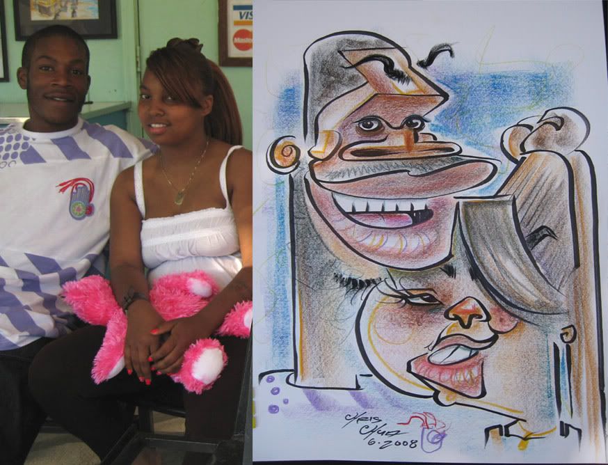 27 I like the girl more
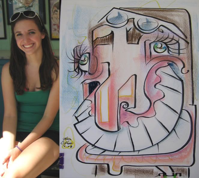 28
28 29 demo. I like this one.
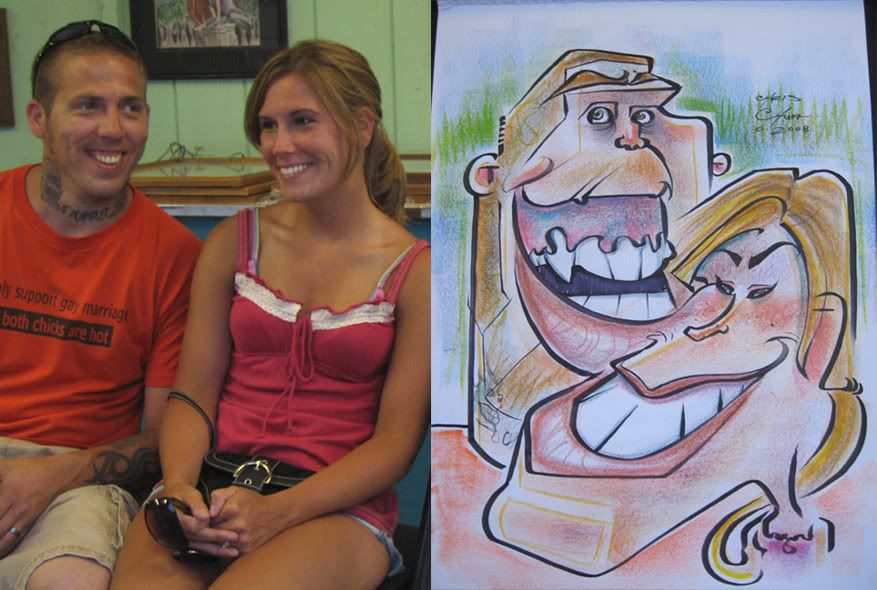 30 I was pretty happy with this one. great faces. they were really cool too.
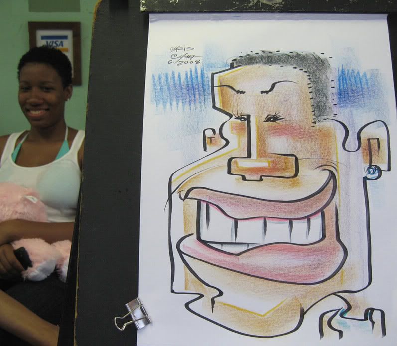 31
31 32
32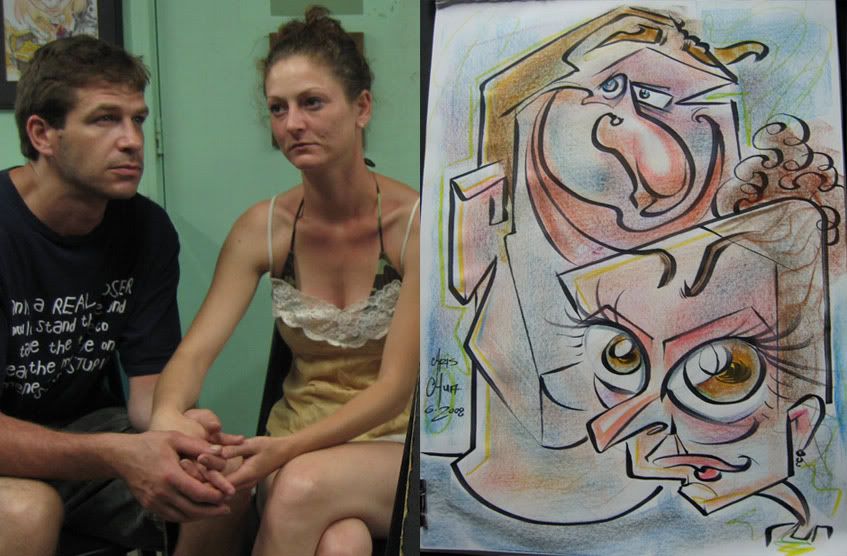 34 mouth to eyebrow connect line
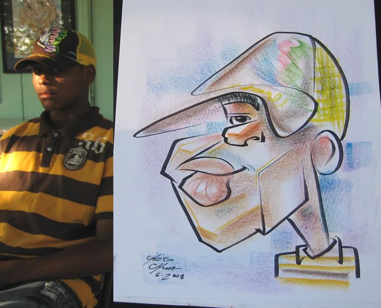 35 this was a tame-ish demo.
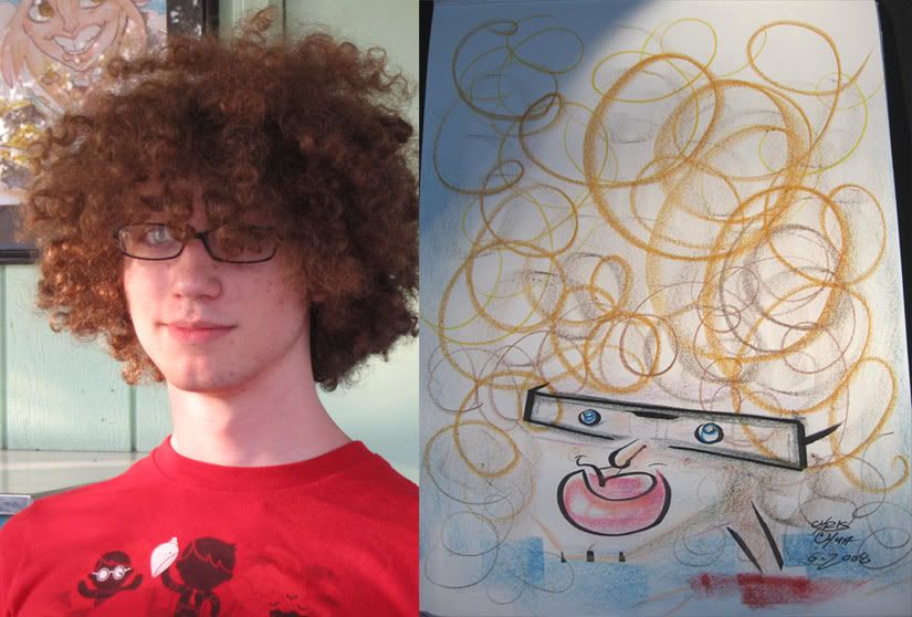 36 demo.
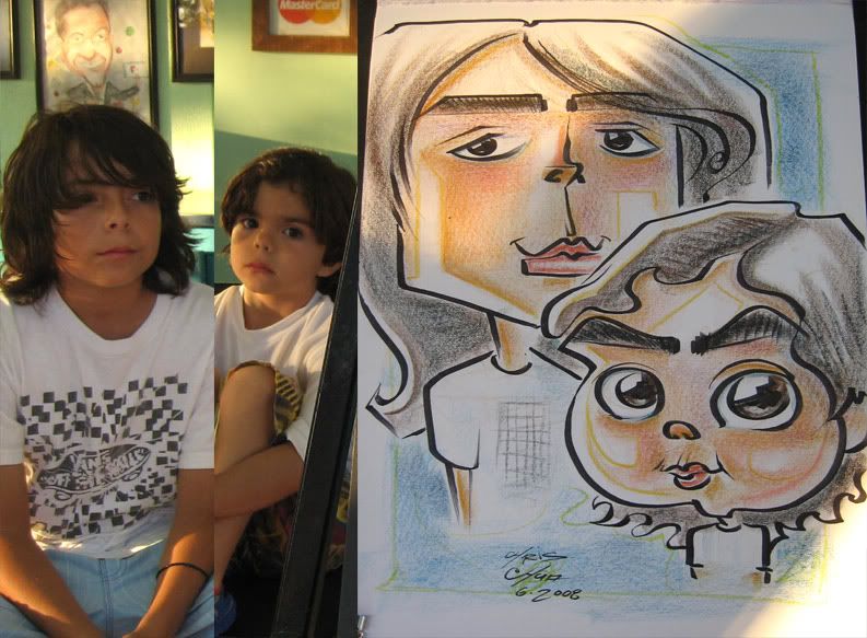 37
37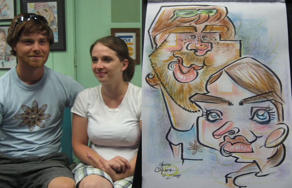 38
38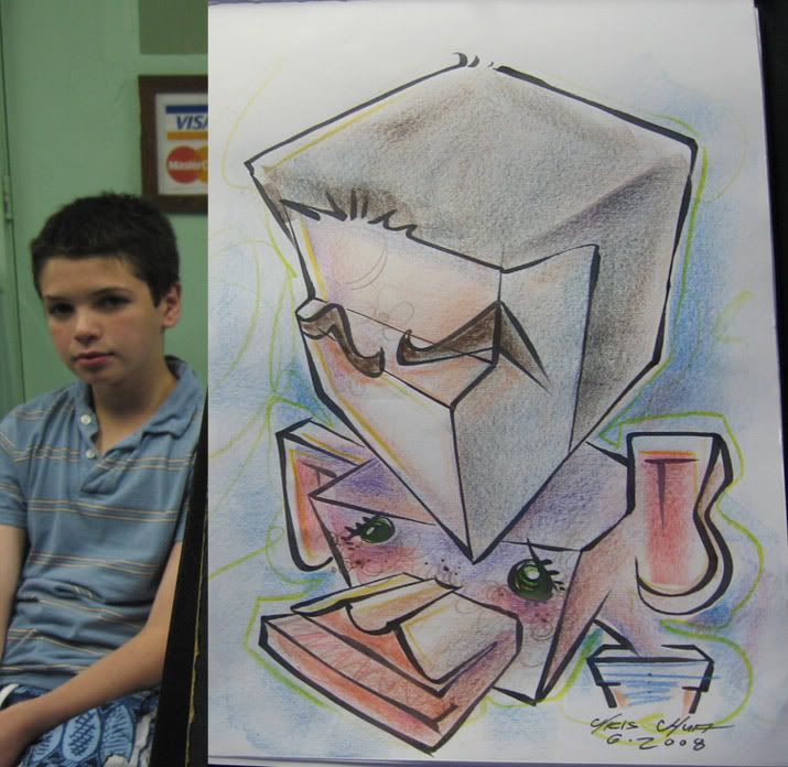 39 demo. I like the forehead Rubix cubiness.
 40
40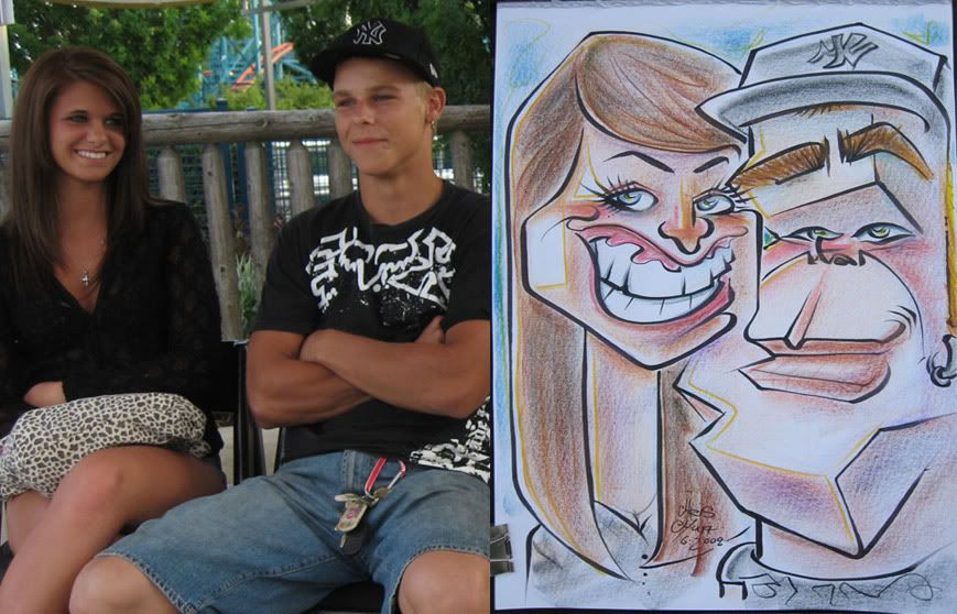 41 I like the connect line of her face to his mouth which extends to his neck.
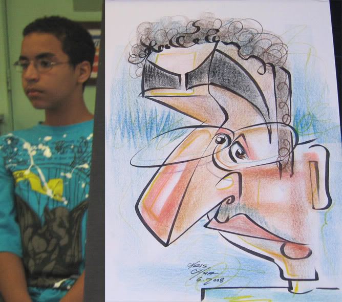 42 demo
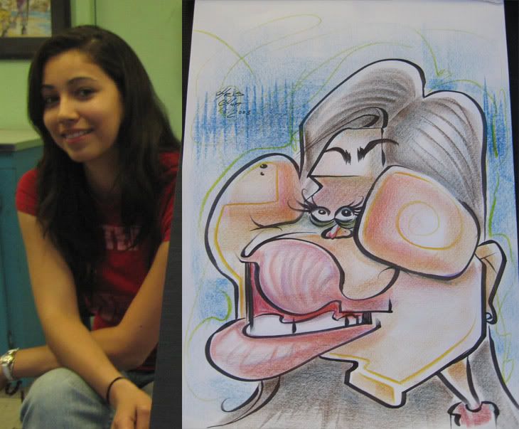 43 this girl was watching me draw the demo right above, so I figured she knows what she's getting into so I went more for it. should have given her more nose. she had a good laugh.
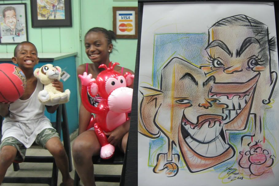 44 the girl's mouth is too hidden behind the boy, I need to draw smaller.
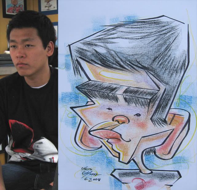 45 this one is off a bit...think I made him look too younger.
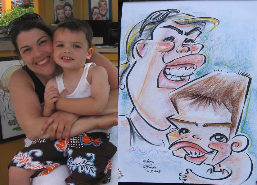 46
46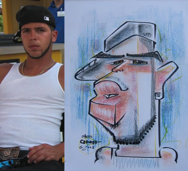 47 this guy was hovering around the caricature stand for a while. He had gotten a caricature before and wasn't too happy with it and was hesitant about it. I told him I'd draw him and if he didn't like it he didn't have to buy it. he didn't like it and punched me in the face. ok, not really. he liked it and bought it.
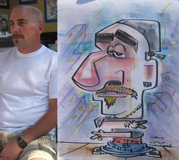 48 this was a teacher who taught intercity kids and he asked to be drawn blinged out with his pants down by his feet just like his students. I added the heart boxers.
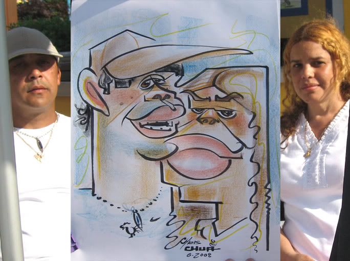 49 eh...I just like that connect line of his chin to her mouth. little stuff like that amuses me enough. otherwise it's just kinda eh.
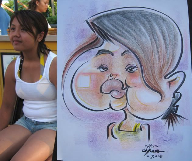 50 I liked this one.
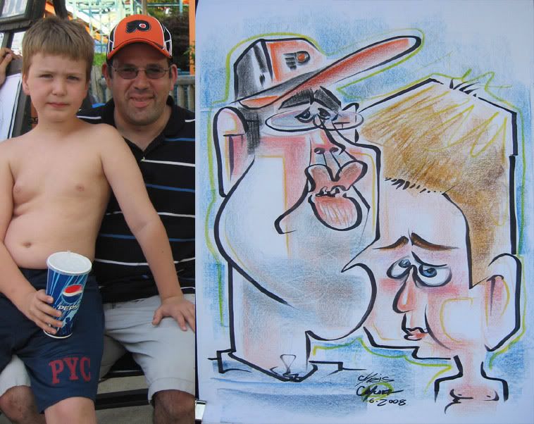 51
51 52 this one is almost there, I like the direction it was going but is not as full realized. but it did get me the next one...
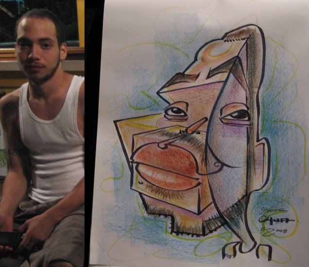 53 this guy was with the one right above, relative, maybe? not sure. then, I guess he saw his and liked it and decided to get one too. I like the ideas here, could have pushed the exaggeration more though.
 54 I like his blocky mouth and circular body.
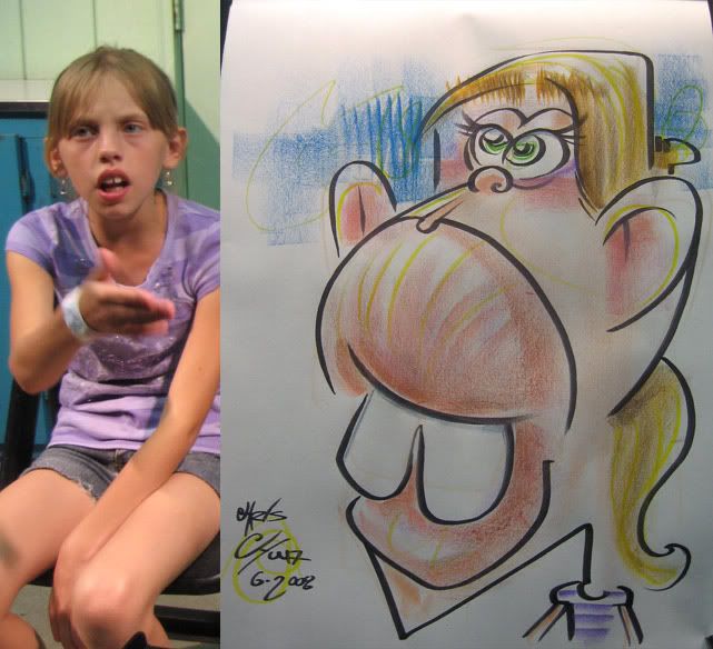 55 she's pointing and saying, "that looks exactly like me! I love it!" ok, so she didn't. she was hanging around beggin for me to do a demo. her friends/relatives were cracking up as I was drawing her. then she saw it and didn't like it at all, she wanted me to throw it away. sorry, kid, you gotta buy it and then you can throw it out if you want. Her mom and adult chaperones came and thought it was pretty funny, heh. no sale though.
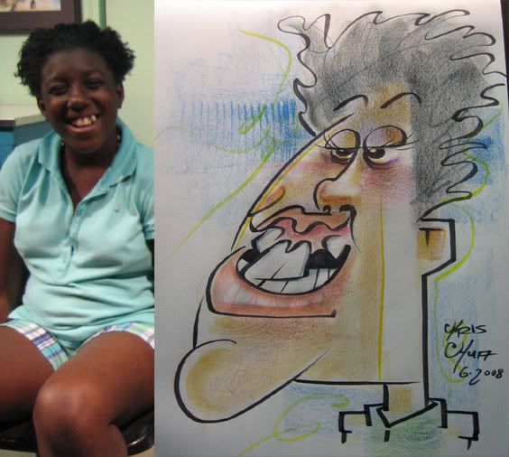 56 demo. this is one of the friends of the one right above. likeness is off. she was a good sport.
 57 I was happy with this one. I liked the layout of it, the connect line of the left guy's nose to her eyelid and how the right guy's adam's apple doubles as her cheek, although I prolly should have made that more obvious and gave her more hair- I sorta ran out of room.
 58 I got another 3 person shortly after the 3'er right above. I was pretty happy with this one too. prolly could have pushed the woman more.
 59
59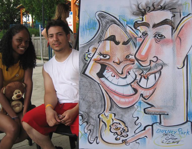 60 connect line lips
 61
61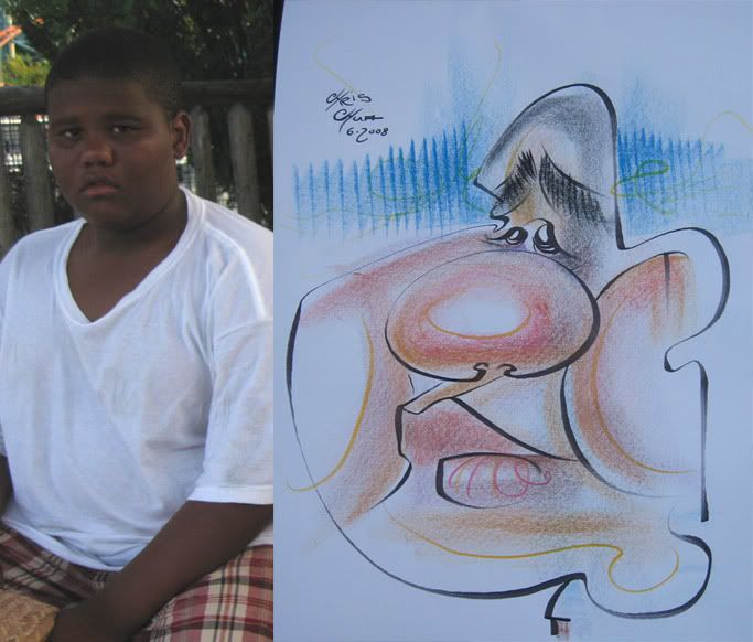 62
62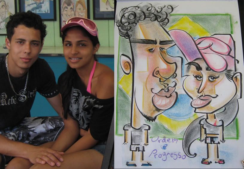 63 pretty tame. I just think it's funny that when asked what kind of bodies they wanted- like playing a sport or activity or something silly, they asked to be just standing there. ok, just standing there it is. but did add they wanted a brazilian flag. connect line of hat to forehead.
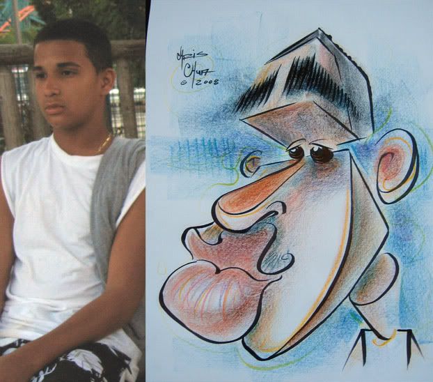 64yay, shapes!
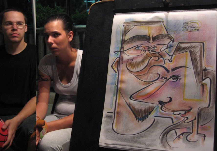 65 the girl didn't like it, the guy had a good sense of humor about it. connect line lip to her eyebrow
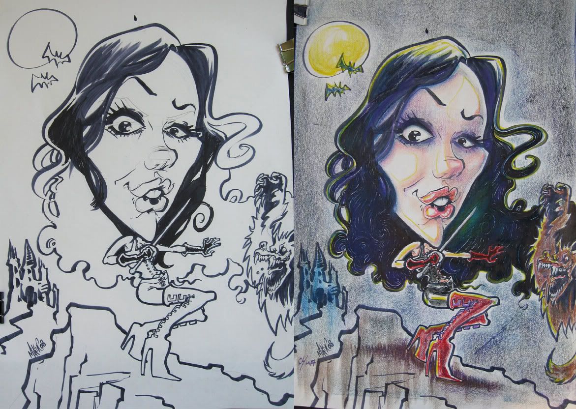 66 Mike Crawford drew this and I thought I'd color it for fun, and I finished drawing the hair too.
 67 another collaboration between Matt Zitman and I. Each of us would draw a few lines and then switched back and forth. It's funny, the 1st lines I drew, I intended for those lines to be his eyebrows but Matt interpretted them as eyes. that stuff is fun and it still works.
July sketches coming soon. I said in the last post that this post would have rejects, whoops, those rejects are actually from the next month/next post.


4 comments:
Wow Chris! You keep getting better and better! I like the direction you're going with all the shapes--that gives them a really fun, cartoon-y look that brings them to life. Oh, and I like how you use purples and yellows on the face a lot.
What with all your demos, you've inspired me to do more--I've fallen out of practice. Great stuff.
thanks, Francesca! I really try to improve all the time. I like the shapes too, although for a little bit (as you'll see closer to the end of the '08 season posts) I was in a funk and I think it's because I was getting away from shapes. yeah, you should do more demos, it's a great way to let loose and try new things.
Those collabos are really fun to watch and a great idea to do it and present it that way. Also, i think the drawings turned out pretty cool too! That top one's a hoot.
yeah, those are fun. hope to do more of them!
Post a Comment