Here's all the better sketches I did during the month of JUNE 2009 at Dorney Park, PA. BOO-YAH!
1. the guy on the right asks his other buddy, who was watching me draw them, if I was almost done the drawing yet and his buddy responds "...I have no idea" ha ha ha, I draw weird, what can I say! ha ha, and especially if it's not colored in yet, it looks really confusing. I tend to jump around a lot too instead of finishing one face and then moving on. that's one of my favorite lines from a guest now, hee hee. these guys were a bit shocked when they saw it but were cool about it.
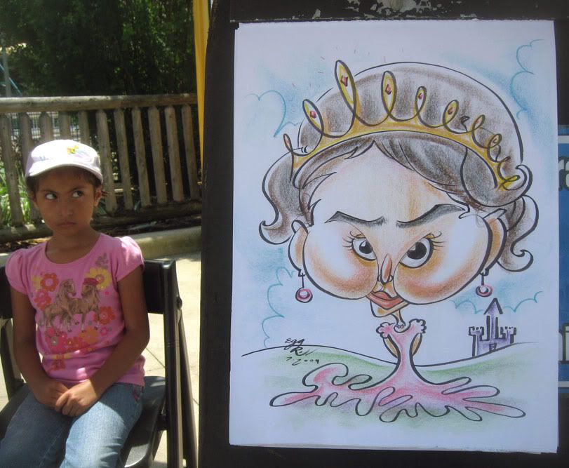 2. I like the eye to cheek lines. I just threw those lines down and luckily it lined up with the eyes and I so I put them in. they bought a large frame with it too, woo hoo!
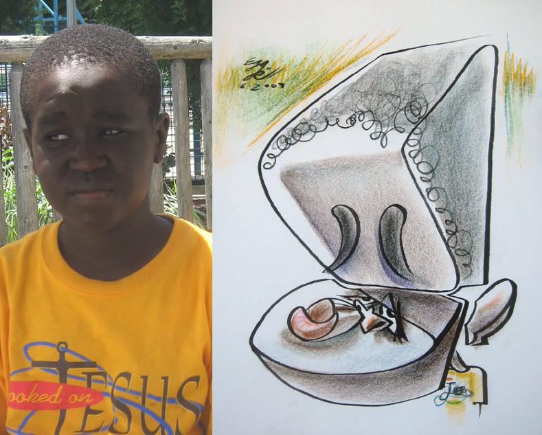 3. demo. trying things
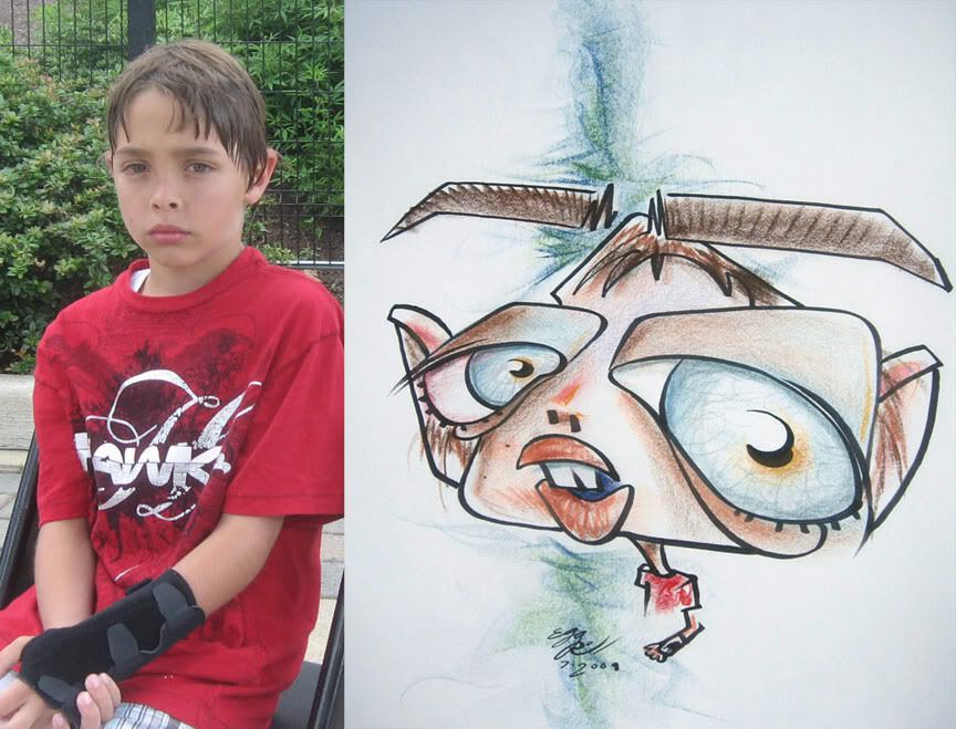 4. 'nother demo.
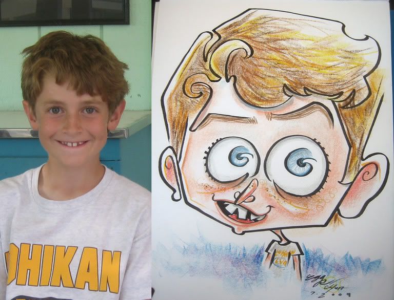 5.
5.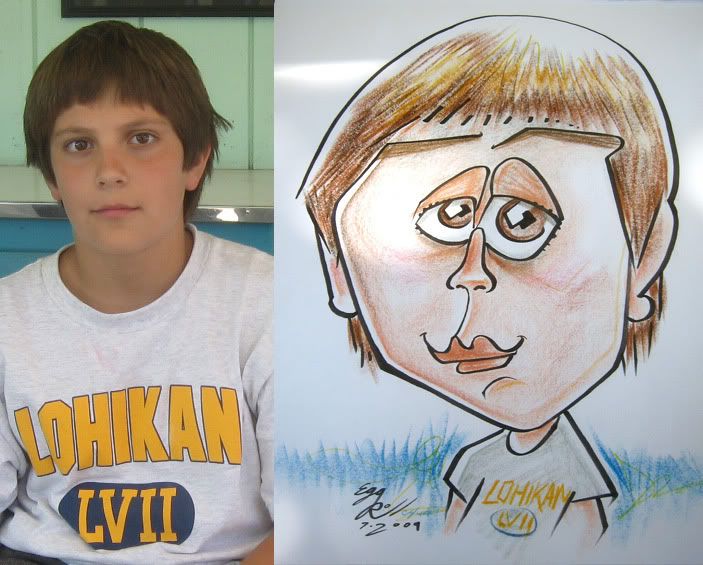 6. could have made his hairline lower.
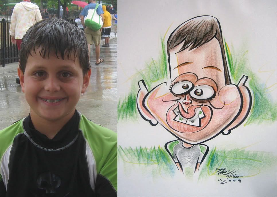
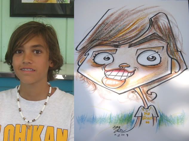 7. he didn't want his braces in the sketch. I think people should emBRACE their braces. ha ha! see what I did there? me so clever, I'm going to win an award for most cleverestness! can't wait! I also wrote that on his shirt as well. I like the weird connecting of his pupils to eyelid. and mouth to eye.
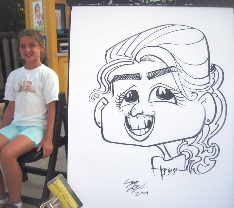 8.
8.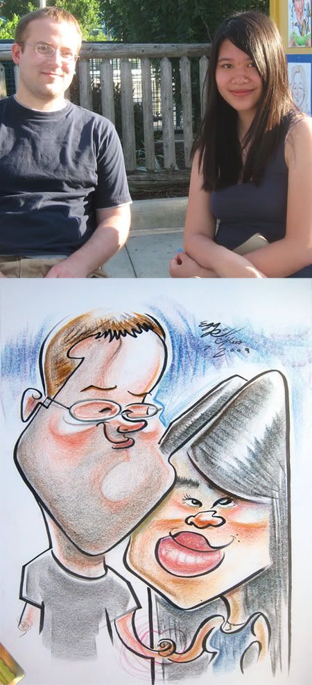 9. his chin to her hair part connect line. I liked the way his face came out- simple and fun. saw the movie "9" it was decent. cool visuals, ok story. needed more action or wow moments for me. I only paid 7 bux to watch it though. which was one of the best things Matt Zitman has ever taught me, hee hee...
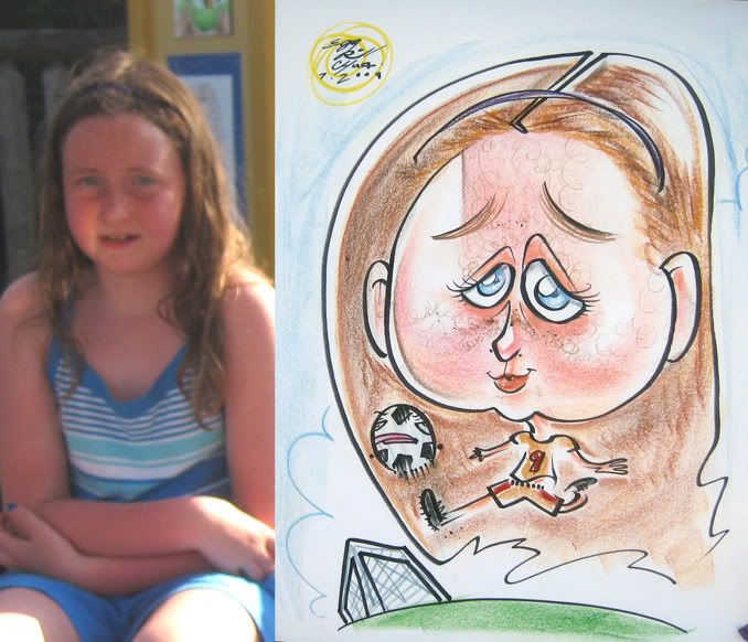 10. Matt Zitman as a soccer ball. well...sorta, Matt's usually not that happy, ha!
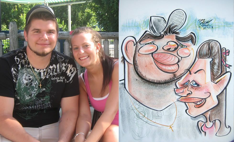 11. should have given him more upper lip to nose area and less upper lip. connect line from his ear to her head.
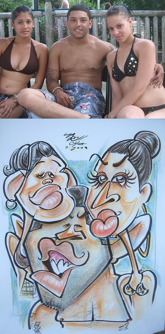 12. these people were cool. I think I could have pushed more on the girl on right but overall I was pleased enough with how it all came together. the connect line of his head to her lips is kind of a different one than I usually do.
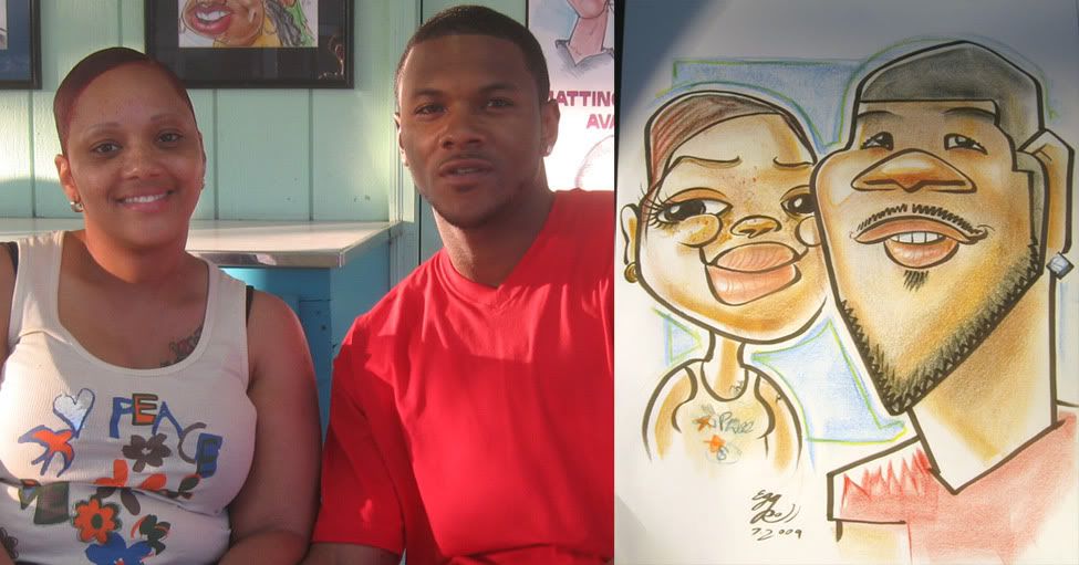 13. better likeness on the guy. woman's eyes too big
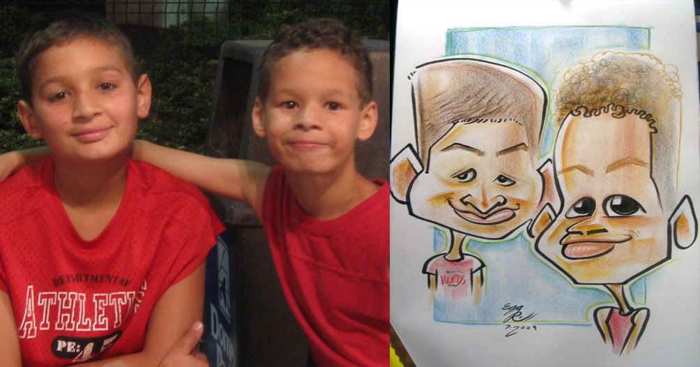 14. nothing too crazy. made the right kid's eyes too big and close together. I like his hair line with color.
 15. I drew myself in the reflection of his glasses. *caution- objects reflected in sunglasses are weirder...I mean awesomer than they appear*
 16. eh. ho-hum sketch. I put my co-worker, Meg Grube as a turtle dumbell though. oh and I'm definitely not saying Meg is dumb or anything, she's actually quite the smarty pants, just wanted to put something irrelevant in the pic and put a co-worker in there.
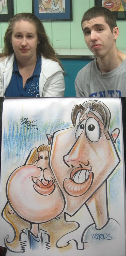 17. the girl had a ho-hum attitude when getting the sketch and had an equally ho-hum non expression attitude after seeing it and paying for it ho-hummingly.
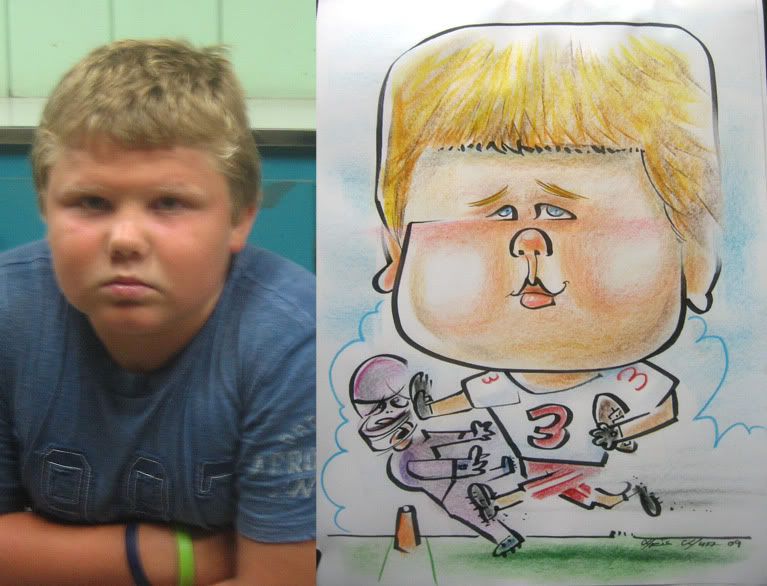 18. random note: I watched the 2nd episode of the new season of the Office today and that show still rules! they keep coming up with great new stories that progresses the series and it's still hilarious and clever. awesome possum!
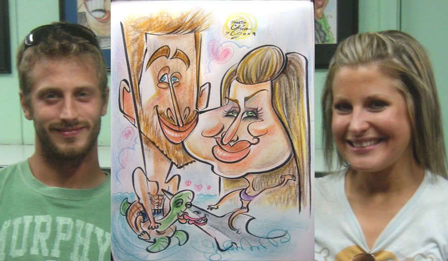 19. turns out the girl is a classically trained artist for many years but never drew cartoons and after watching me draw one prior, finally decided to get one...which is kinda nice, but then I do remember feeling a bit more pressure. I think I tried a bit too hard and overthought it a bit and it came out stiffer and less fun than I could have done, especially on her face. they liked it though and it was better than the one she watched me draw...but still, I wished I had this one back to do over and went looser and funnerest.
 20. ahh...my favorite college shirt to draw! :) also, man! I'm pretty darn good at drawing really vertical and really horizontal lines, if I do say so myself!
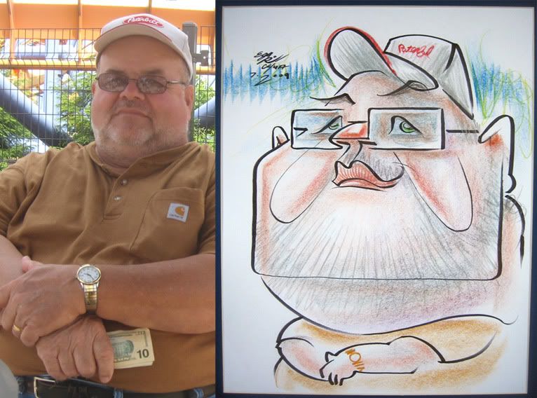 21. I like this one.
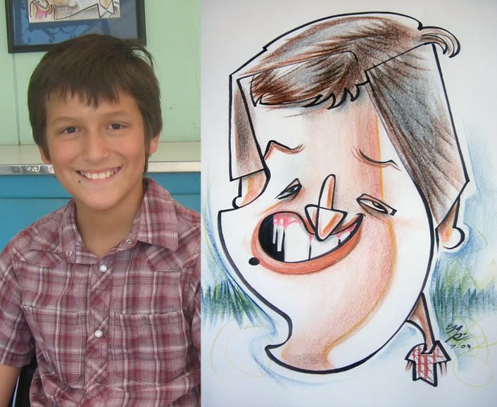 22. a demo I really liked. him and his friends liked it too. I'm gonna rhyme that previous last word with the word shoe. woo hoo!
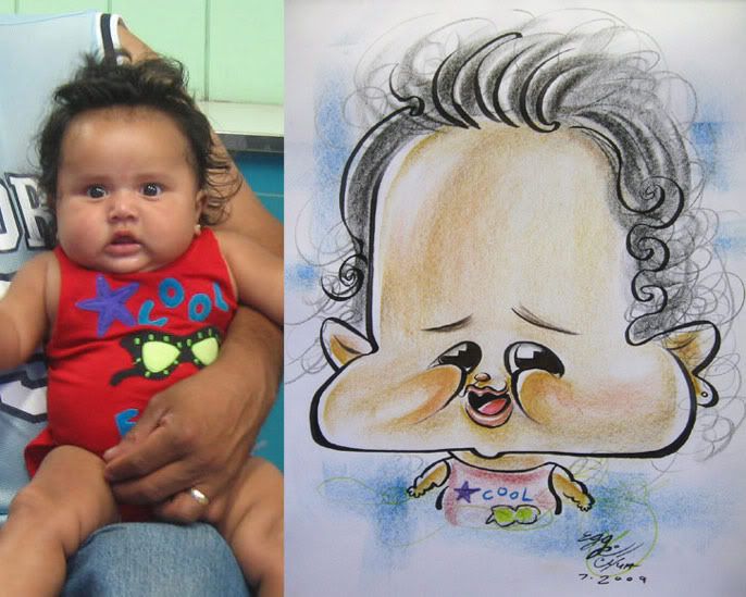 23. ha ha, this one was fun- goo goo!
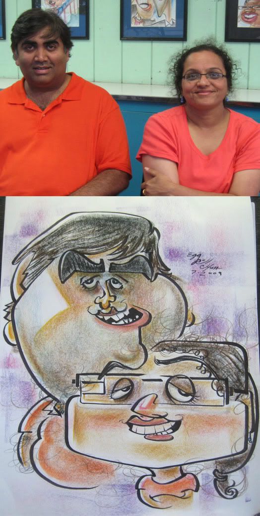 24. I like this one for the most part except for the coloring shape on his cheek, bad shape. it needs a spanking- boo hoo :(
 25. the kids of the one right above. I drink chocolate milk whenever I go to Old Country Buffet- moo moo!
 26. I missed on the "trying not to show my teeth so I'm going to clench them" look. the eyes are off a bit too and too much forehead. hmm...wonder why I'm even posting this one...I guess I still like the overall vibe of it and it looks enough like her, I suppose. I like cherry coke, I really do!
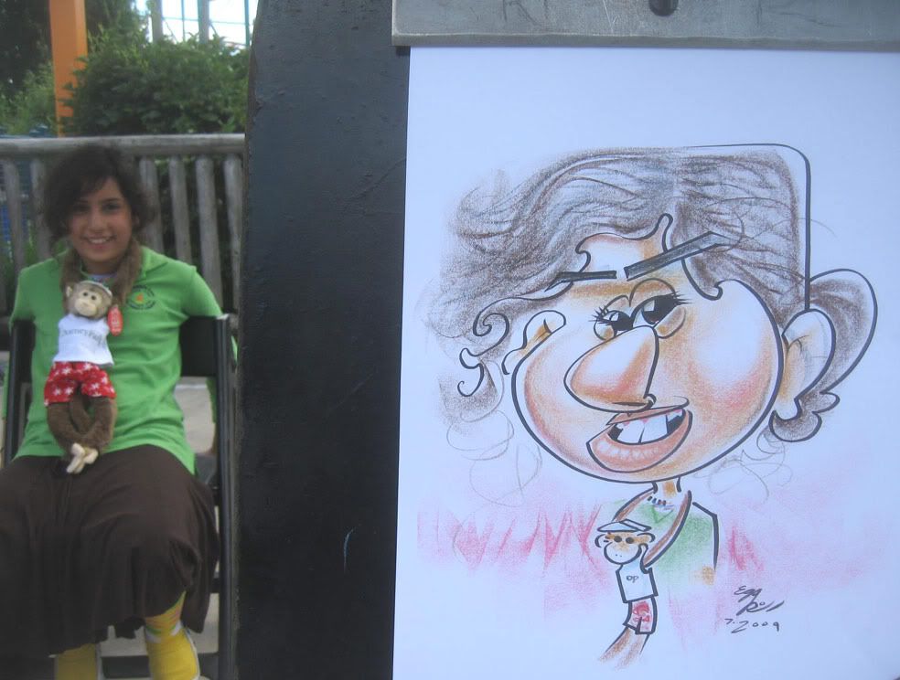 27. man, I told her I was going to draw her really really funny and she was cool with it, and it was one of those times where I just couldn't really figure out how to really push her face. oh well, I think I got her likeness though. I really try not to exaggerate for the sake of exaggerating and don't want to sacrifice likeness. although at times, especially in a live setting where you don't have AS much time to carefully plan things out you have to take a chance and go for it and sometimes the bold exaggeration works out sometimes it doesn't. even still, she was quite shocked about what I did. luckily I didn't do a crazy one, prolly would have been a reject and her head would have popped off too.
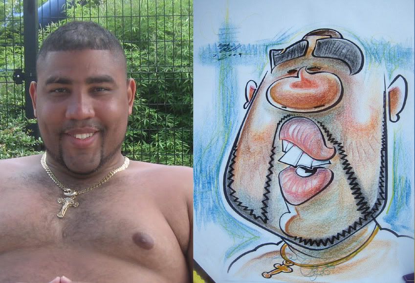 28. this was a fun cool dude. can't think of anything else to rhyme, oh poo.
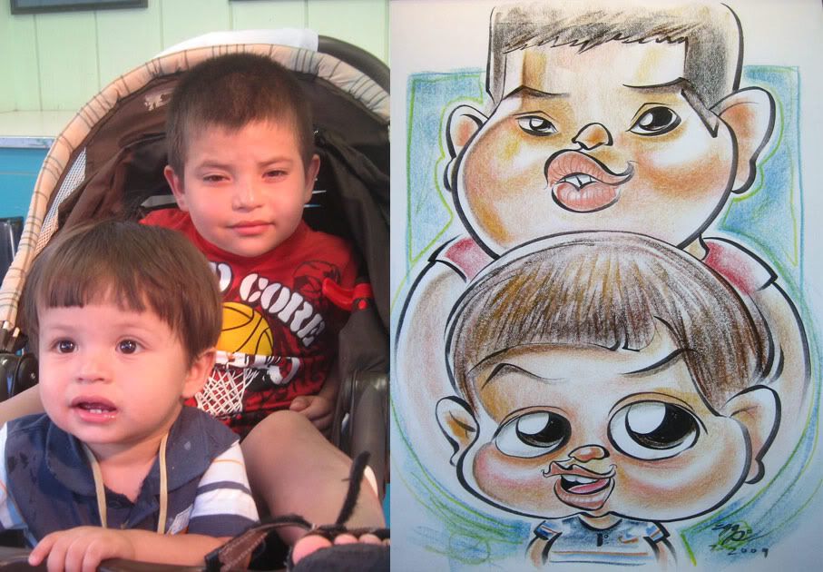 29. some unwanted wonkiness throughout, mostly the eyes which I sometimes tend to do when I don't go as crazy and try to draw "nicer." but overall, it's a nice cute sketch..hmm...prolly should have made the bottom kid's eyes a bit smaller and further apart.
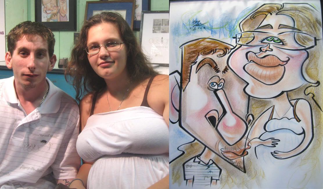 30. messed up the lines on the guy's nose a little. I like how her eyes and hands came out. connect line from his mouth to her shoulder. some softer coloring style to mix it up, never sure what I like. I tend to lean towards leaner meats, wait what? I mean I usually lean towards a more textured coloring but sometimes I like the softer blended transitions.
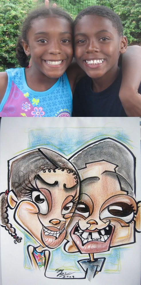 31. hmm...prolly could have made it a bit more cute. I like the sharing of cheek/eye but their eyes are too close together and placement wise looks bad.
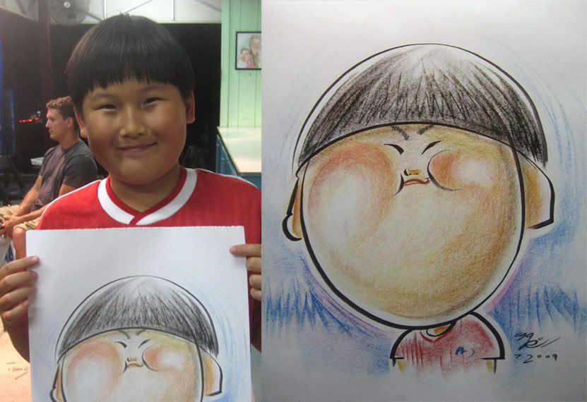 32. this was a demo that his parents (or guardians or adults he came with?) bought afterwards. could have been a better likeness but he had such a distinct face and I think I got enough of that that it still works. I drew outside in with drawing the face shape 1st, which I don't do as often as I'm not as confident with and tend to mess up my porportions which messes with likeness...but my instinct was that I wanted to capture the immediate essence of what made him him so I tried it that way. plus just to mix it up and do things where you aren't sure the outcome is gonna work is a nice challenge and keeps it fresh. his group he came with loved it.
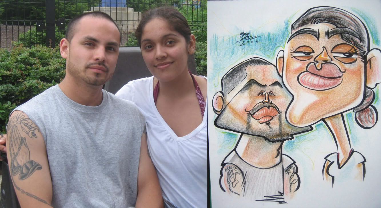 33. you can't really see it in the photo, but the guy was smaller in real life and I wanted to play that off. I like how her eyes came out- I tried pushing it more graphically and less literally which is an easy trap to fall into. also an easy trap to fall into are holes covered by leaves...unless the hole is inside a house then you're just stupid if you fall(literally) for that...unless your house is lined with rugs that has a leaf motif then....touche'
 34. I think this one came out shape-errific-ish. and the coloring actually complemented it nicely for once- still trying to figure out how I want to color things, I keep trying and bouncing around different ways. anyone remember the tv show "who's the boss?" with Tony Danza? he actually sang the star-spangled banner at a Phillies baseball game I went to last week (thanks to Jess- she rocks!) that's why I put "who's da boss" on his shirt.
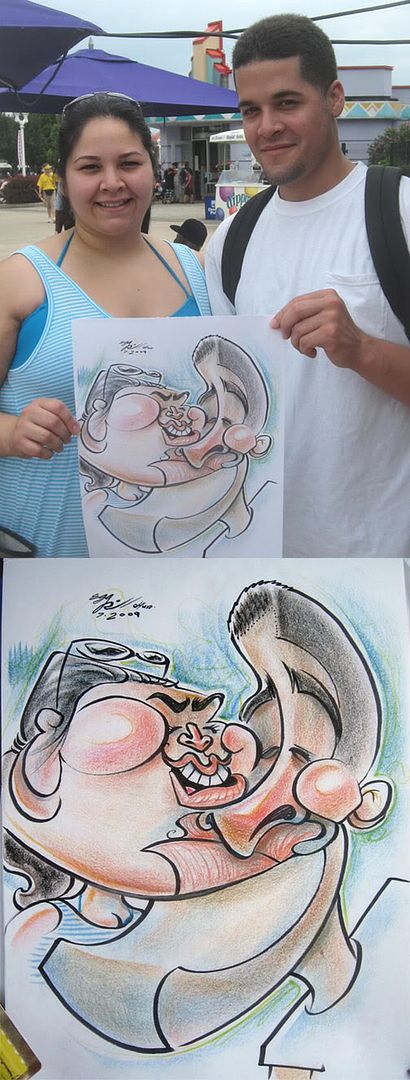 35. Zitman watched me draw this and said I missed the likeness on the girl and I was like "what? I thought I got her..." then later on I looked at this picture I took and it was like "oh. yeah, you're right. poo" It happens a lot when you are in the moment and you feel like you are doing it right and then when you look at the picture afterwards you see all the mistakes you made. anyhoo, I still like how the guy came out a lot and actually the overall pic I like and I didn't miss on her too bad, should have made her mouth smaller/bigger nose and wider apart eyes- sometimes when I tell them to turn a 3/4 view when I draw them, I miss on the eye distances.
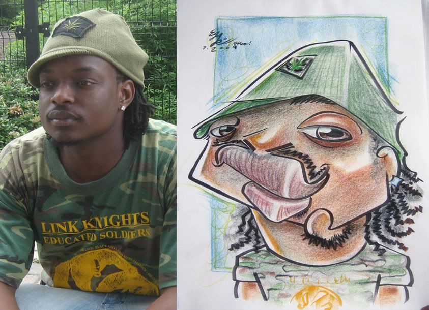 36. I liked how this came out, he did too.
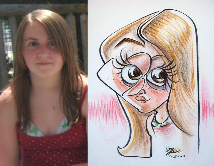 37.
37.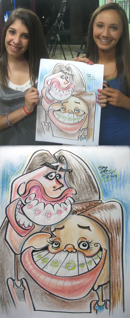 38. these girls were super loud and a handfull. then their friends came by and were scaring them on how the pic was turning out, which usually turns out bad as their friends scaring them gives them the anticipation of what it's going to turn out makes it a lot worse than what the actually sketch is...although in this case it's prolly worse than even their worst thoughts, heh. anyhoo, I was expecting this to go down bad, but oddly enough, they loved it and thanked me. go figure. go turtle in braces as well. my co-worker, Tony Dong, was hanging around so I put him in the braces for fun.
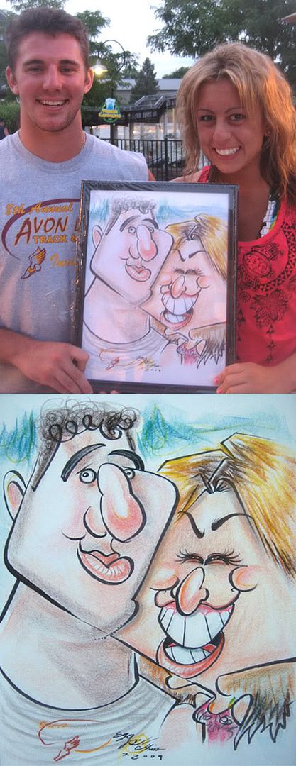 39. sometimes when you meet people you immediately get a good vibe. that they're good people, don't take themselves too seriously and will like a good fun caricature. these people weren't, they were horrible. ha! just kidding, I pulled the old switcheroo! so yeah, I got a good vibe from this nice couple, especially the girl, who was always smiling, laughing and excited. I'm glad I caught that expression of hers. the guy came out ok, felt like his likeness could have been a bit stronger but it was still fun.
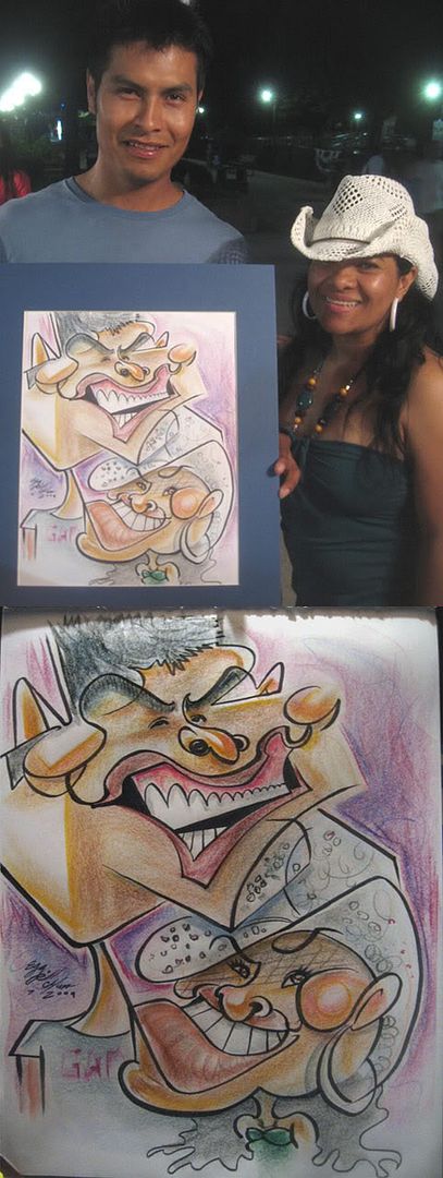 40. this couple watched me draw the previous couple and waited for me to draw them. sometimes I feel bad cause they refused another artist cause they wanted me to draw them. which happens to everyone and myself as well. although it's understandable, as I'D be really picky if I got one done, but at the same time you do feel a teeny bit of "aww man, what's wrong with my work?" syndrome when someone says "oh, we want to wait for that other artist." but I'd rather them get what they wanted then get something else or it turn into a reject cause they really wanted one from another artist. but at the same time, if people are waiting for me, I'm flattered. So, if someone is watching me drawing a more exaggerated one, then I try to one up it even more, partly cause they already saw what I do and partly it's to back up my fellow artist in that maybe if I pushed it TOO much they'll be like "hmm, maybe we should have gotten it done by the other artist when they asked and plus we just waited extra long for this" anyhoo, the guy was a bit shocked, heh. I liked his chin meshed to her meshed hat combo platter.
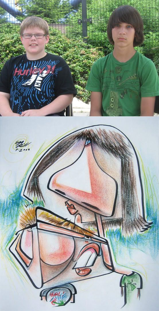 41. demo. I like doing stuff like this and was real happy with it. the t-shirt gag I did was I changed Hurley to "Hurl" which is a game show where they have contestants do competitive eating then they put them in some sort of crazy device, like they strap them to a maching that spins them upside down. and sees who vomits 1st loses, it's hurl-arious. that's right, I said it! oh, so as I was drawing this this woman comes up behind me and says she really likes what I'm doing and I'm kinda surprised as this one is a bit out there, and at first I thought maybe she was just being nice and really didn't know what she was looking at, and so I asked her "really?! you know what this is?" and she pointed out all the features and she did know. so that was cool. then she says something that I (and other caricature artists hear a lot) that I should go work for Disney. as if it's easy to work for Disney. but then my response to that (and what I say a lot) is that sure that might be great, but for ME, I like knowing that a good amount of the drawings I'm doing are going up on people's walls which can't be said about those Disney artists, which isn't a knock on them. as I'm sure they're making WAY more money than I am but I just really really enjoy my job doing live caricatures and feel that it's a very unique job and has lots of cool unique things to it and I'm drawing a new face and a new challenge every few minutes.
 42. this one was funny in that as I was drawing them, the girl on the left was telling me she likes art and specifically surreal stuff. well, how appropriote since I was already making it pretty wacked out and surreal-y. she had this worried smile thing happening, heh. oh and the right girl was eating an icecream cone so I put it in but she had finished before I was done.
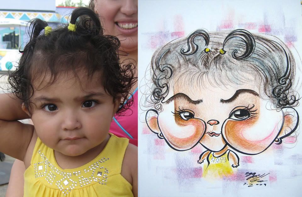 43. cheeks!
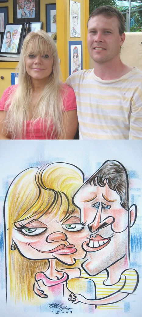 44. fun faces.
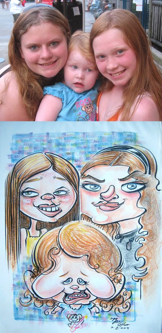 45.these were the kids of the one right above. I should have pushed it just as much as I pushed the mom and dad. that's prolly one of the most complicated coloring background I've done, hah. I was waiting for the baby to get back so I could take a picture, so I had time to kill.
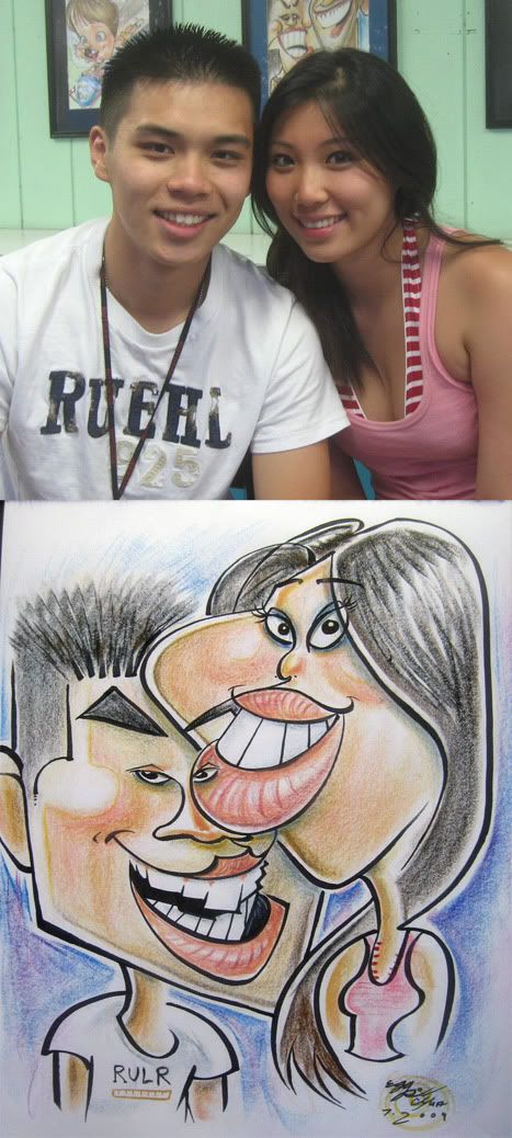 46. these fellow rice-eaters were cool. this was their 1st caricature and they plan on getting more. I missed on the likeness of the guy a bit, should have made his eyes further apart. eyes on lips, hooray! and ruler shirt, heh.
 47. I like this one. great faces and size contrasts to play off of. connect line from his cheek to her hairline
 48. more eyes on other people's faces, yay! I drew this a few hours later that same day as the other one. guess I just had "eye on people's faces" on the brain. I should have condensed her facial features more and played more with size contrasts. I like the way the guy came out and was happy about her face to his nose connect.
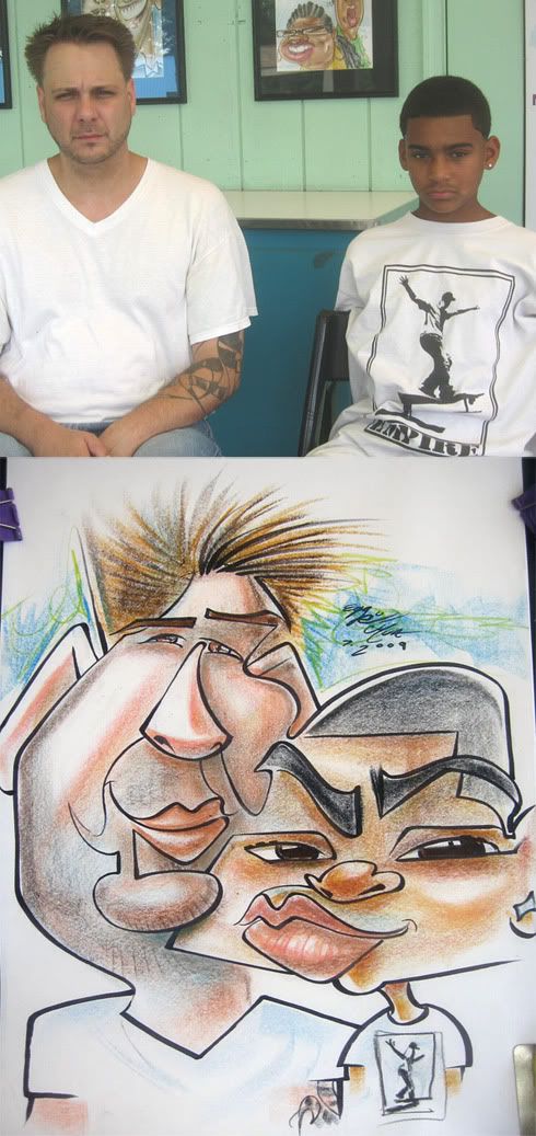 49. potato chin.
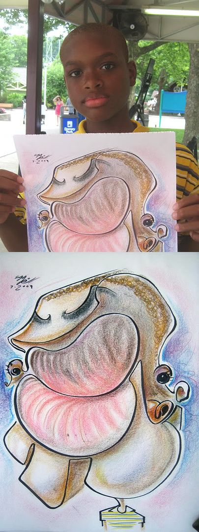 50. his friend was laughing while watching me draw him and said that he looks like a potato in the drawing. prolly one of my crazier ones of the season so far. I got another one coming up in August that's pretty whacked out.
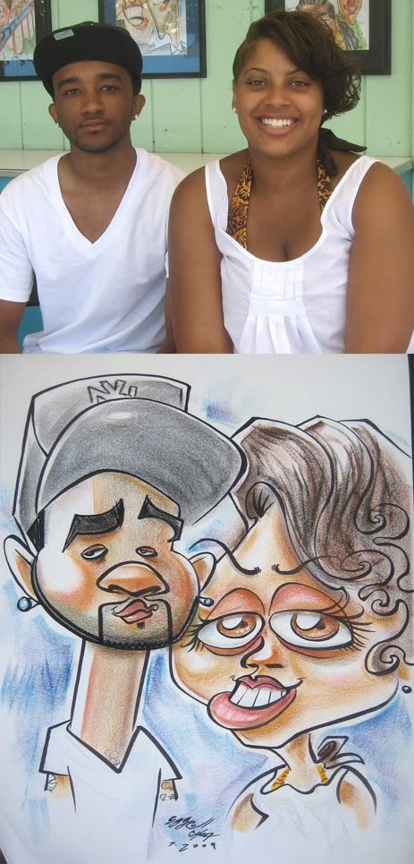 51. I like the guy, I made the girl's eyes too big
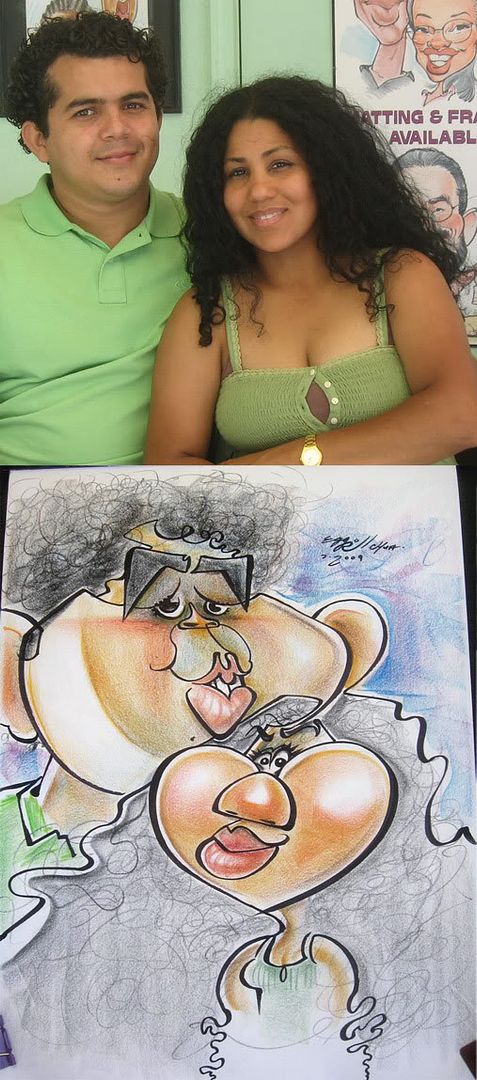 52. these people had fun faces.
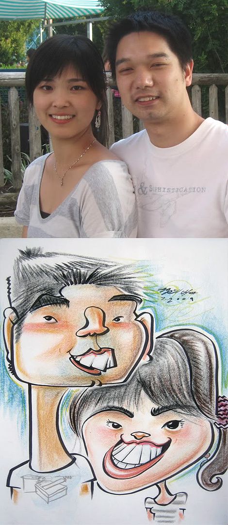 53. Zitman said I missed on the girl but I think I got her. wait, or maybe he changed his mind after seeing the photo again. I forget. also, the other day at the grocery store I accidently grabbed the wrong shopping cart and after strolling it around, I thought to myself "hmm...I don't remember grabbing a giant box of tomatoes...oops." so after about 10 minutes I stroll back to where I think I grabbed the wrong cart and found my original cart (which correctly had a giant bag of rice, of course) and then a guy in another cart points to my cart with a puzzled look and I go, hey, this is your cart, right? ha. he was still confused and didn't seem to be coherent, he sorta muttered to himself "...I left my cart here and then was confused...." but it turned out all right, I tried to play it off all light hearted "...heh. sorry about that, ha ha" and quickly strolled away. awwwwkward, heh. oh and he was asian too. I chastised him about having too many tomatoes and not enough rice in his cart, heh, ok, I didn't.
 54. should have made his forehead even bigger and eyes lower, but still pretty cute, me thinks. although I could have picked a more dynamic pose.
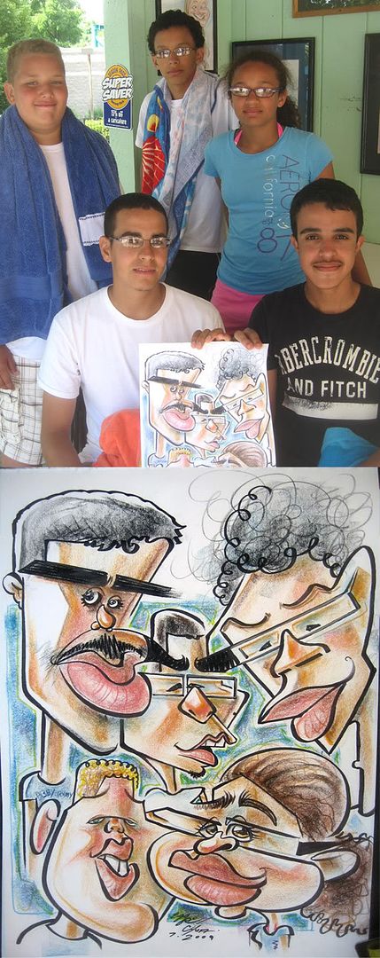 55. I missed on the girl but overall I was happy with getting all 5 in with exaggeration, likeness and all the connect lines. middle guy is a little small. when I try to get my connect lines to fit sometimes stuff like that happens, usually it's likeness gets loss like what happened to the girl,
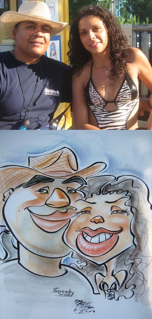 56. guy needs more upper lip to nose area. overall-eh, borderline post worthy.
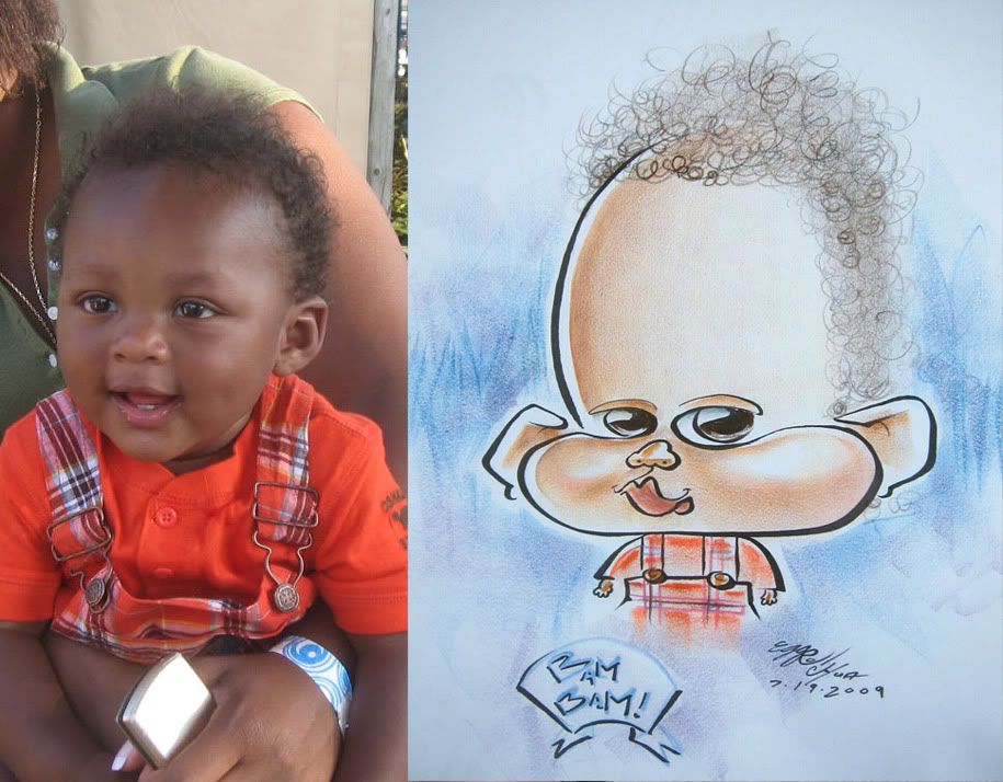 57. I hate writing words on pictures. that just looks weird and distracting. or I just hate that I suck at writing words. yeah, that's it too.
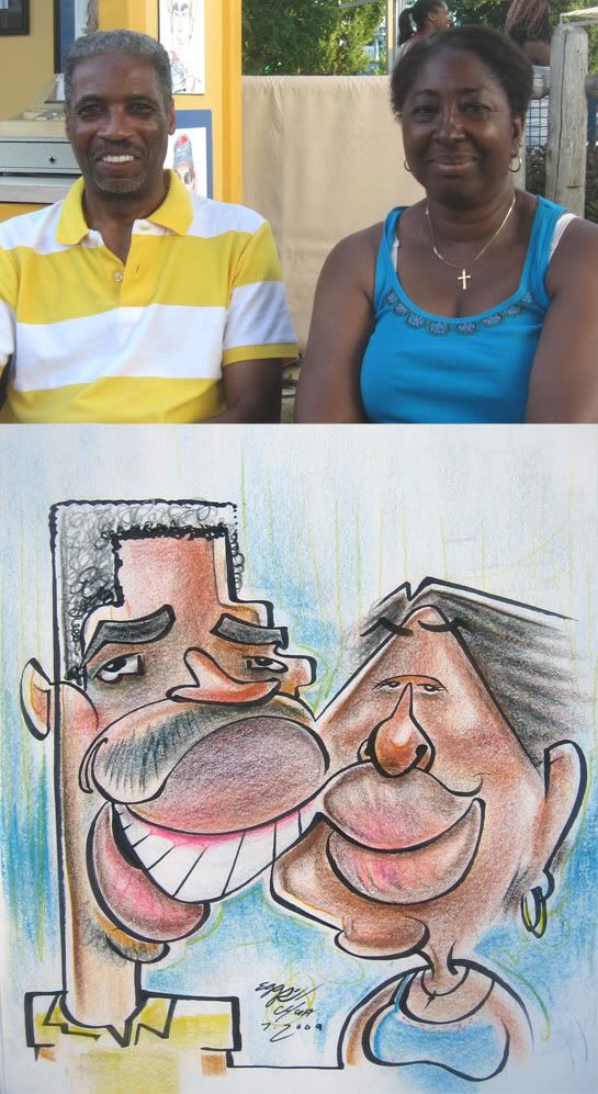 58. these people were fun to draw. I think I got their vibes. they digged it and the guy shook my hand. happy all around, yay!
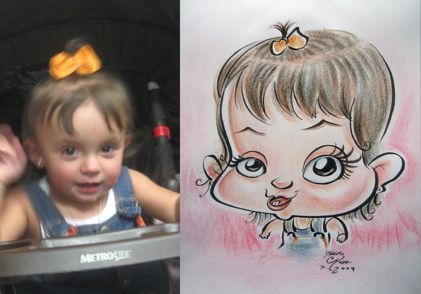 59. eyes are a tadapole offa but it'sa cute. it'sa me, mario! I dont' know.
 60. ehh...
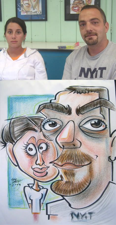 61. should have made her eyes closer together but I do like the wispy lines of her eyes. I love playing up size contrasts when the sichuawation presents itself.
 62. could have made her eyes smaller and more tilted. I liked drawing his shirt and drawing the pikachua.
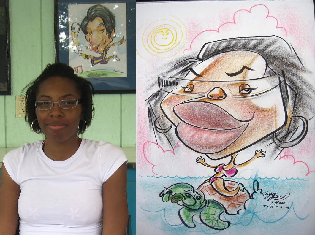 63. I like the open loose lines here. Matt Zitman makes another apperance as a turtle. you can see Matt's drawing of me playing soccer in the background.
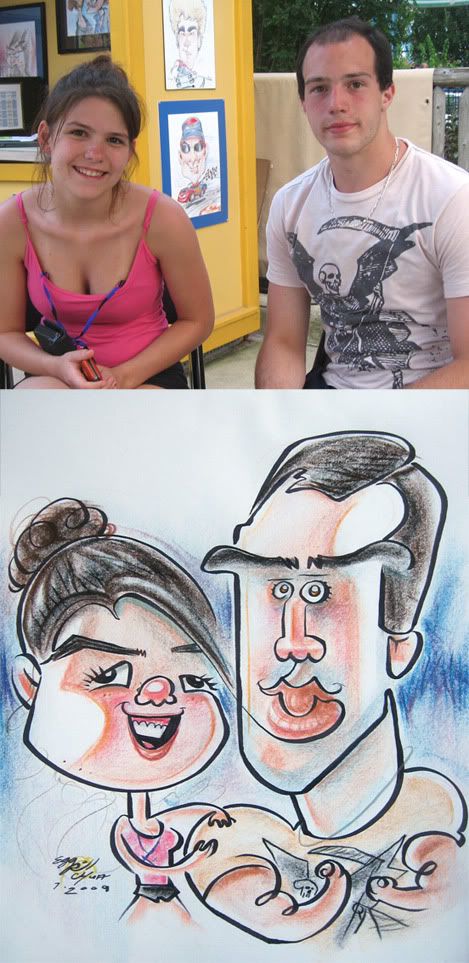 64. I like this one. it's fun and more simple-y. unintentially made her eyes kinda off though, oops. the guy mentioned something about me drawing him as the hulk or something so I just made him muscular-y.
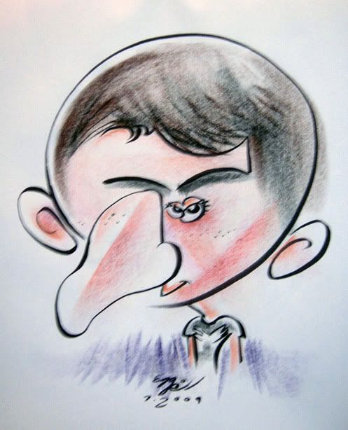 65. haha so this cocky lil kid comes up to me and says how about I draw him for 5 bucks. it was really really slow so I said, sure...BUT it's gonna be really funny. he agreed. as I was drawing him, his friend watching was dying with laughter, making him feel very uncomfortble, he kept saying "oh, man, oh man, is it done?! " etc. etc. covering his face and getting red. not so cocky now, huh, kid? so this is one of those situations where others laughing/heckling build up so much bad thoughts in the guest being drawn's head that they are already so negative. so as soon as I showed it to him, he took it and ripped it apart and said "worst 5 bux I ever spent" ha ha. I made him pay 1st, so still a sale, hooray, me! I didn't get a chance to take a picture of the kid but did manage to snap a blurry one of the sketch before it became food for the garbage can.
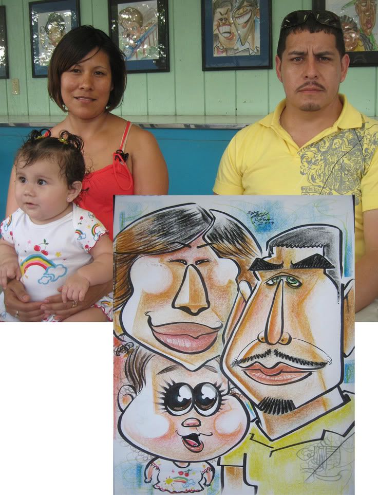 66. this was a redraw and usually, I go tamer to make sure we still get a sale. but for this one, I didn't feel like it, cause they rejected my buddy, Shaun Stipick's sketch and I didn't want to go tame for him. His sketches rock and he does some of the best bodies ever! anyhoo, I was kinda happy with how this turned out. I should have made the mom's chin larger, but at the same time, I'm glad I didn't cause I already didn't leave enough room for the baby as it is. that baby was uber cute!
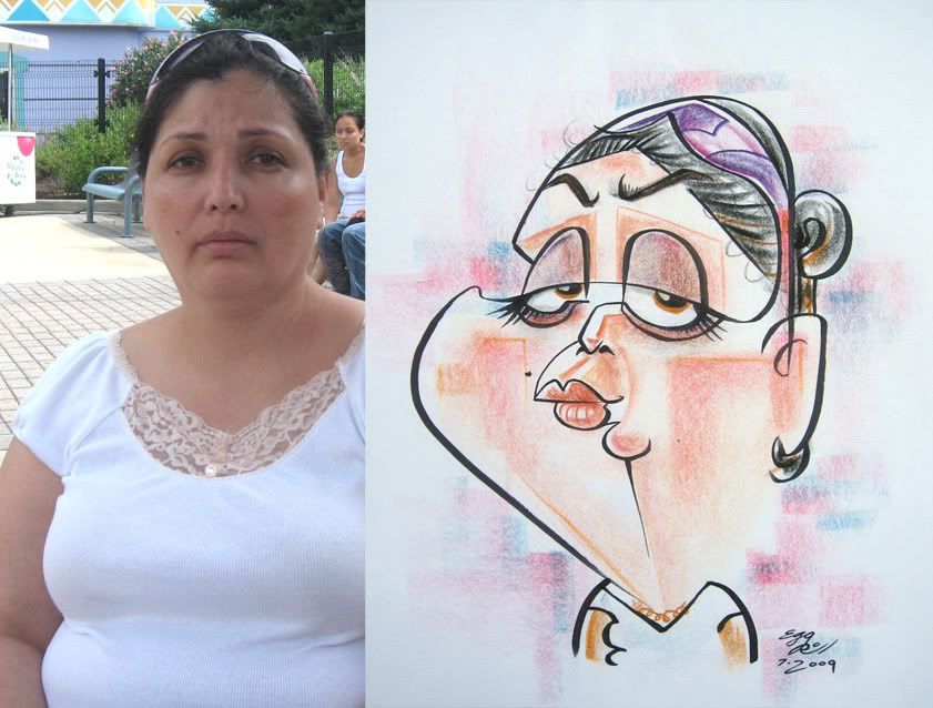 67. should have made her eyes wider apart and smaller...I like all the shapes and coloring shapes though.
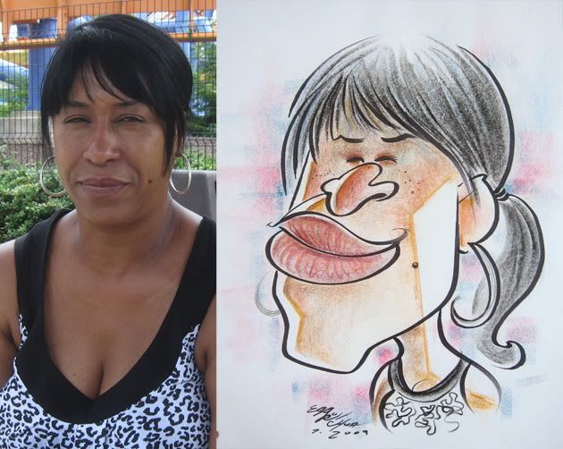 68. yay to drawing eyes as lines.
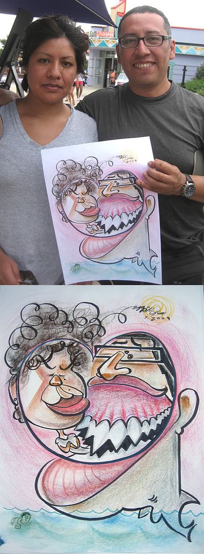 69. oh boy, oh boyo! so this one's got a cool story behind it. so on this day it was rainy and I was hustling trying to get some sales. I see this couple maybe about 20 feet away looking at the stand talking, I was guessing that they were trying to decide if they wanted to get one or not. then they turned away and went on their way. I told, Katie Lawter, my fellow caricaturist, that I should go after them, even though they were pretty far away and it'd be kinda awkward to hustle someone so far away...but sometimes you gotta do stuff like that. so I run after them and told them that I'd cut them a deal if they got one done. the guy says, ok but they wanted to go inside the gift store first...which usually means that they'll never come back. but you, my friend, are a sleuth and know I drew them so you know they'll come back...or DO they?! stay tuned! oh. I guess to right now. So I go back to my stand thinking, yeah, MAYbe they'll come back but you never really know when people say that stuff, we're used to people not coming back after saying they will. So I was wating and telling Katie that I want to draw this guy real bad as well, cause he looked like a shark to me, at least his teeth. Then it starts to rain really hard, boooo. but what's this?! the couple comes back and I was like, "you're back!!" but I couldn't draw them cause it was just raining too hard and the paper would get wet. I said if it lets up, come back and I'll draw ya. So they said they'd go hang in the waterpark pool and then come back if it lets up. so soon after, it did stop raining and actually it was one of those days where it was just a passing rainstorm and then it got super sunny! yay! but I waited and waited and they never came back *tear* I stayed about 30 mintues past my shift, hoping that I'd get to draw shark man...and lo and behold they came back!! hooray! I was soo excited! I sat them down and the 1st thing I say to the guy is "do you like sharks?" he goes "yes" I said, "awesome." and then went along with my sketch. they only asked for color faces but I threw in the shark eating her on the house, heh. they were cool people. yay! oh, I tried to make their faces a heart shape but I dont' think it came out as obvious. and I make a cameo as a sea turtle.
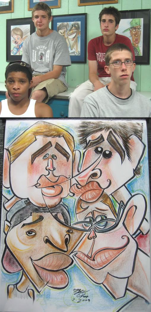 70. this one came out decent. lots of connect lines. I think I prolly missed a bit more on the top left kid, needs more cheeks less lips.
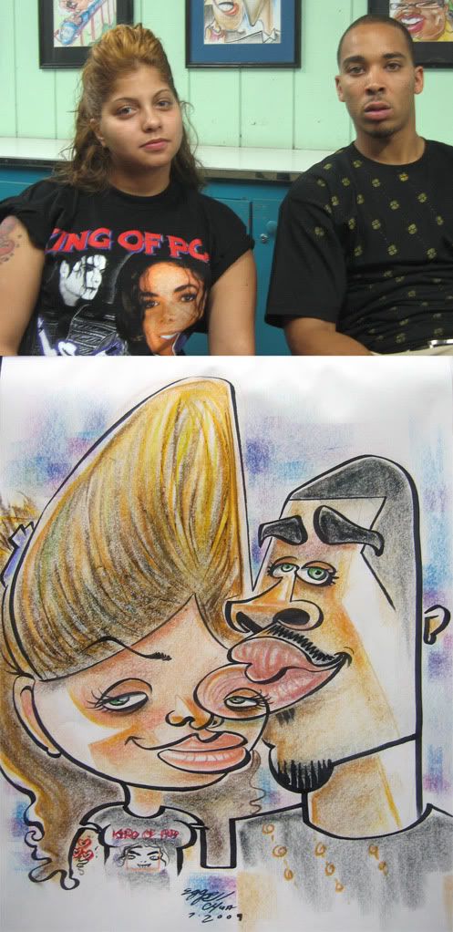 71. more eyes on other people's faces! I liked her hair. and it was fun drawing michael jackson on her shirt.
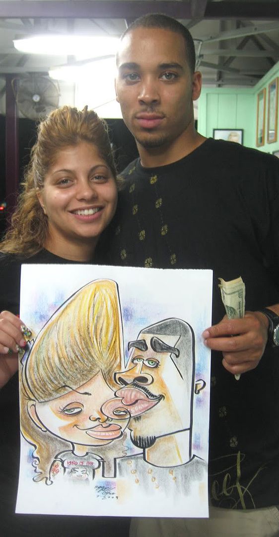 72.
72.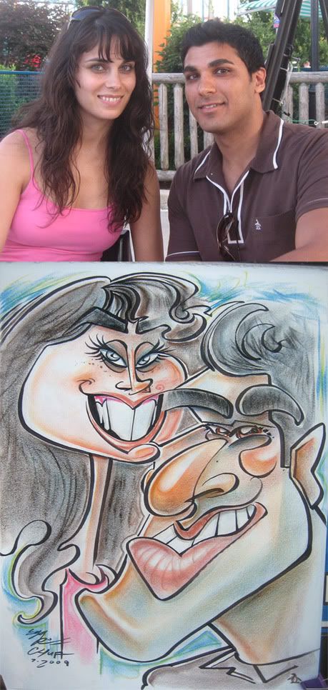 73. her mouth to his eye brow connect line. the guy was a bit taken back when he saw it. he was like, "wait, are you serious?" heh. hmm...his likeness is missing something, think I made his nose too long.
 74. the hat actually came out kinda cool looking in a realisticy rendery way.
 75. yay! tiny hands. and sold!
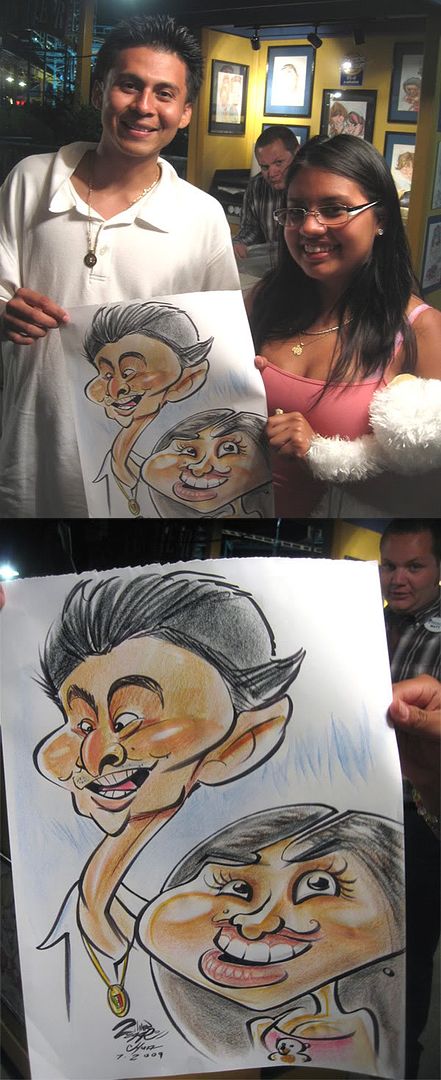 76. 1st collaboration of the season between Matt Zitman (drew the guy) and I (drew the girl). I think this is our 4th one overall. a pretty tame one, especially mine. Matt's is better. Matt is in the background making faces, oh wait, that is his normal face, zing! we haven't done as many collabs this year. we actually did another one the following month that got rejected, and it was the LEAST exaggerated collab we've done too. after that Matt chickened out and doesn't want to collab anymore. I'll post that one in August's caricature post. I'll get him to collab some more before the season ends. I wanna collab with Alex Clare as well.
---------------------------------
so overall, I think this month's stuff is more successful and I'm happier with a lot more of them. August has some good stuff as well, there's actually a few bodies that I was happy with.
August sketches post coming up soonish!


6 comments:
So much good stuff this month.
i really enjoyed 41, 42 and 50,plus a couple more made me chuckle, especially shark man.
awesome, as always.
Nice caricature and facia expression !
Number 41 of the guy on top is my absolute favorite of this batch, although there are others. What I can't understand is how you keep all your caricatures so exaggerated and yet so FUN! When I exaggerate too much, my drawings always end up ugly and distorted:D Maybe it's because I need more practice, eh?
The only ones I think could use some work would be the ones with features flying everywhere, I guess, because I don't see as much likeness on those....But most of these are fabulous!
will- thanks, man! and thanks for letting me know specific ones ya likes!
always informative.
pavel- thanks!!
fran- glad you like 41! that might be my favorite of the batch as well. as far as making it exaggerated and fun, I actually think YOU do it very well. A few things that come to mind that I think helps you push it and still keep it fun--
by simplifing things/ making things look less realistic/ more graphic (which I think you do pretty well!), making someone look younger/cuter usually helps as well. then there's just some things where you make a case by
case scenario where you know that aspects of someone will come across as exaggerated fun if you push it like big forehead on a baby and knowing if you push something else it might come across as too aggressive and ugly
which I still do at times as well. like teeth--sometimes by pushing someone's distinct teeth the wrong way it can come off looking more aggressive evil than silly fun cute... but yeah, it comes with experimenting and trying different
things and seeing how other artists translate things and picking it up.
yeah, on some of these, like 50, I'm really trying to push the features around...I actually really like doing that and is something that I want to keep exploring and work on still getting likeness.
some of these made me laugh pretty good, also asked myself wtf!? Hope to see stuff like what you did to the two white boys, one with glasses and blonde hair, the other with his eyes pinched and nose real big( you know which one) and the black kid with the big lips, at the convention. DOoooooooooooooooooooo it...
thanks, nate! I'm gonna try and bring it at the ISCA con this year and do my thing rather than doing that other thing where I choke and do crappy art, heh.
also, use the numbers I put on each caricature, dummy! so you don't have to take forever in trying to describe which one you're talking about! silly goose! :p
Post a Comment