eh. nothing too exciting this month, didn't really start getting into a grove/figuring things out more until the following months (July & August), which I'm going thru the pics now and will post soonish!
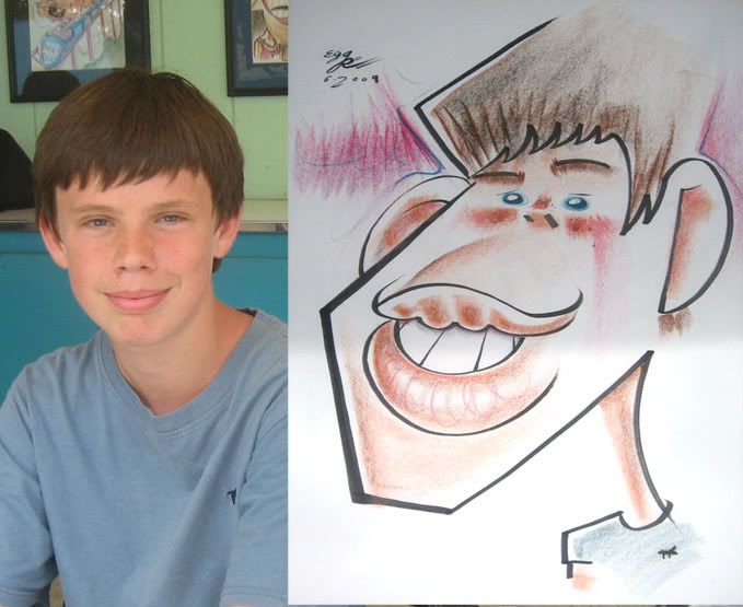
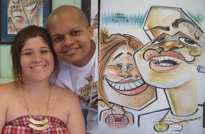 1. these people were cool and had a good laugh. they had cool faces. I liked the way the coloring came out on the guy- shapes and simple. I tend to overdo it.
 2. was trying to cute-ify the poop out of the drawing. that was a weird statement. should have made her eyes further apart- lost some likeness.
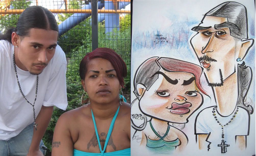 3. WAY too much excitement here, heh. they both pretty much held those expressions the whole time I was drawing them until I showed them the sketch and I got a smile from the girl. yay! I was pretty happy with the likeness on these and overall, I think it was a pretty solid sketch. nothing crazy special but solid.
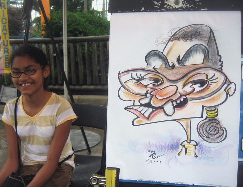 4. ooooh. this one came out kinda vicious. oopsie. don't think she liked it so much, heh. I like her smile becoming her eye shine.
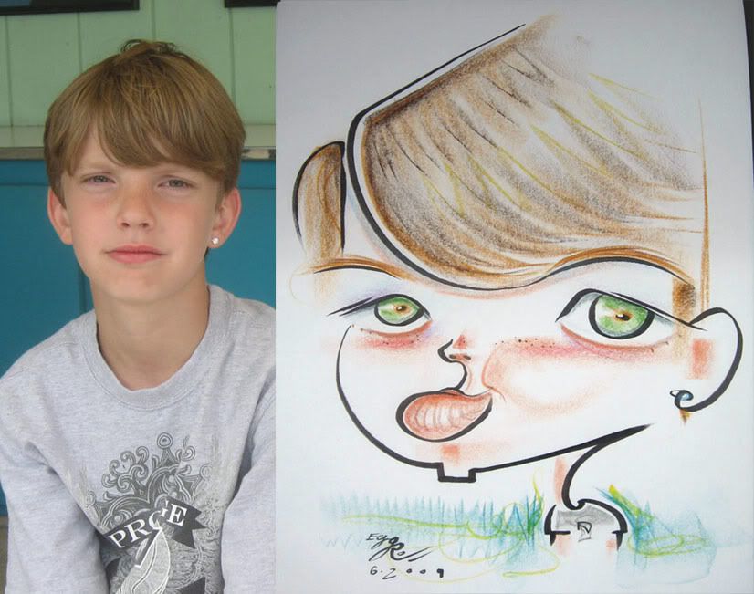 5. a demo that his parents bought. likeness is not too good, eyes too big, but I like the simplicity and look of it.
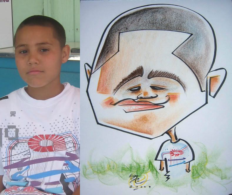 6. I like the simple coloring, need to try and do more. I tend to shy away from it cause I think people will think it's "too" simple even though I think it looks better.
 7. I took a chance on this one. the 1st line I threw down was that circle of the kids forehead. I didn't plan anything out and just put it down. luckily it worked out nicely and I put the eyes and nose on that line. that is one of those happy accidents that I enjoy. it's nerve-racking but fun when things come together.
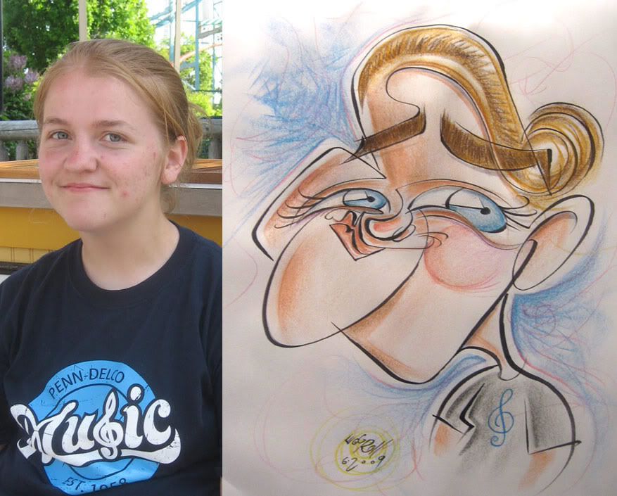 8. I redrew this from a previous sale to try out some things.
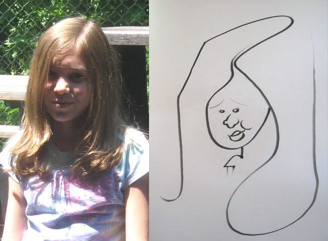 9. these next few, Matt Zitman and I drew at a special in-park event where we were doing free black and white sketches. we drew super fast, most were 30 seconds or less or WAY less. Matt did some sweet sketches. I took pictures of all of Matt's. Bug Matt to post them on his blog! think this one took me like 5 seconds, heh.
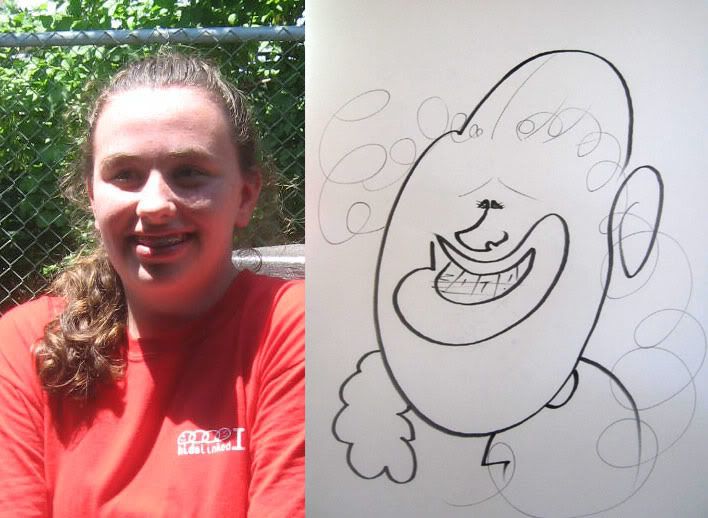 10.
10.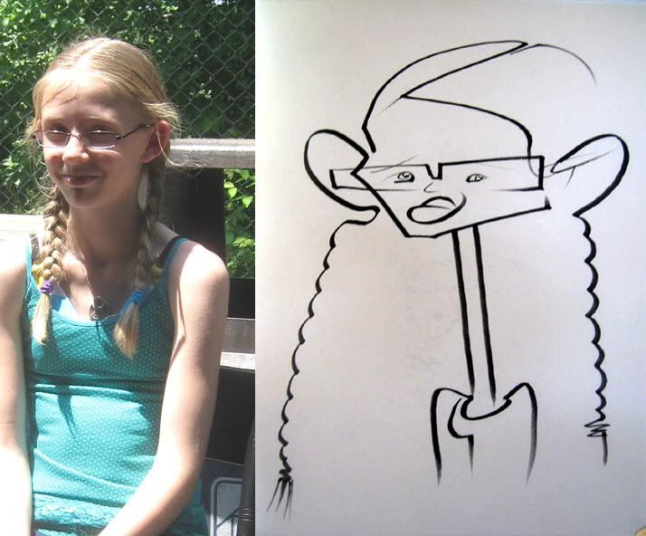 11. I started the sketch with the left side bottom pony tail.
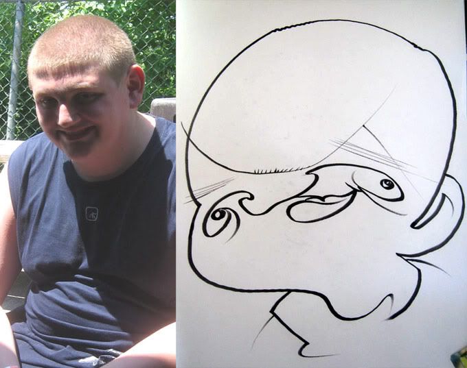 12. hee hee. it's real sloppy but fun.
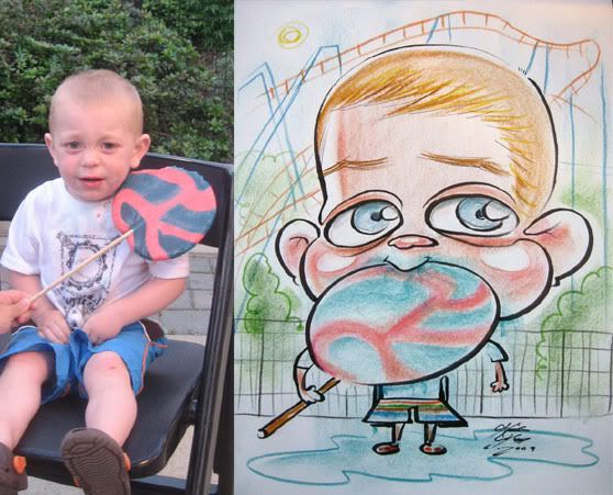 13. I liked this one except for the pants, I was trying to make them overly large for a funny effect but messed up and made it look kinda like a dress. I like the puddle of drool. all the family said was do anything as long as he's got his lollipop. my dilema was that after I drew in the lolli, I had to draw in his hands to hold it and it was too long, so it looks like he's got an extra long shoulder arm thing.
 14.
14.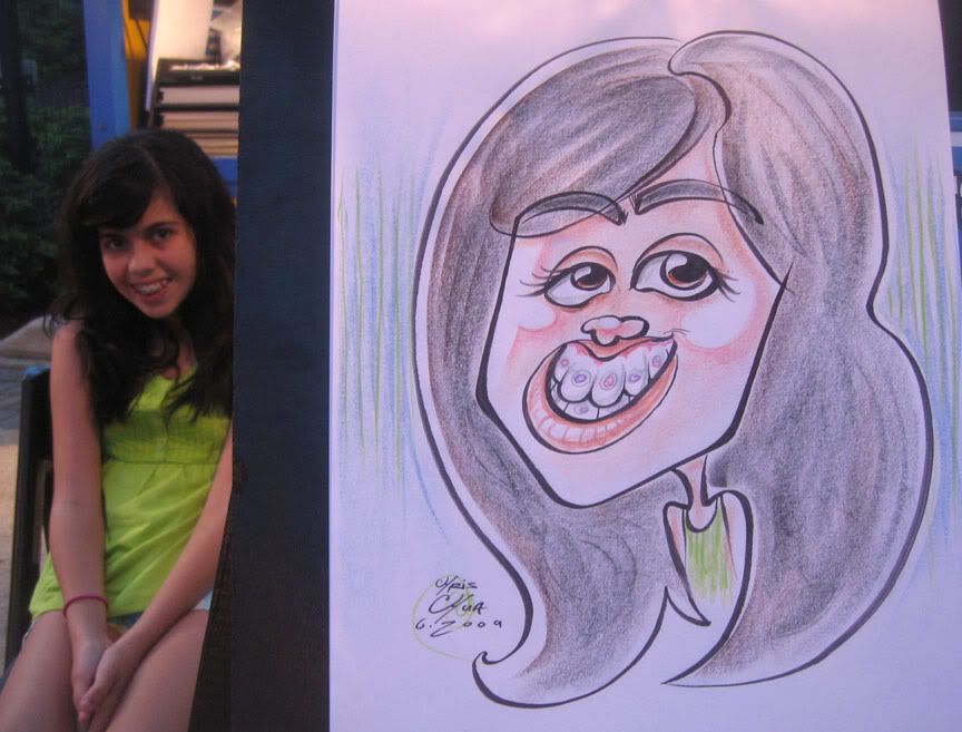 15.
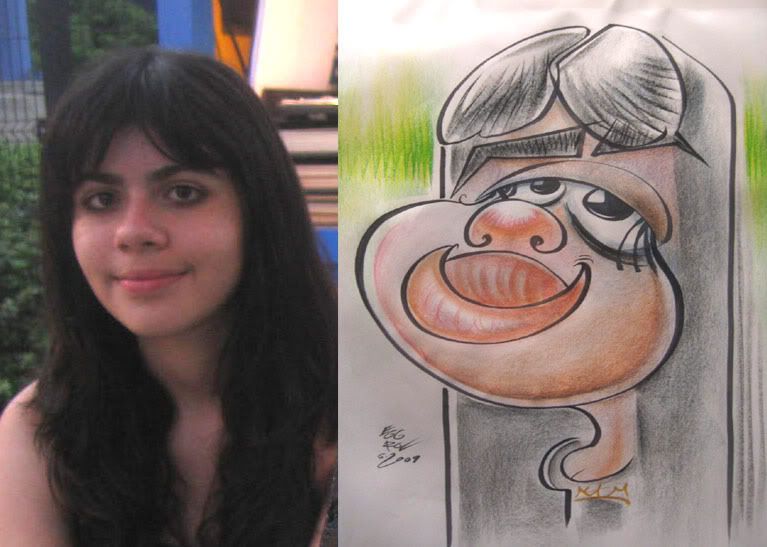
15.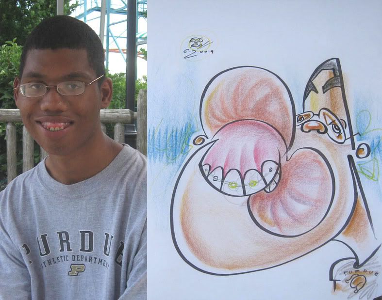 16. He had such a jackpot face and I messed it up. Should have emphasized his protruding lower mouth and gums. my favorite part of the drawing is that I drew a "Perdue" chicken on his shirt playing off of his Purdue school name, hee hee. seriously, this is the kind of stuff that makes my jello brain dance.
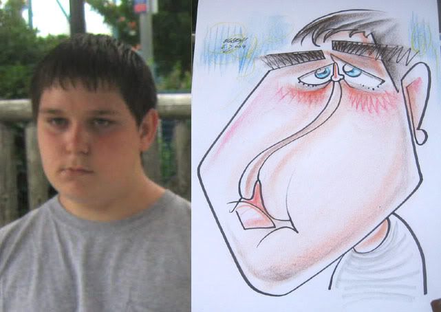 17. I like the feel of this one
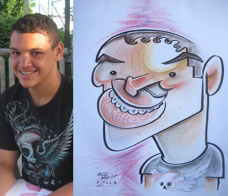 18.
18.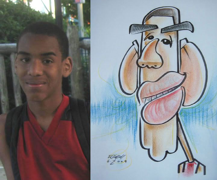 19.
19.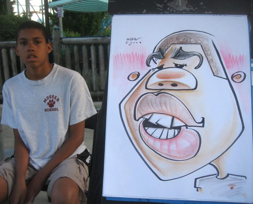 20.
20.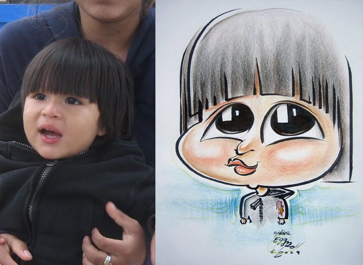 21. the parents whispered to my co-worker while I was drawing this kid whether I knew that it was a boy. I did, just drawing what I sees. kid's got long hair.
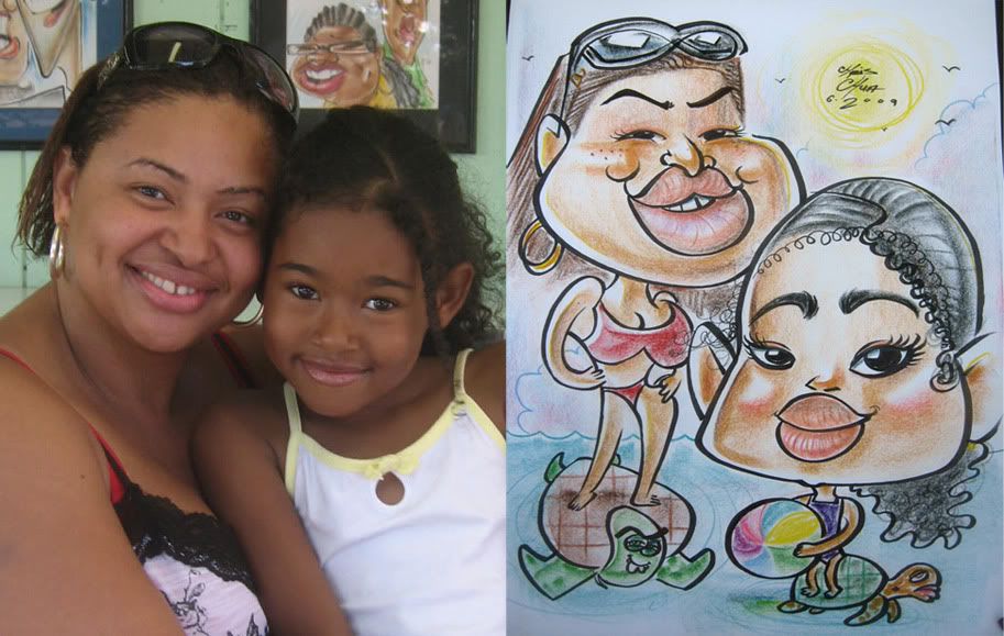 22. my buddy and awesome caricaturist co-worker, Alex Clare is the left side turtle and Zitman is the other turtle, well, sorta. lots more of them in my sketches coming up soon. this one is pretty tame. it was funny cause I didn't tell them that I was going to put them on turtles and then the woman goes "I love turtles!"
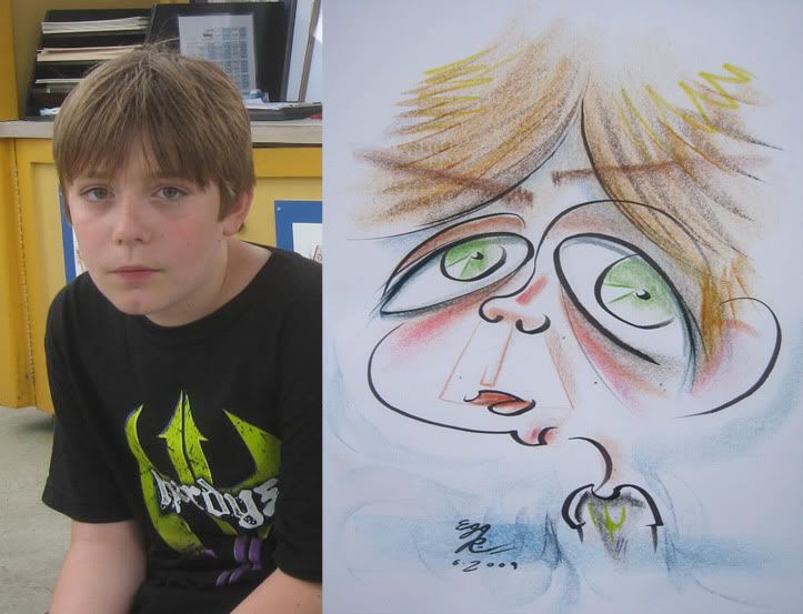 23. demo. mom really liked it and wanted to buy it but kid didn't like it as much and didn't want it. usually it's the other way around.
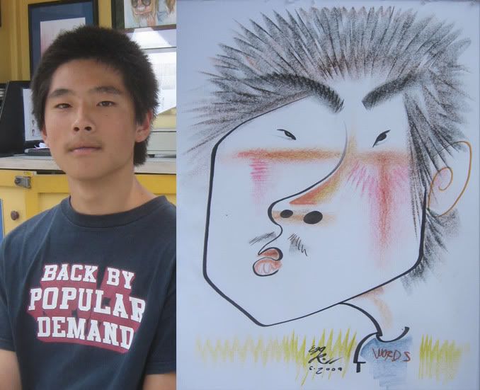 24. words
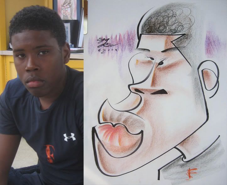 25. I liked the coloring on this one.
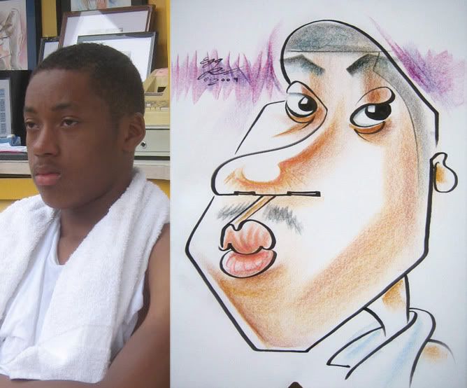 26.
26.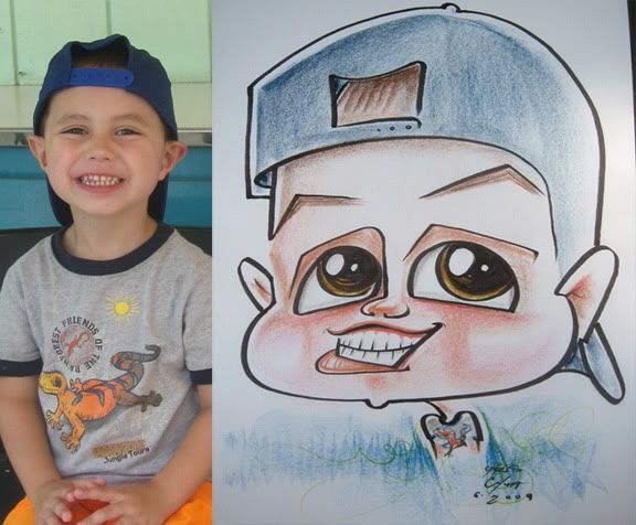 27.
27.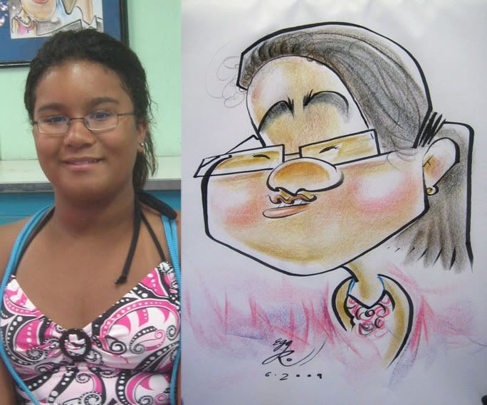 28.
28.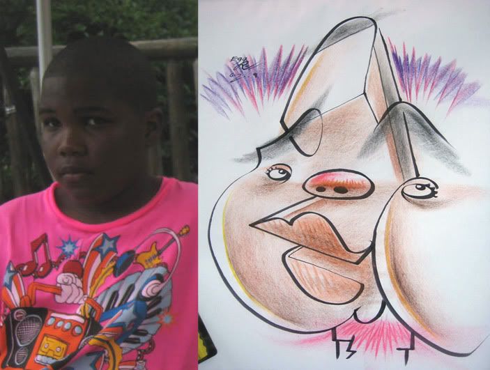 29.
29.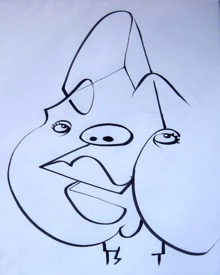 30.
30. 31.
31.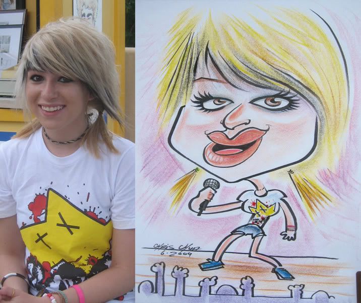 32. she really liked it. I liked drawing silly shirts like that.
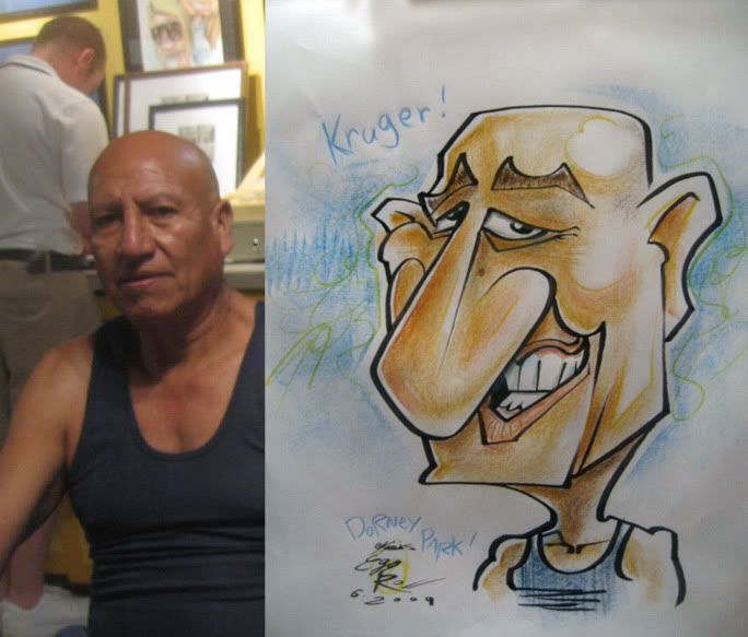 33. his family was laughing pretty hard while I was drawing it. good times. he liked it as well and shook my hand. I could've went for it even more. still haven't been pushing it as much during this time period. I hate writing words on a page. my handwriting is horrible when I don't try hard. Alex Clare in the background.
 34.
34.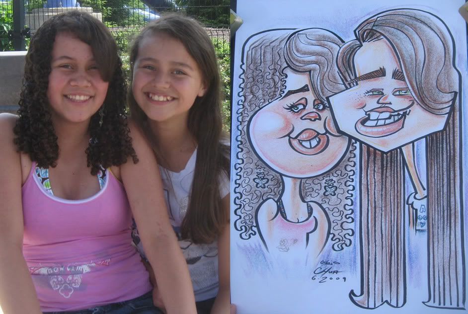 35. kinda stiff, should have made the left one's nose bigger. I did this 1st in black and white then they wanted it in color.otherwise if I knew it was going to be in coloring, I wouldn' have put in so many lines in the hair.
 36. the baby got wonky, I usually draw from inside out, as I feel I have more control and can work out my porportions more accurately. I do mix it up though and when I do work outside in, I do get more interesting solutions and sometimes get more weird lopsidedness, like the baby- I threw down that left side line first then was like, oopsie.
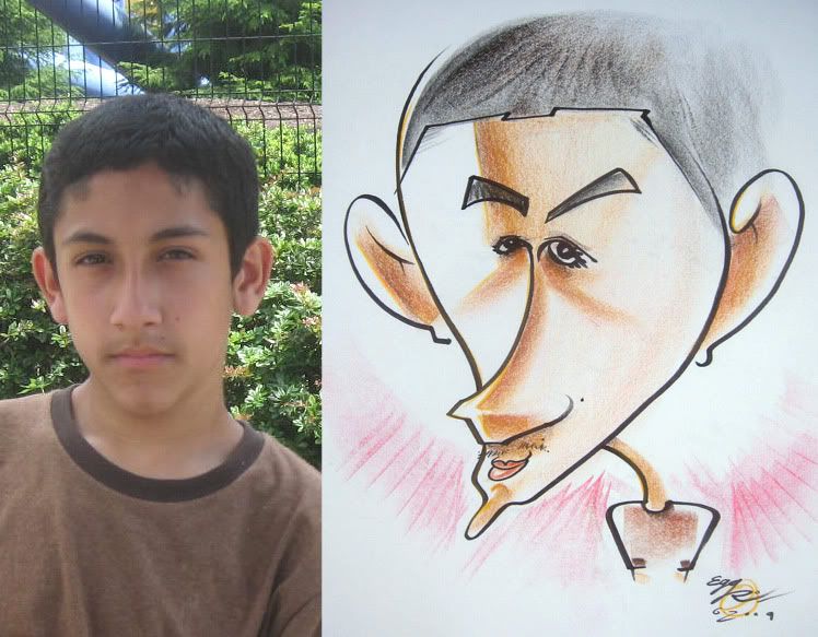 37.
37.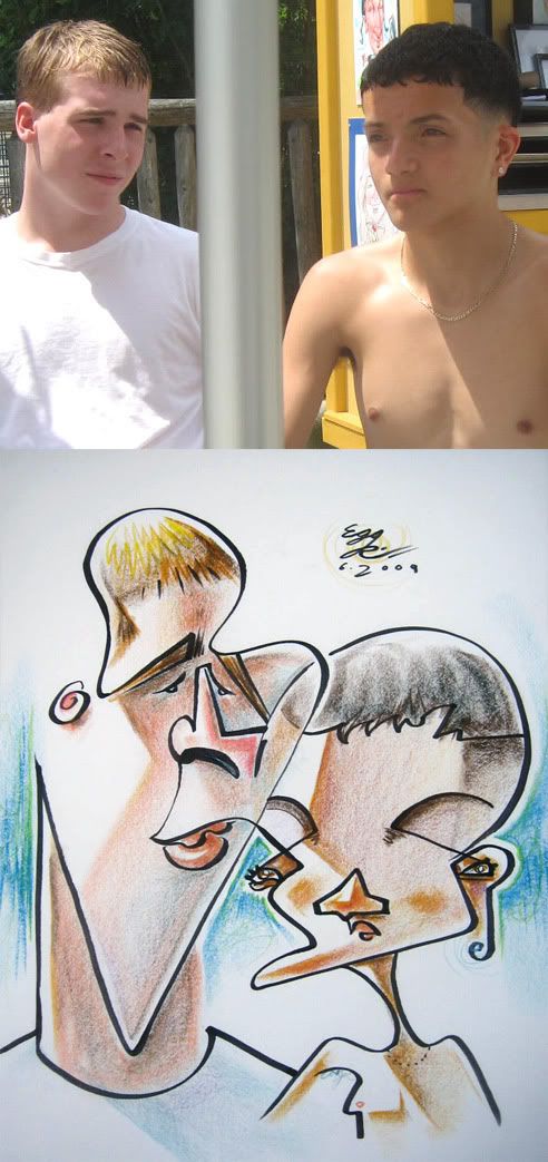 38. demo that I really liked. I like that his eyes are in his ears and was really happy with the coloring. prolly my fav of the month.
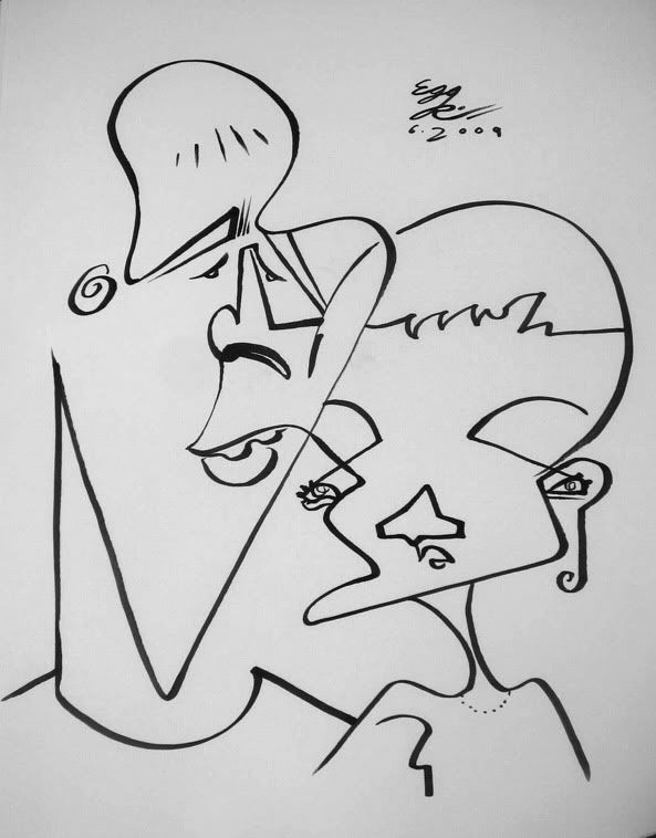 39.
39.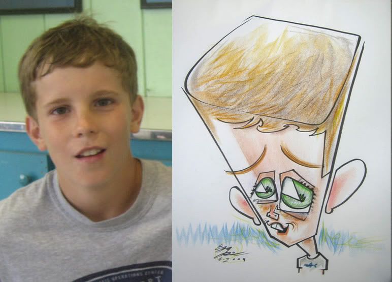 40. likeness is off but I like the downshot and the graphic eyes. I also like buffets.
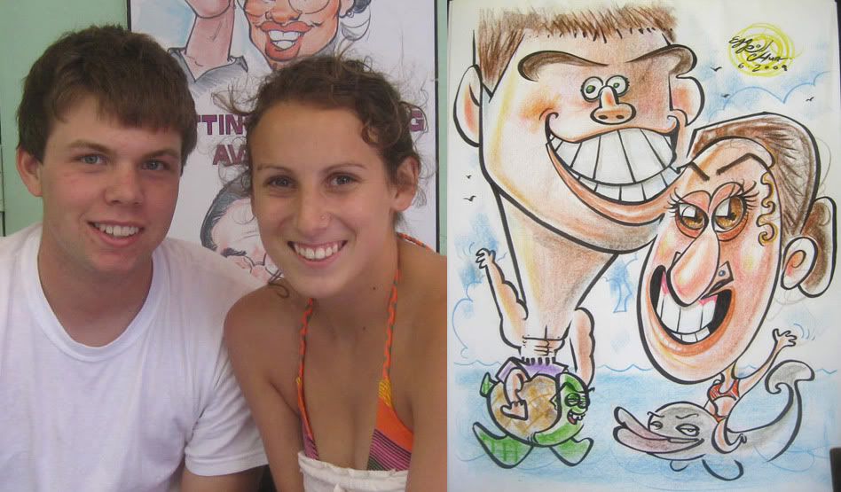 41. more Alex as a turtle. his lip goes into her forhead
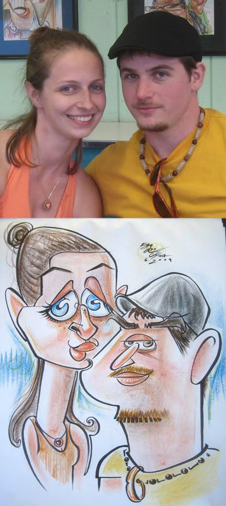 43. The guy was kind of neutral the whole time I was drawing them, he was pleasant and all, just really sleepy. but then he lit up and really liked it when he saw it which was cool. I was happy with it. her eye to his eyebrow connect line and they share the center line for their face outline.
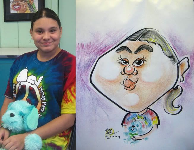 44. I like the that the only marker line on the bear is the nose and mouth. it's the best part of the sketch. and the tye dye t-shirt, I love coloring them.
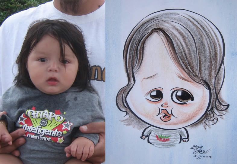 45. couldn't tell if it was a girl or boy. leaning towards boy. I met this girl the other day with 1 leg...her name was Eileen. bada-bing!
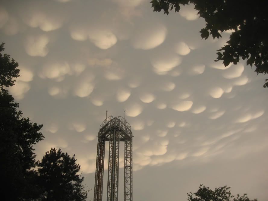 I took this picture at the park one day. really weird clouds. like a cartoon or something.
----------------------------------------------------------------------------------------
I didn't do anything too crazy this month either. but I just looked thru my photos of ones I did in July and August and they're MUCH better and more exaggerated stuff! a lot more pics to post I think as well. working on July stuff so SOON!
One of my favorite bands Muse, just released a new album called "The Resistance". you can listen to the whole thing at their myspace. I listened to it once, so far, it's decent. good, but not as epic as their last few albums. I think 1 song I really like that stood out. the album cover is gorgeous though. love all the colors.


4 comments:
I've said it before, but your work will never cease to inspire, such unique caricatures.
i especially like the simplicity of the free ones and 23 and 24.
keep it up!
thanks, Will! glad ya like the simple ones, I jump around from simple to more complicated (as you do) and actually want to get back into a bit more minimalist. gonna try and do some more of them this month.
WoW! I completely missed this post! Guess I didn't check often enough---but this is FANTASTIC!!! You're b/w crack me up! and 31 was way cool. This is you at your finest. Can't wait to get one from you someday..hm....
I'm trying to go to draw with you guys in Sea World this winter! hopefully things can be worked out, I'll draw you then!
Post a Comment