Caricatures drawn during the month of August 2007 at Great Wolf Lodge, PA, Dorney PArk, PA and Sesame Place, PA and Six Flags, NJ--
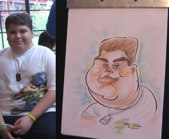
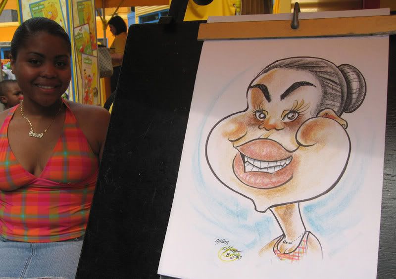
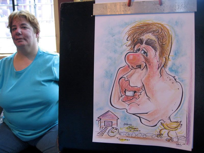 hee hee. this one and the next bunch were all from the same group and lots of fun. check out that egg....roll, heh.
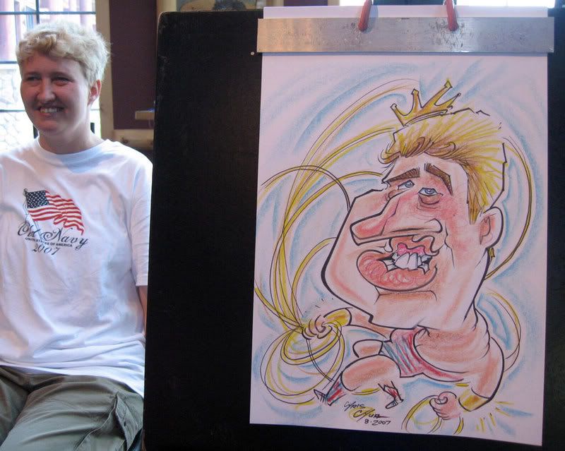
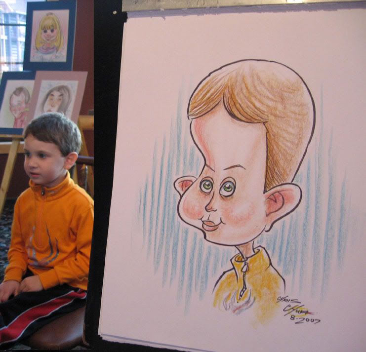
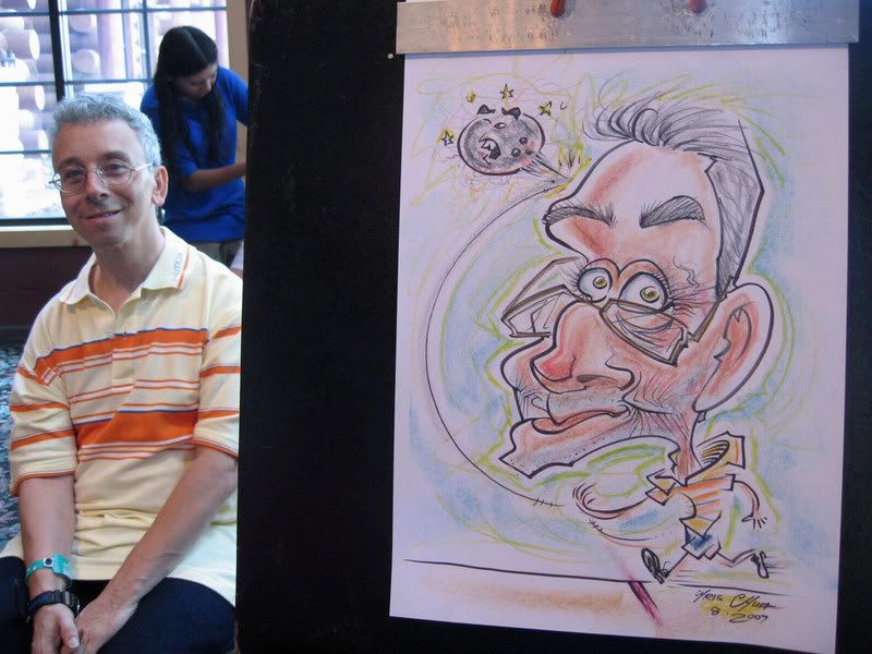 my 1st bowler body. I felt like I could have gotten a better likeness, he had a fun face but something feels off...needs more chin. liz in the background!
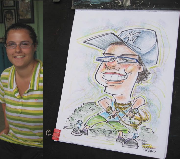
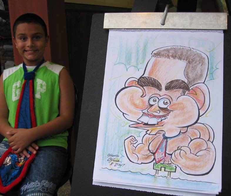
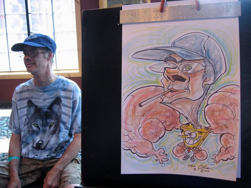 The chaperone for him kept suggesting that he should get himself drawn as spongebob, he wanted to be a muscle man. I suggested combining the two...but I didn't want to make spongebob all muscley and thought it'd be more fun (ridiculous) if I just made the arms and legs jacked up, heh. wish I pushed the face more, it really isn't very exaggerated.
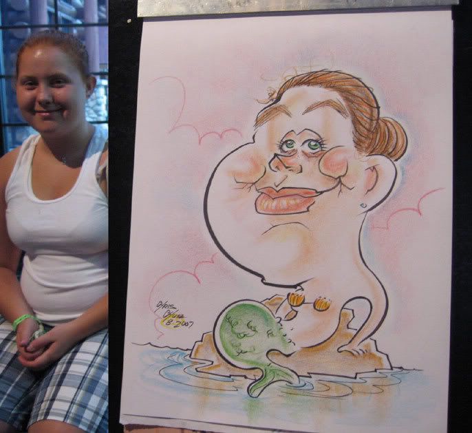
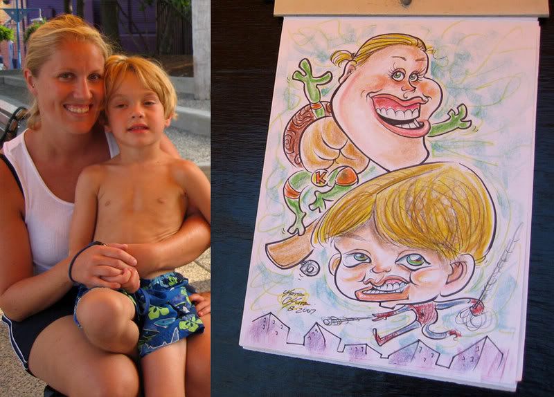
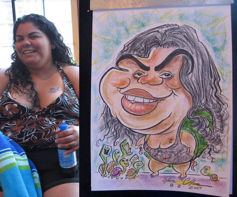 this is one of the chaperones. she couldn't decide what to get as a body and said I could do anything. Turtle it is! heh. my very 1st caricature of someone as a turtle, I've done more since. I like drawing people as animals so I usually try to convince people to get themselves as such. more animals and such coming in the coming month posts. anyhoo, not sure I really did it justice. I'm the purple turtle.
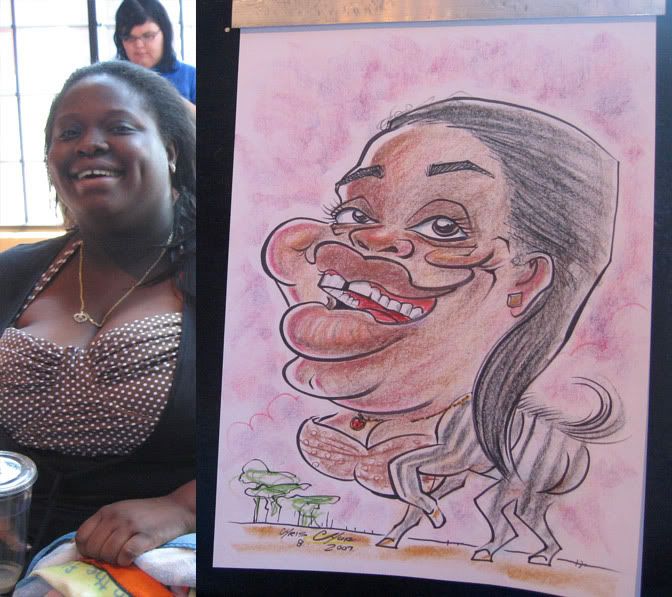
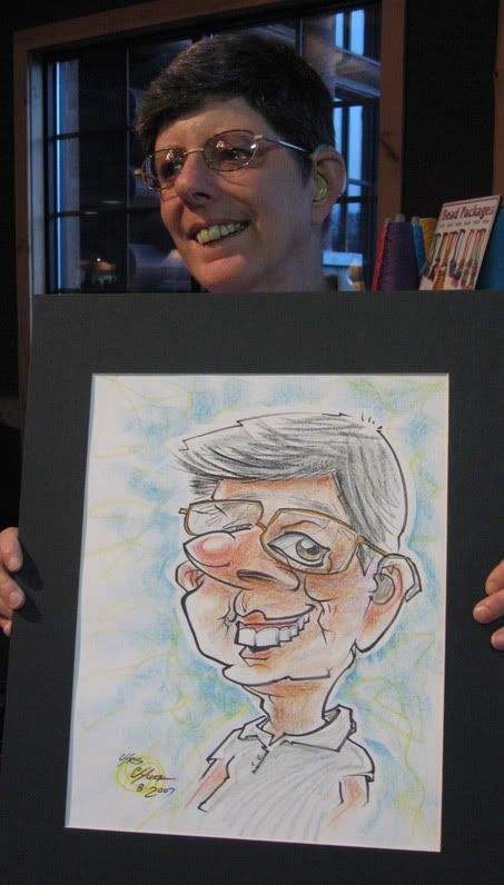
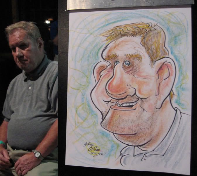
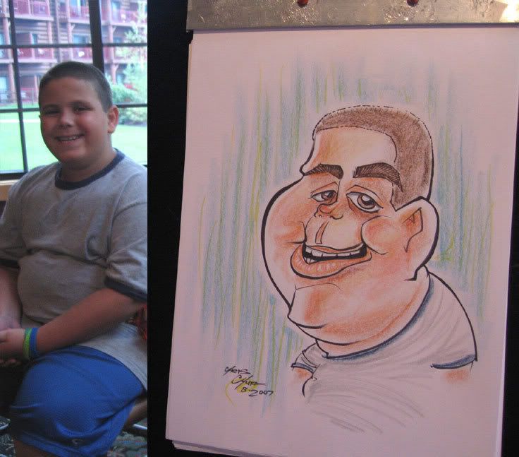


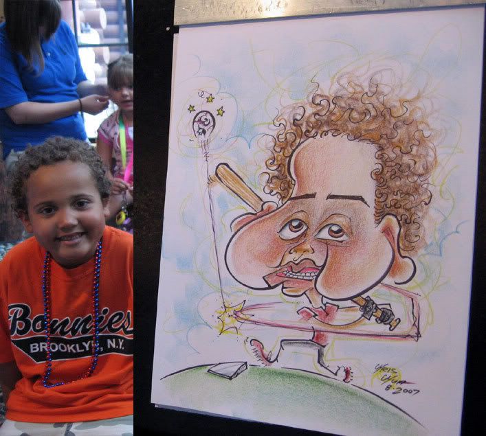
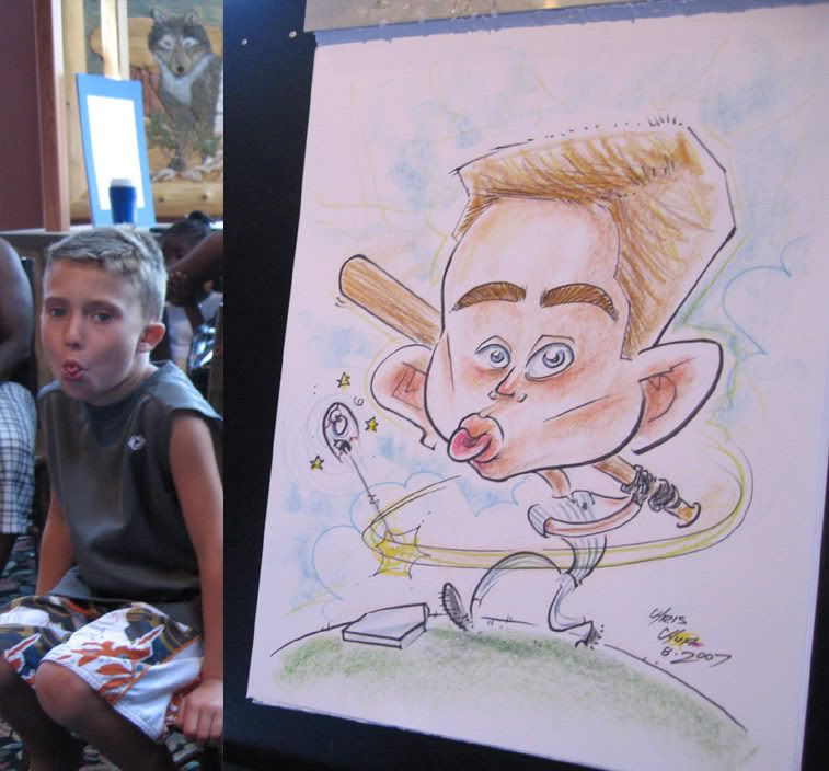
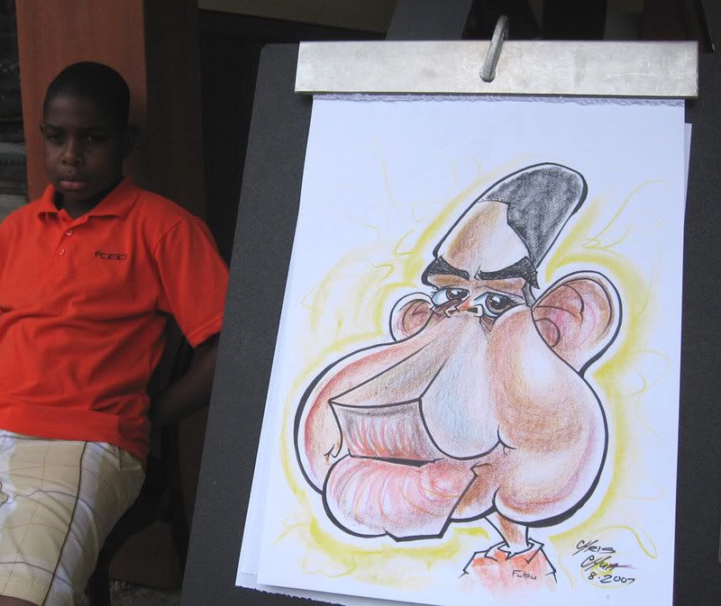
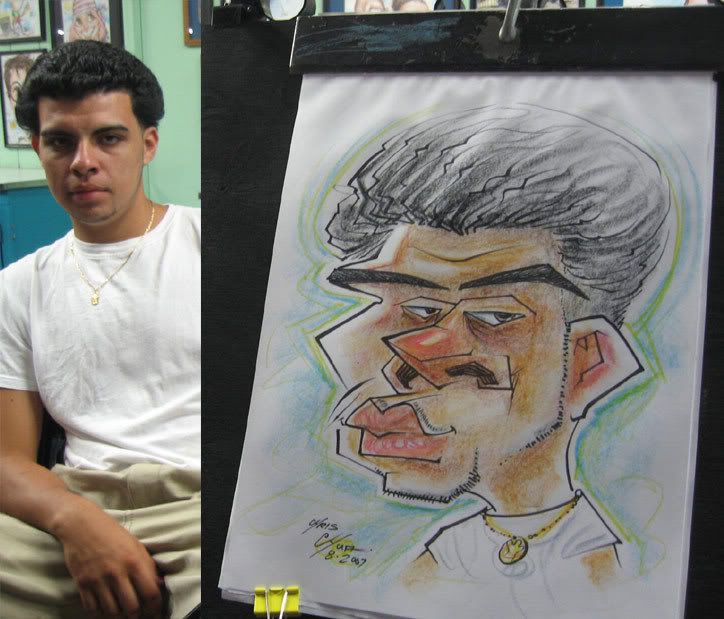
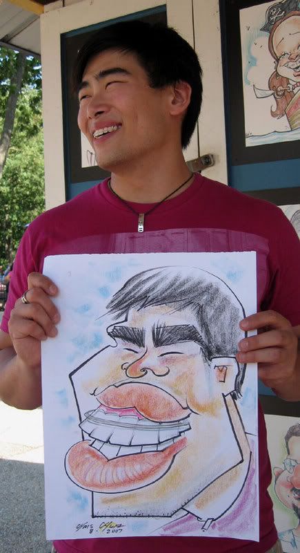
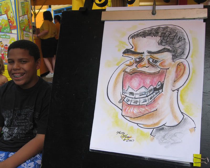 this is what I call a jackpot face, heh. got too excited and missed the more space between mouth and nose. also, just noticed that I wrote CHUA in his hair, heh, I don't remember doing that.
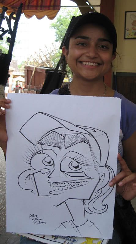
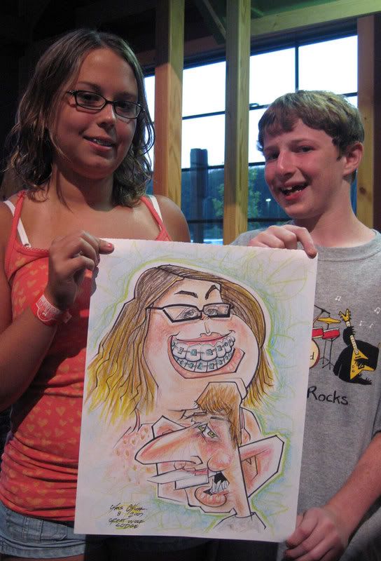
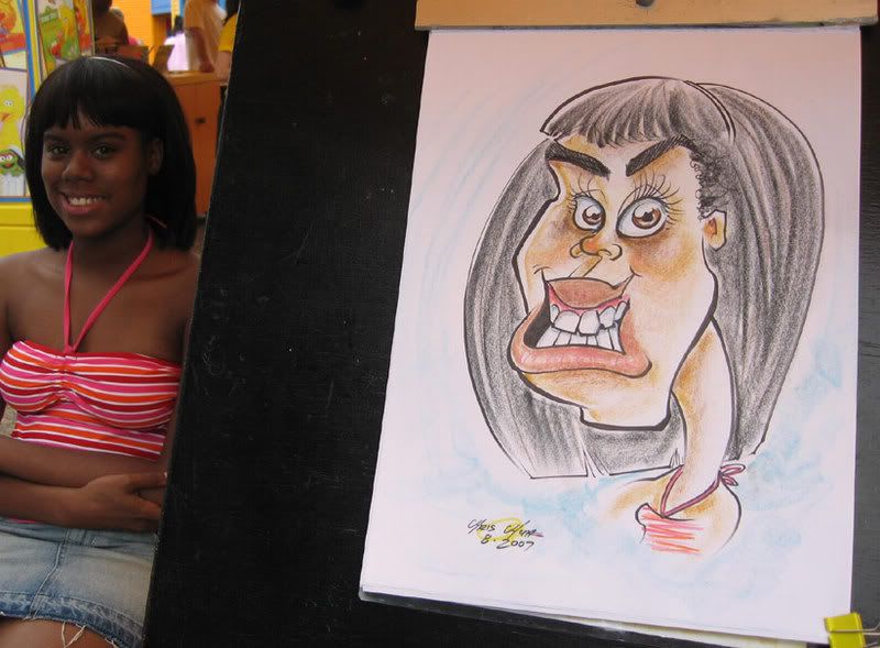
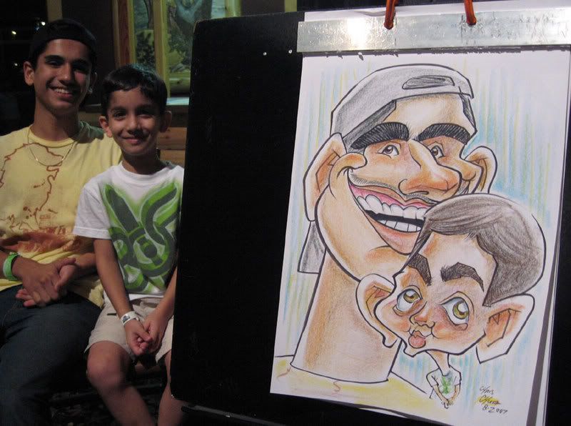
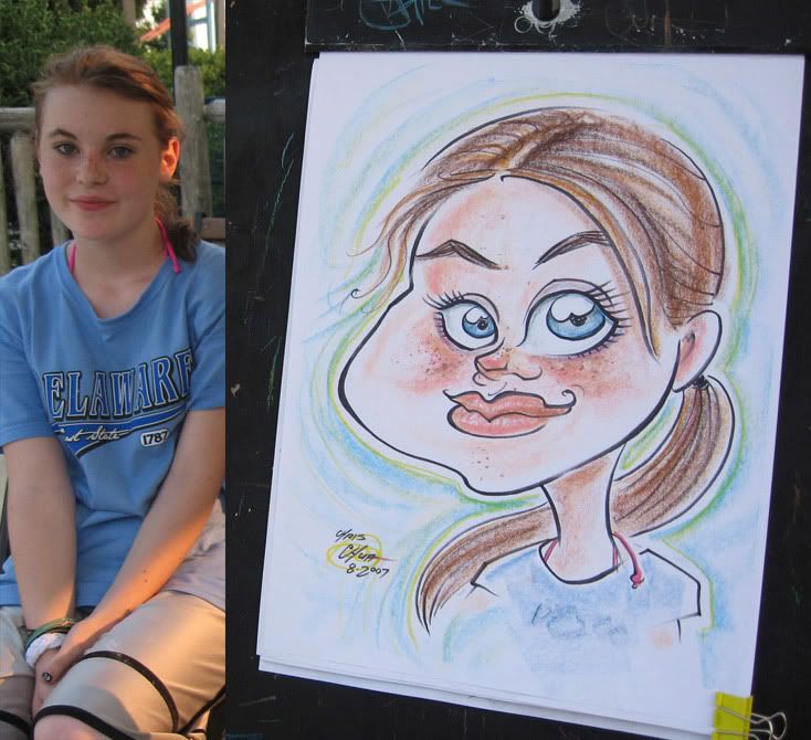
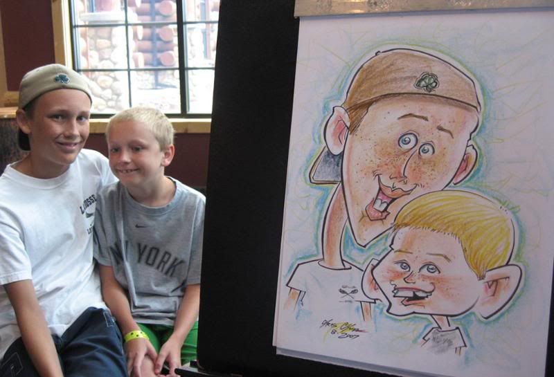
 really tried to push and simplify on the girl, I like that fact but think I used the wrong shape. made the boy older too.
 don't remember why I did that thing with her hair, I think I wanted to try to fill out that space compositionally. eh, looks weird.
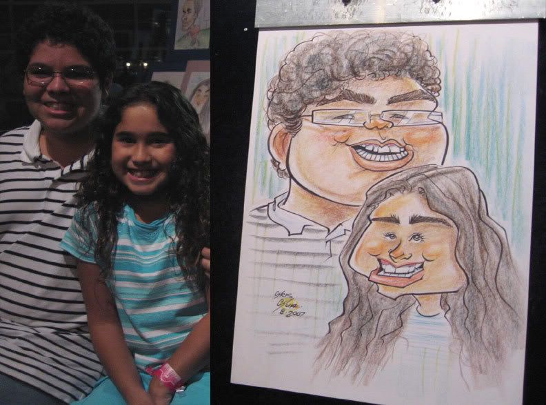
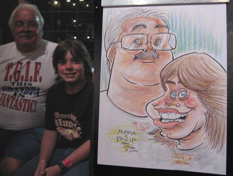
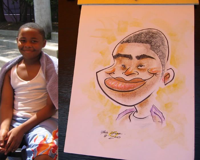
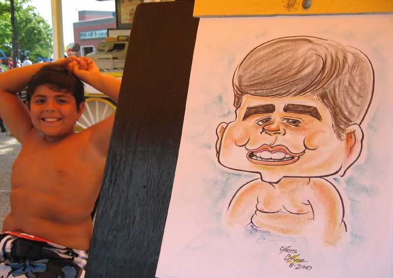
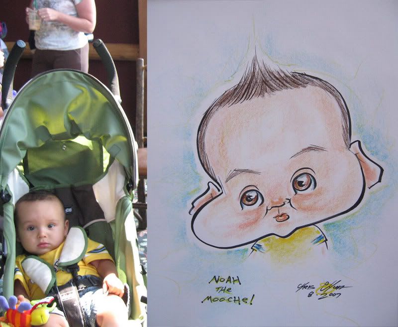
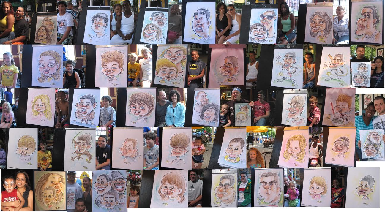
 this one got me the next sketch which was of the cutest baby (see baby in floaty tube one in the collage of last pic in this post) they said they were looking at the different artists earlier and picky about the artists and liked what I did to this caricature so wanted me to draw their uber cute baby. hey, kinda funny, I thought.
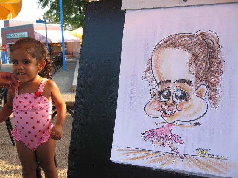
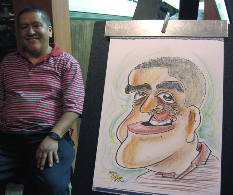
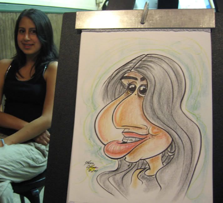
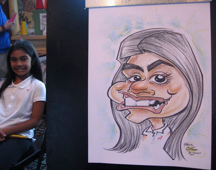
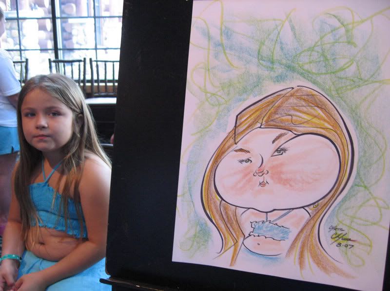
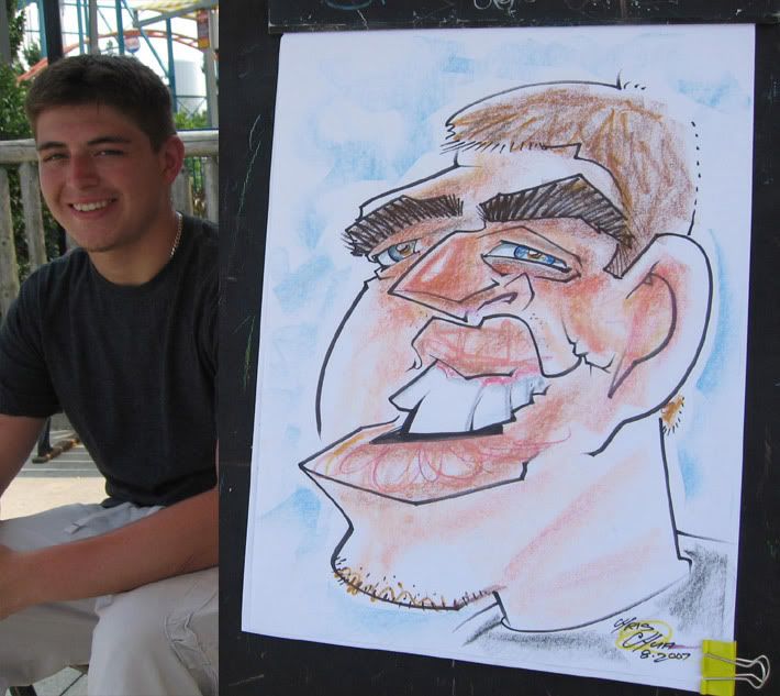
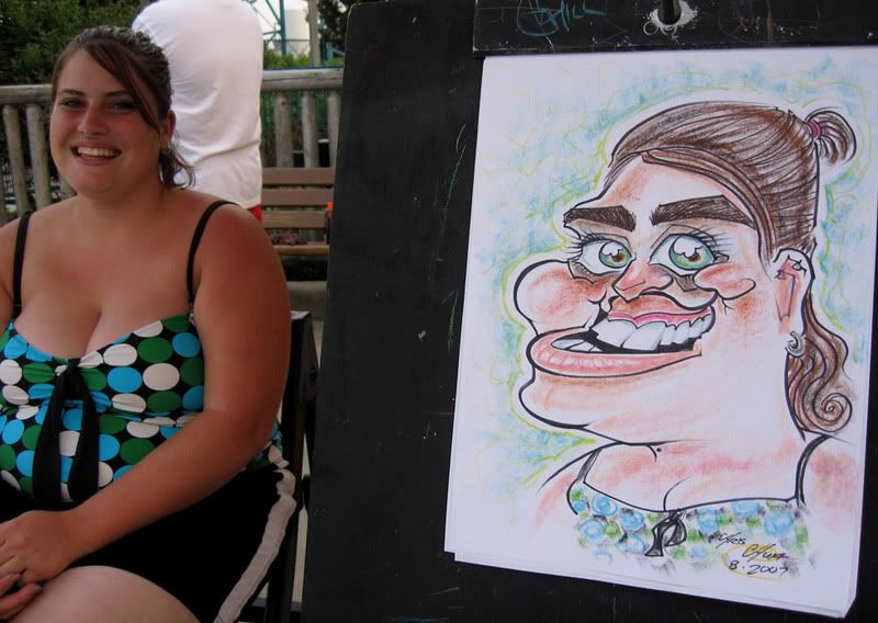
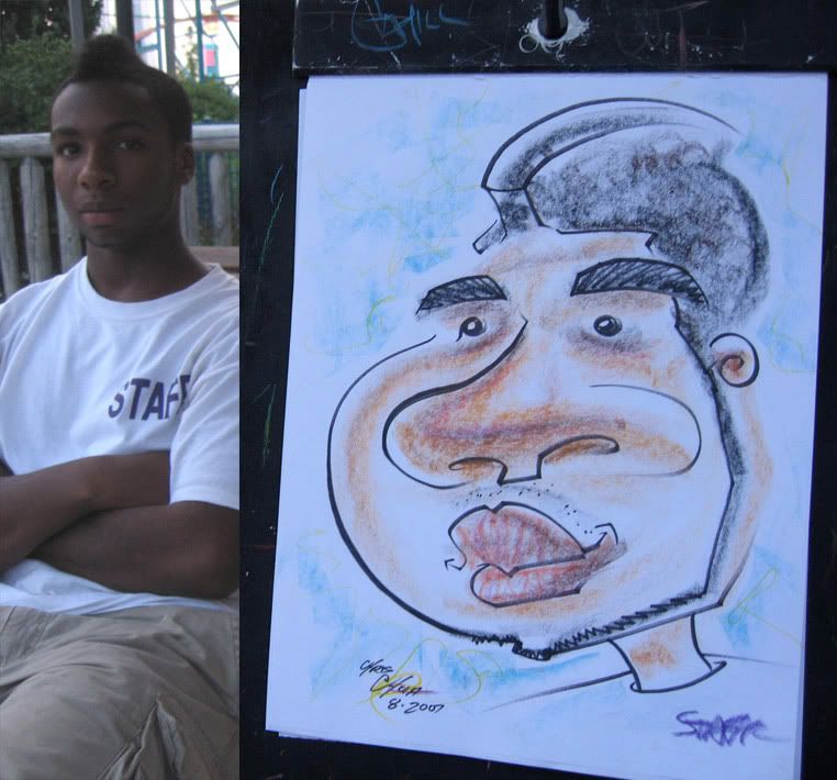
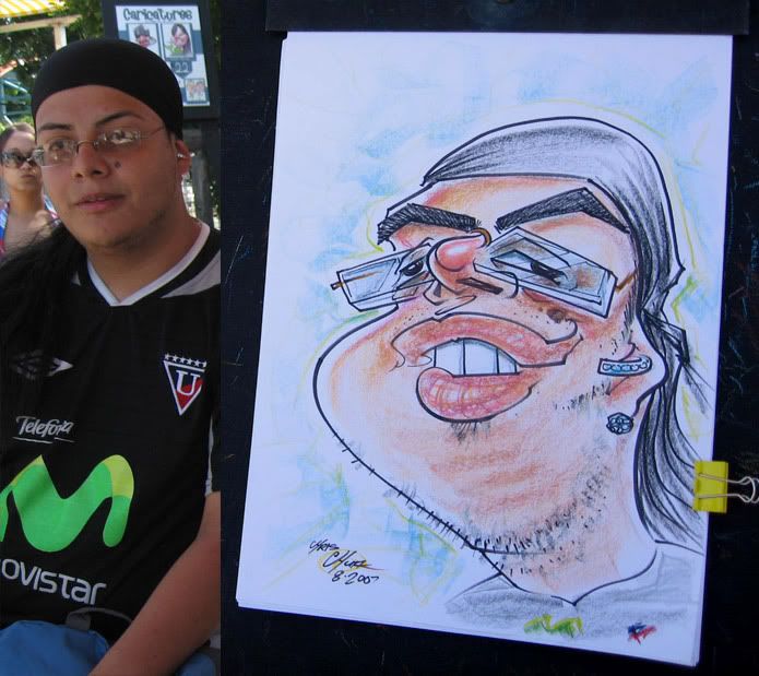
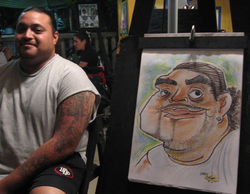
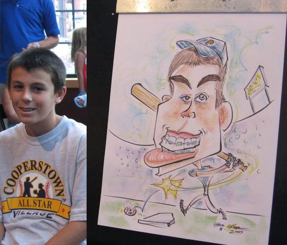


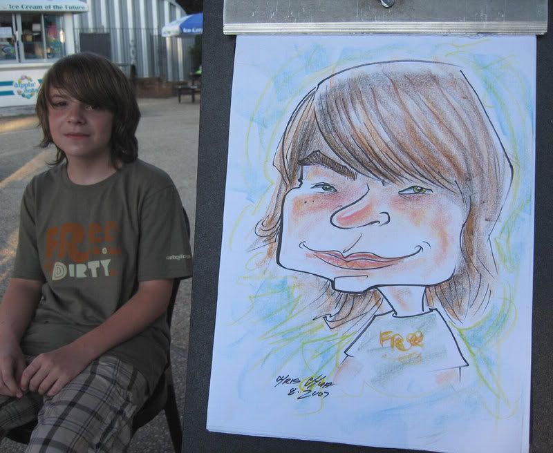
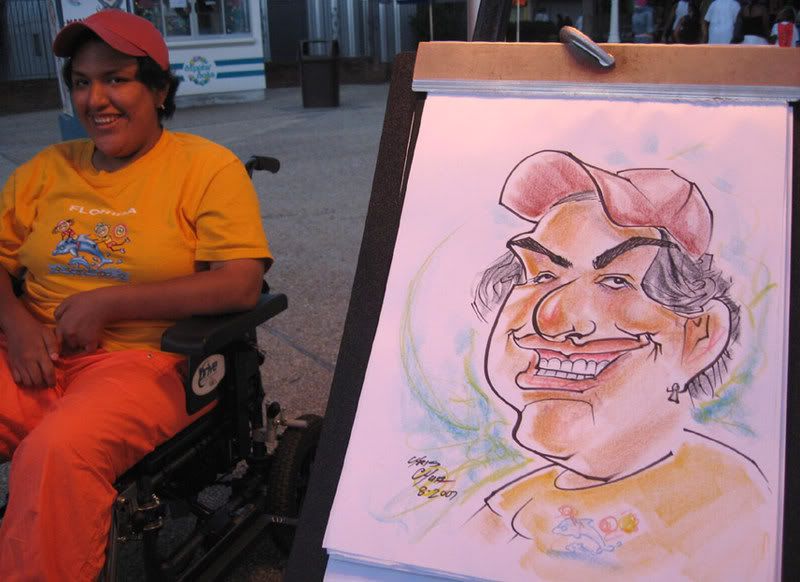
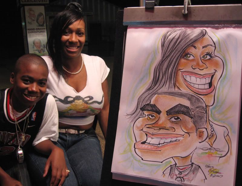
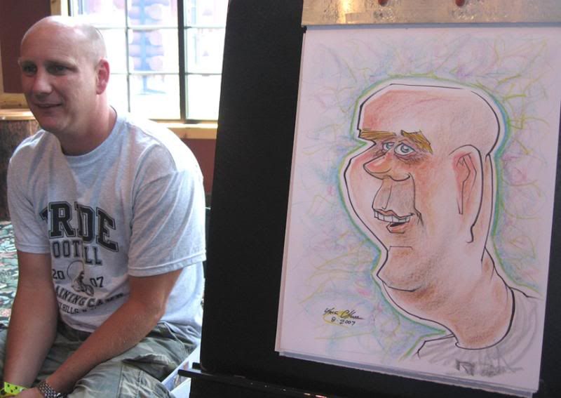
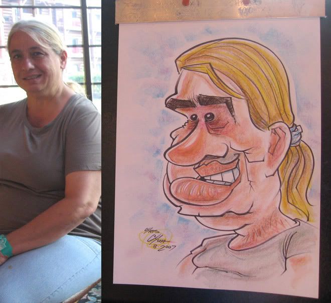
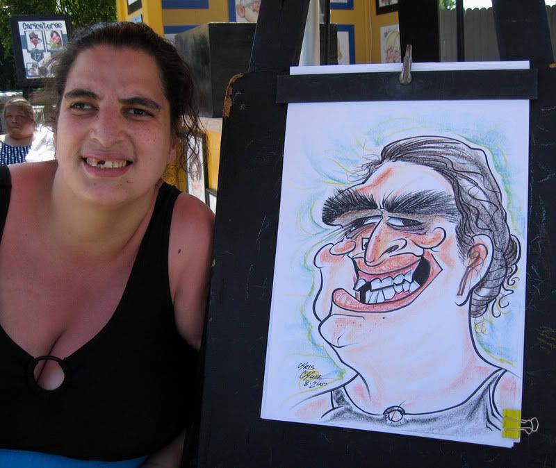
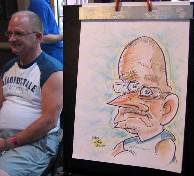
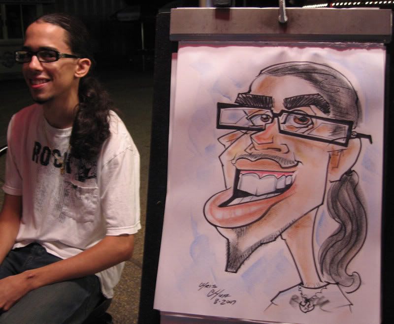 I asked this guy if he wanted to get one as he was looking around the caricature stand. he said he likes caricatures but got one last year and wasn't happy with it. I told him that I'd draw him and if he didn't like it, he didn't have to buy it. he loved it and bought it. yay to satisfied customers.
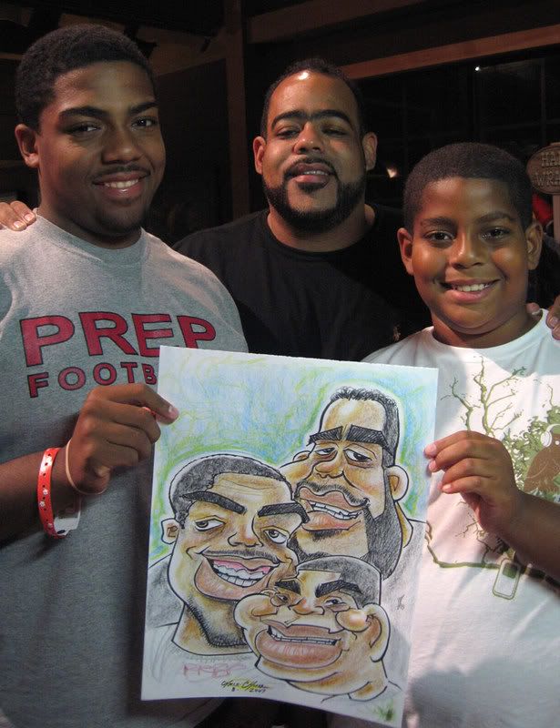
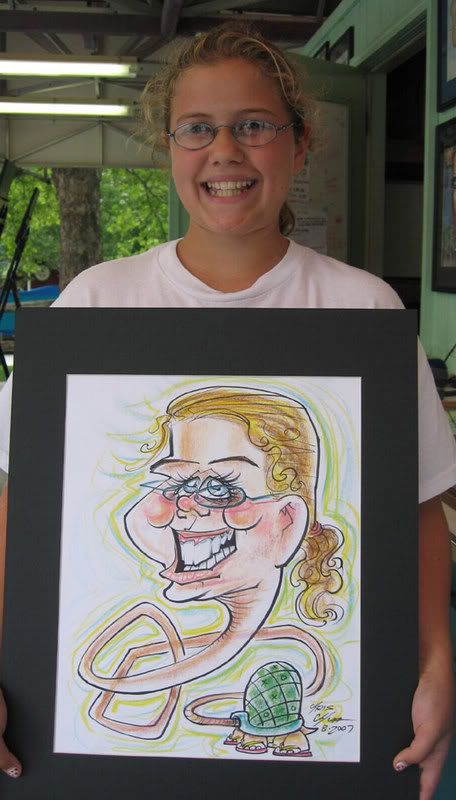 she asked to be drawn as a turtle! ha! it's her favorite animal. I need to have a better turtle body though, kinda boring.
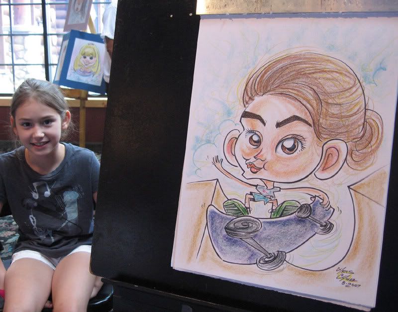
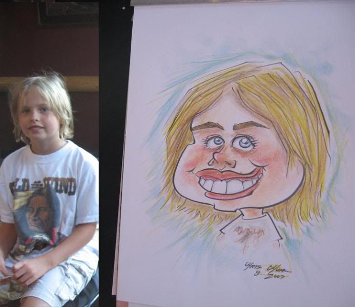 so I asked the father of this kid, "so what would he like? a color face or a color body?" the father responded, "that's a she" ooooh, awkward.










No comments:
Post a Comment