Hey, it's me again! it's been a little while. I have lots of pictures, just been busy with the park and feverishly trying to finish a side project that is due very soon (gonna get down to the wire!) which hopefully will turn out very cool and you guys will be able to buy in stores in the near future! more on that soon!
This season has been more of trying to figure things out (which seems never ending, which is good and bad). I've just felt very unsure of what I wanted to focus on so the quality of my drawings have been ranging from decent to really bad (but I'm not posting those bad ones, heh) it's just been a very uneven season so far. I'm trying to be more consistent with better overall quality even on ones that are tamer. I think after about 2 months in I'm finding a groove. hopefully you'll see once I post those later.
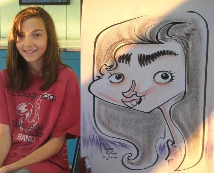
the first few are from my visits to Six Flags, NJ and Sesame Place, PA. then it's in the home park, Dorney, PA stuff.
 1. this one and the next 2 were from the same group, they and their family watching were really cool and were digging what I was doing. they each had their own distinct look which was fun.
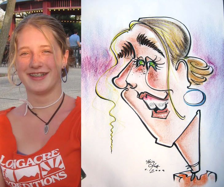 2. I like the squiggly stray hair on the left
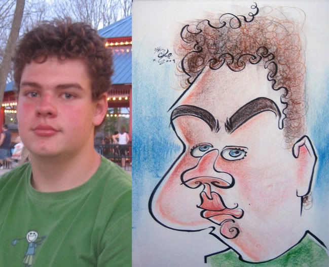 3. likeness could have been better but I think I got enough of his vibe.
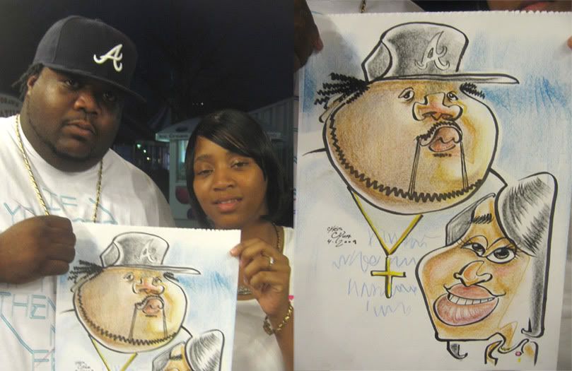 4. not too crazy, I just like the connect line from his shoulder into her hairline, especially since I drew them one at a time. it's always cool when things sorta work out nicely like that.
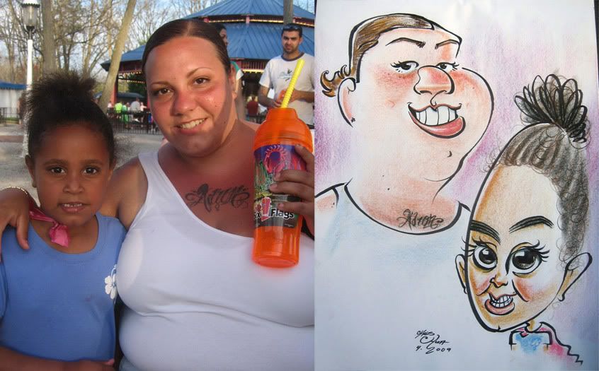 5. this was a reject. they bought it and later in the day I found out they took it to another caricature artist, my friend, Mike Diaz, that day and had it redrawn. the woman didn't like how I drew her supposedly. I thought I was being nice too. oh well. that kid came out kinda creepy and her eyes should have been closer together. like if she was able to take her own eyes and glue them closer together. wait, what?
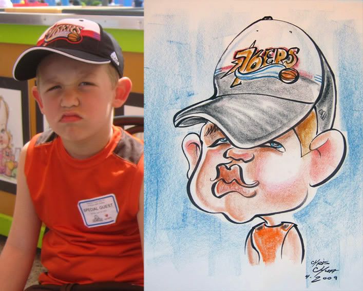 6. thought I'd try drawing the hat first then the face- ended up kinda off. could have made him look a bit younger and more protruding lower lip. I like the 76'ers hat though.
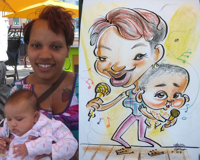 7. I usually hate drawing bodies and singing bodies as well but thought the added baby singing made it fun. I drew the mom first and was panicking a bit as I realized that I didn't leave enough room for the baby's back of head. I kinda fudged it and think it's not too noticeable. I like her leg connecting to the background line. little things like that make me happy.
Listened to this band called "Settings." not bad, kinda like older Linkin Park (the better stuff, not feeling their newer stuff) mixed with electronica. you can listen to their new album here-- www.myspace.com/settingsband
 8. I was pretty happy with this one and that connect line that went around the tall girl's head and into the other girl. I like coloring tie dye t-shirts too. these girls were cool and appreciative of the sketch.
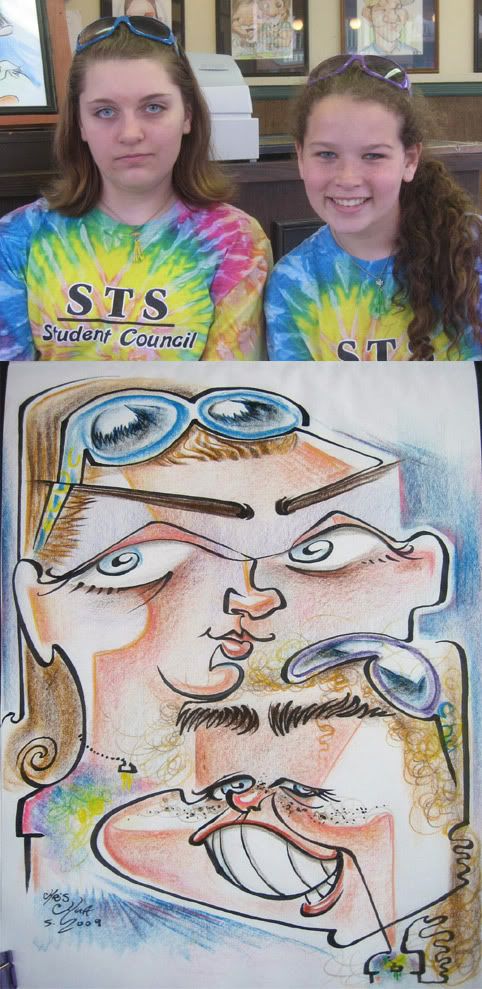 9. after seeing their friends above get one these two wanted one as well. I like the openness and lack of solid marker line look. I enjoy doing that although I don't do it as often.
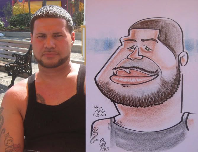 10. this is kind of a ho-hum sketch. think it's decent all-around but is lacking something that makes it zing.
 11. I jumped around a lot on this one, I think I drew the glasses first. things are off, I missed on the upper lip but I liked that it didn't have a lot of marker holding lines and was done with color.
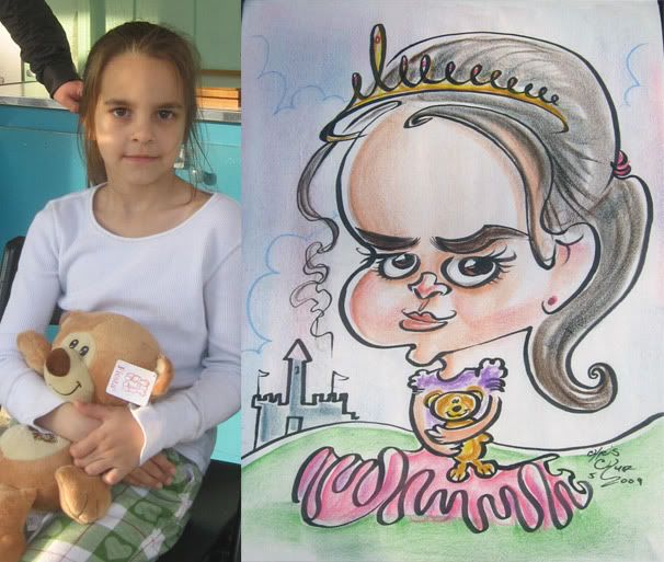 12. just a cute-ish one. her family were really liking the sketch and all started clapping after I finished which was kinda cool, heh.
 13. I told him it was going to be funny and he said he was cool with it. I then showed it to him and he was shocked and confused and was like "wait, are you serious?!" heh. he still bought it. I didn't even think it was that funny either, I could have pushed it more.
 14. demo
 15. another quick demo
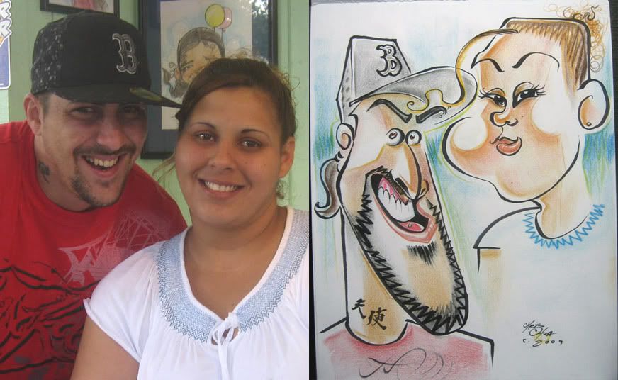 16. I mostly like the guy. the girl came out eh. really nice couple.
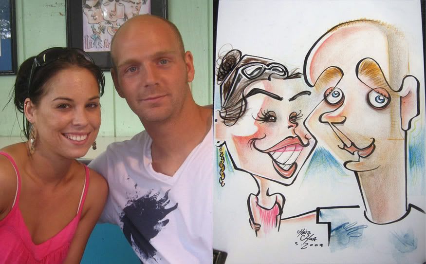 17. I was pretty happy with this one. I really liked the lines on the guy- his head to eyebrow to her chin line especially. might be one of my favorite connect line thingies. they were a really sweet and cute couple. wished I had drawn her gums better though.
 18. the lighting came out kinda strange. oh well, trying things
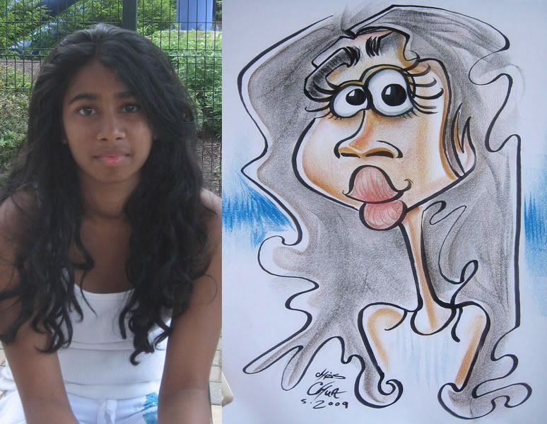 19.
19.
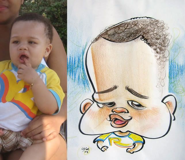 20. lately I've been enjoying drawing babies. they really are funny looking.
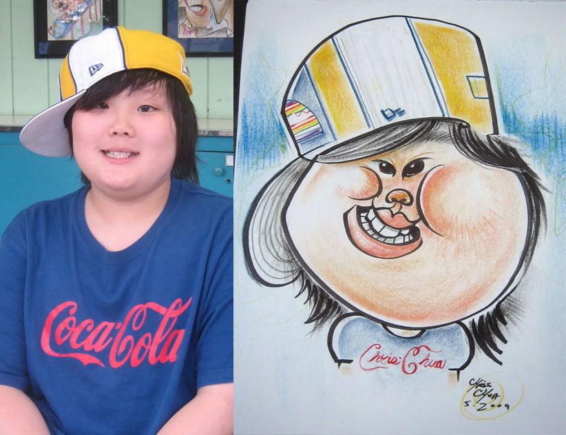 21. I liked this one when I finished it, but the more I look at it, the more I feel like I could have done it better. I remember debating whether I should make the hat flat or curve the interior lines so it's more 3-D and true to form. obviously, I decided to make it flat, thought it'd be cooler and more graphic looking. but I don't think it looks right cause the outside marker lines are not graphic enough so it looks wishy washy and just makes it look kinda wonky. oh wait! I remember why I liked it so much- I wrote my name instead of Coca-Cola on his shirt, heh. oh, you're so clever, mr. chua! thanks! ok, not really.
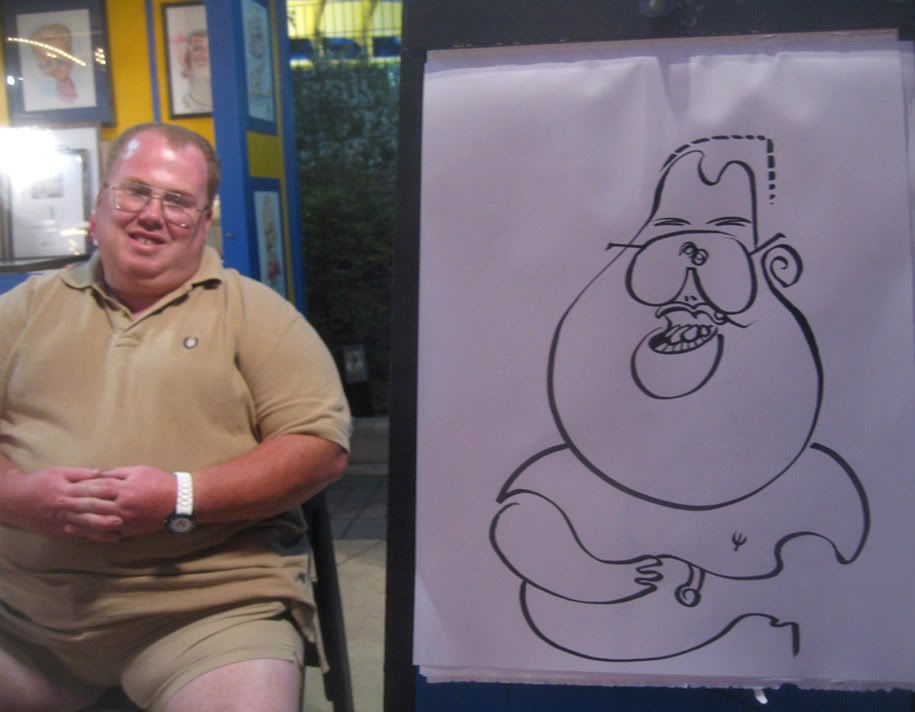 22. quick demo
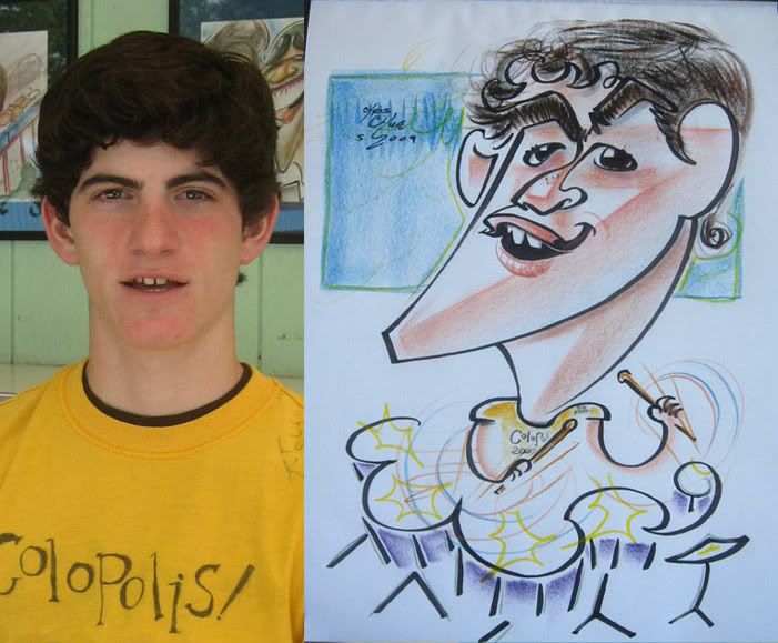 23. pushed the coloring a bit for more simple graphic.
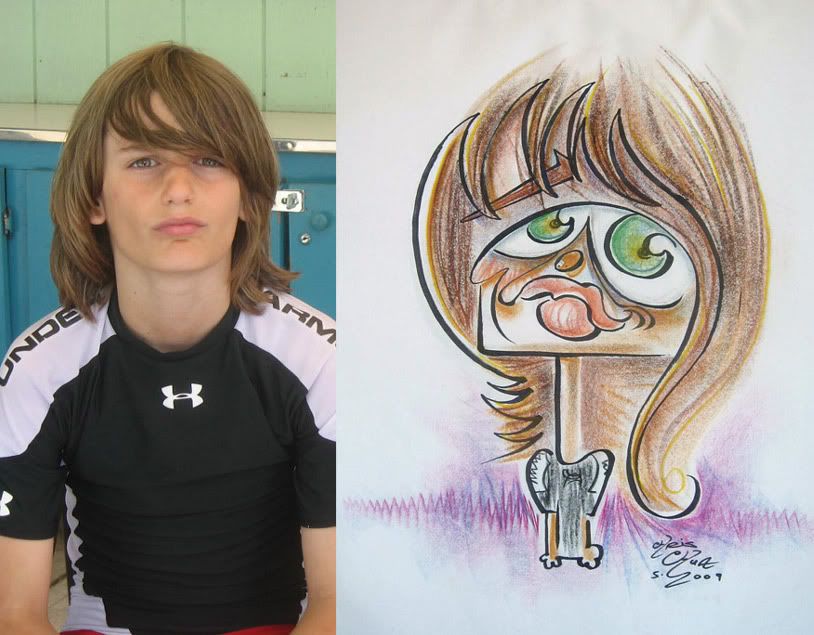 24. eyes too big.
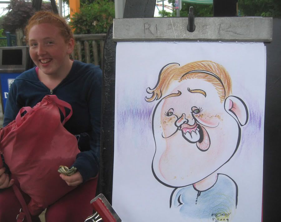 25. it was raining and crappy that day which means the paper is saturated and hard to get vibrant colors. her friends were laughing and making her really really nervous. I thought it might be a reject. but she actually liked it. the hair is my favorite part the rest is ok. oh I think this might be the 1st sketch I started signing my name as "eggroll" heh. I just thought it would be silly and have stuck with it throughout the season off and on depending on my mood and how I feel about the sketch or situation/guest.
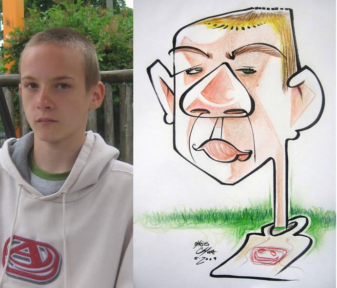 26. trying some color things.
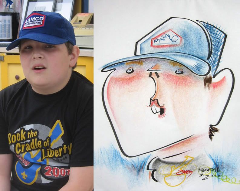 27. hee hee. oh and I love drawing hats, it's usually just one connecting line, this one has an added face to ear connect line.
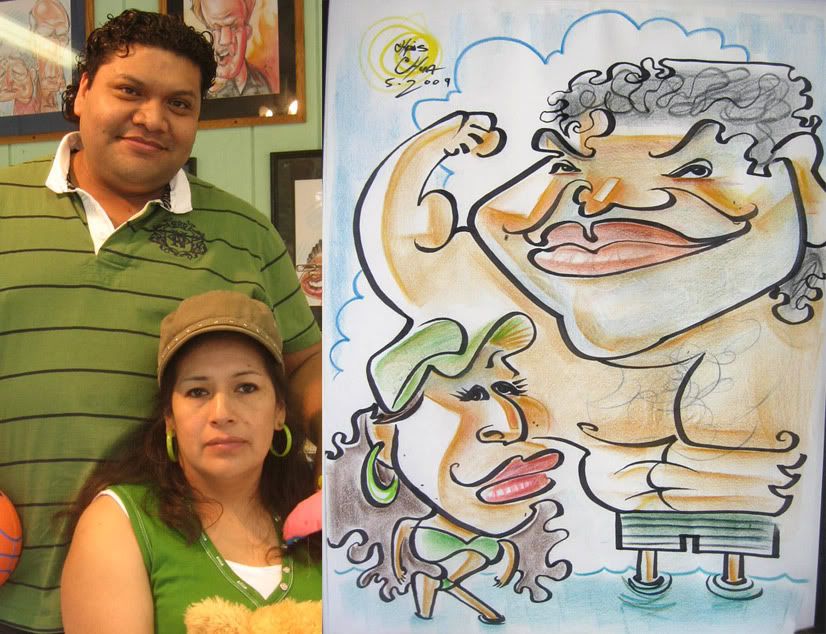 28. I liked how this came out. it's always fun playing with size contrasts. and that connect line from his arm to hat was a happy perfect controlled accident.
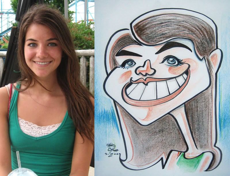 29. demo. I liked the coloring.
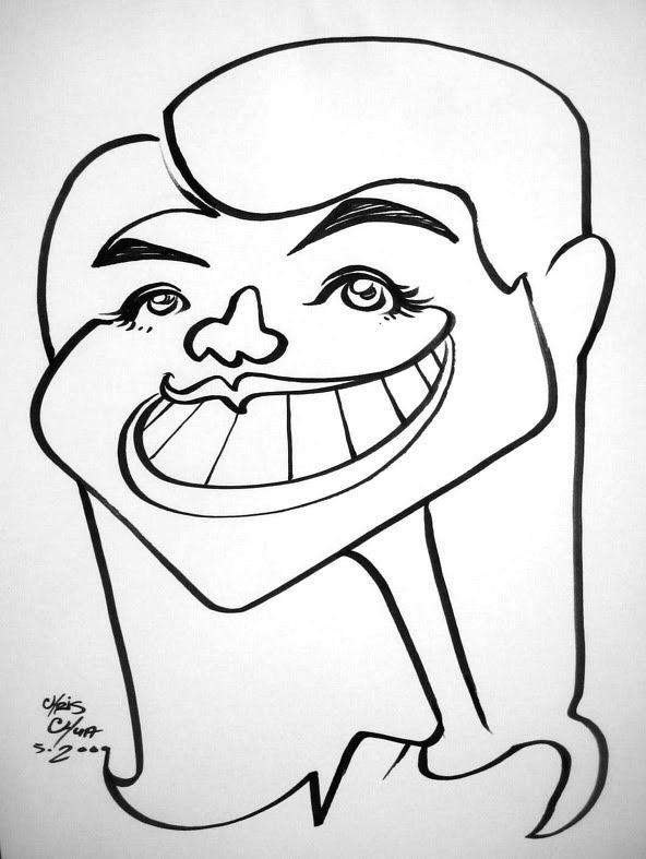 30.
30.
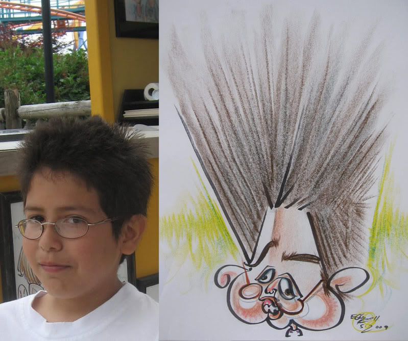 31. demo. kid said it looked nothing like him. c'mon kid! you got 2 eyes and I drew your 2 eyes, didn't I? heh.
 32. I draw too big, I need to draw smaller so I can be faster. kid liked the sketch. nice chap.
 33.
33.
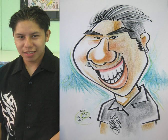 34.
34.
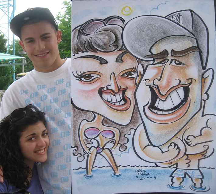 35. I liked the way she came out.
listening to another cool band called "Lights" www.myspace.com/lights it's a girl with synths and a computer. very cute, catchy and poppy. seed. check it out.
more live caricatures coming soon! they should get better and better. July has some good stuff.
 1. this one and the next 2 were from the same group, they and their family watching were really cool and were digging what I was doing. they each had their own distinct look which was fun.
 2. I like the squiggly stray hair on the left
 3. likeness could have been better but I think I got enough of his vibe.
 4. not too crazy, I just like the connect line from his shoulder into her hairline, especially since I drew them one at a time. it's always cool when things sorta work out nicely like that.
 5. this was a reject. they bought it and later in the day I found out they took it to another caricature artist, my friend, Mike Diaz, that day and had it redrawn. the woman didn't like how I drew her supposedly. I thought I was being nice too. oh well. that kid came out kinda creepy and her eyes should have been closer together. like if she was able to take her own eyes and glue them closer together. wait, what?
 6. thought I'd try drawing the hat first then the face- ended up kinda off. could have made him look a bit younger and more protruding lower lip. I like the 76'ers hat though.
 7. I usually hate drawing bodies and singing bodies as well but thought the added baby singing made it fun. I drew the mom first and was panicking a bit as I realized that I didn't leave enough room for the baby's back of head. I kinda fudged it and think it's not too noticeable. I like her leg connecting to the background line. little things like that make me happy.
Listened to this band called "Settings." not bad, kinda like older Linkin Park (the better stuff, not feeling their newer stuff) mixed with electronica. you can listen to their new album here-- www.myspace.com/settingsband
 8. I was pretty happy with this one and that connect line that went around the tall girl's head and into the other girl. I like coloring tie dye t-shirts too. these girls were cool and appreciative of the sketch.
 9. after seeing their friends above get one these two wanted one as well. I like the openness and lack of solid marker line look. I enjoy doing that although I don't do it as often.
 10. this is kind of a ho-hum sketch. think it's decent all-around but is lacking something that makes it zing.
 11. I jumped around a lot on this one, I think I drew the glasses first. things are off, I missed on the upper lip but I liked that it didn't have a lot of marker holding lines and was done with color.
 12. just a cute-ish one. her family were really liking the sketch and all started clapping after I finished which was kinda cool, heh.
 13. I told him it was going to be funny and he said he was cool with it. I then showed it to him and he was shocked and confused and was like "wait, are you serious?!" heh. he still bought it. I didn't even think it was that funny either, I could have pushed it more.
 14. demo
 15. another quick demo
 16. I mostly like the guy. the girl came out eh. really nice couple.
 17. I was pretty happy with this one. I really liked the lines on the guy- his head to eyebrow to her chin line especially. might be one of my favorite connect line thingies. they were a really sweet and cute couple. wished I had drawn her gums better though.
 18. the lighting came out kinda strange. oh well, trying things
 19.
19. 20. lately I've been enjoying drawing babies. they really are funny looking.
 21. I liked this one when I finished it, but the more I look at it, the more I feel like I could have done it better. I remember debating whether I should make the hat flat or curve the interior lines so it's more 3-D and true to form. obviously, I decided to make it flat, thought it'd be cooler and more graphic looking. but I don't think it looks right cause the outside marker lines are not graphic enough so it looks wishy washy and just makes it look kinda wonky. oh wait! I remember why I liked it so much- I wrote my name instead of Coca-Cola on his shirt, heh. oh, you're so clever, mr. chua! thanks! ok, not really.
 22. quick demo
 23. pushed the coloring a bit for more simple graphic.
 24. eyes too big.
 25. it was raining and crappy that day which means the paper is saturated and hard to get vibrant colors. her friends were laughing and making her really really nervous. I thought it might be a reject. but she actually liked it. the hair is my favorite part the rest is ok. oh I think this might be the 1st sketch I started signing my name as "eggroll" heh. I just thought it would be silly and have stuck with it throughout the season off and on depending on my mood and how I feel about the sketch or situation/guest.
 26. trying some color things.
 27. hee hee. oh and I love drawing hats, it's usually just one connecting line, this one has an added face to ear connect line.
 28. I liked how this came out. it's always fun playing with size contrasts. and that connect line from his arm to hat was a happy perfect controlled accident.
 29. demo. I liked the coloring.
 30.
30. 31. demo. kid said it looked nothing like him. c'mon kid! you got 2 eyes and I drew your 2 eyes, didn't I? heh.
 32. I draw too big, I need to draw smaller so I can be faster. kid liked the sketch. nice chap.
 33.
33. 34.
34. 35. I liked the way she came out.
listening to another cool band called "Lights" www.myspace.com/lights it's a girl with synths and a computer. very cute, catchy and poppy. seed. check it out.
more live caricatures coming soon! they should get better and better. July has some good stuff.


12 comments:
SUper Dupper Ultra Mega Post!! damn thats a ton of pictures. I got to say, I'm not sure I'm feeling these. They are really tame (for you) the likeness are there though, but I miss the vibrant colors and ....the rest of the stuff that doesn't make seance to me.
I bet it's that damn Zitman that's rotting your brain!
HOly moly. So much coolness. I love 17, and that's definatly one of the best connector lines ever. I like how you did the gums on her too.
sean- yeah, these are kinda tame, I do feel like I'm concentrating on likeness a bit more these days and haven't been pushing it as much, but defintely want to get back to more crazy. There are a few crazy ones coming up in the next post or two. and yeah, I guess the coloring isn't as pushed lately too, I'll try to get back to it! thanks for the honest feedback, buddy! always appreciated!
aaron- thanks! yeah, I really like 17 as well. I don't know, the gums really bug me, I wanted to try just coloring over the teeth lines but it doesn't look quite right to me, and I think she was more gums than teeth and I emphasized teeth.
A tour-de-force! (whatever that means!) Brilliant, brilliant! I really like the whole package of number 19. Very cool. Keep experimenting so I can see all the cool posts!
wow dude...man i wish someday i can work right with yah at your guysez park....shapes flying everywhere
i think i would be able to draw more of what i feel I'm capable of here then at my park
You are missed! And you are my hero!
niice! I think i like 27 the best, it's sick! i love the little mouth
and I saw lights playing when I went to warped tour! we only saw a little but it was good!
#34 looks like you as a cholo, Lets see some JACKIN!!!!!!!
totally awesome, as always, though i agree that these are quite tame.
i think it's great though, that you change things up and try new stuff.
2 and 8 are my favs of the bunch.
amazing stuff, whether 'tame' or not - despite (or perhaps because of) all the wild graphic experimentation that you normally do, you still manage to get a sense of the subjects personalities. It's hard to choose a favorite from this batch, but 19 is particularly dead on.
fran- thanks! and will do!
andy- bug Beau so I can come draw with you guys! go go shapes! I'm not sure if it's my park/east coast...I still do the same stuff at every park I go to, but maybe the west coast is different?
sheina- aww thanks! miss ya too!
erin! thanks! I like 27 too. cool that ya saw Lights!
Nate- ha ha. jackin stuff coming up soon. well, semi soon. going thru my pictures now that I have a bit more free time. July/August I have some good stuff!
will- thanks! I like 8 a lot. and yeah, pretty tame, better stuff coming up.
john- thanks, I appreciate it! I really try to get their essence some way or other.
Cool stuff alright. I dont wanna work next to ya, you'll steal all my customers! LOL! I just look forward to the day I can watch you draw.
Post a Comment