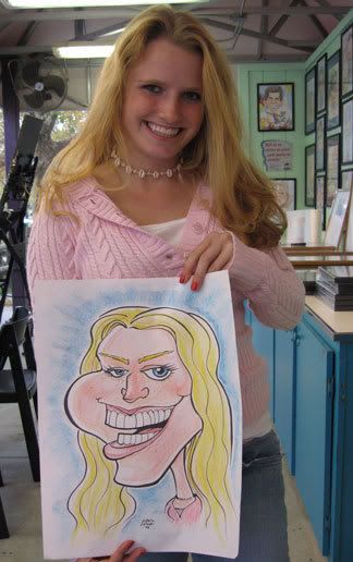
 this girl was real cool, she was down with me pushing it more. still more on the tame-ish side but overall I was more happy with it. looking at it now I screwed up the eye, I should have made it even more screwed up so it doesn't look so screwed up, heh. I know it might not make sense, but it is true, if you make it so "wrong" that it looks like you did it wrong on purpose than it will look "right." making "wrong art" look right is one of my favorite ideas and something that I like doing...
 Here's video of me drawing this here! not really much to see but yeah, enjoy seeing me in action, heh. recorded by my good buddy and studiomate, Jason Baroody on his cell phone. He came to visit for the day along with his gal L-dizzle and our buds Peelan and his maiden JN-funk.
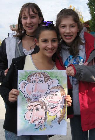
these girls were a lot of fun to draw too. they were hilarious to-- laughing, singing , making fun of each while I drew them. made for a great drawing atmosphere and all around good vibes which I really dig. they were also freaking out worried how I was drawing them because people were laughing at what I was drawing...myself included, heh. and they even said to go nuts, hee hee. If I remember, I think their mom said she was gonna use this picture as ammo to show to their future boyfriends, heh.
as for the picture, I liked it cause I pushed it more, but the layout is really off/bad tangents and some things look off but not in the right way, like I mentioned in the previous paragraph. I still don't have much experience drawing multiple people, still need to work on that. overall, I think the more exaggeration I did makes up for a lot of lil things that bugged me/things don't quite "flow" right as a design.
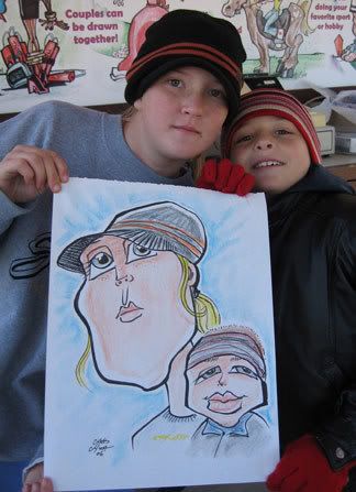
I was pretty happy with the girl. I like the contrast between the two too. the lil kid was ok. It could have had been better design flow. they did love the pic which is always cool.
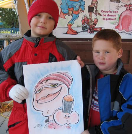 hee hee, this one cracks me up. one of my favs. this one was one of those times where I was in the right mindframe of just going for it and knowing right away what I was going to do after seeing them. I liked how I did the eyes on the kid on the left. this picture has more of my style, me thinks.
 it was funny, after I drew kid on the right, he saw it and his jaw dropped and was speechless then he kept saying "oh my gawd" and other similar shocked words stuff over and over, I wasn't quite sure if he liked it or not but it turned out he loved it. also funny was that both kids got up to watch me as I was coloring it and the kid on the right said "hey, I look like a hand giving the middle finger! cool!" and I soon as he said that I looked at it and thought, "oh yeah, you do....wait, ha ha ha, you look like a twig and berries" it was unintentional, I swear! I had a hard time trying not to laugh after I saw that. The kids couldn't wait to show their parents too, hee hee. although it bugged me that since they weren't siblings they were arguing who would get to display/keep the picture and had ideas of *gasp* cutting out their own caricatures so they could each have it. such blashemy! heh. whatever, I got my photo of it, they can do what theys pleezey.
btw, the black headgear on the small kid's head in the picture, the kid was wearing it when I was drawing him but then when I was drawing the other kid he went on a ride and lost it so that's why he's not wearing it in the photo.
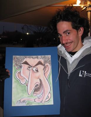 this is of my co-worker at Dorney, Mike Gonzalez, aka GONZO. He's a cool dude. I watched him draw a caricature at Dorney with 28 people on one page! it was awesome, it took him about 3 hours. I think he might hold the new record in our company for most people. This caricature I did of him is more my normal crazy style. I like it. I did another of him a few weeks later that was pretty crazy colory. I'll post that soony.
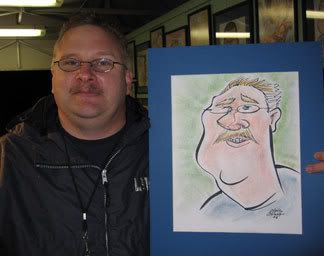 This sketch is crap!
this is the 1st one I did of Brad Bailey, who is our caricature regional manager at Dorney Park and bad ass artist/all-around cool ass dude. He stopped by our park one night and it was really cold and rainy and slow so we drew each other. this was the 1st one I drew of him. this is what happens when my brain isn't working. it's not THAT bad, it works enough in that what I chose to exaggerate is right enough (sorta), but it's bad in that it's very tame and generic, with no "life" or charm or fun or interest or "me" really...it's weird, like my brain is working but not quite and it's not thinking in terms of what I SHOULD be thinking. It's just going thru the normal caricature theories when I should be pushing it and thinking out of the box. and I was really excited about drawing Brad too, because everyone knows that you can just go extra nuts when drawing your fellow caricaturists. I hate when I do pictures like this.
Brad drew me. check it out, I really dig it! to see it click--> ME1 by Brad.
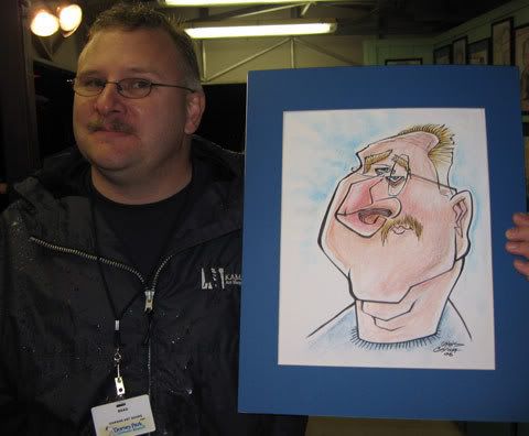 after that crappy one I did, I had to do another one, so about 15 minutes after my crappy 1st one, I did the above, I was much happier with this one and really studied his face a bit more and thought about my game plan before I started and as I was drawing it. this still is one of my favs I've done.
after I did the second one, Brad wanted to do another one of me, click HERE to see it! it's awesome!
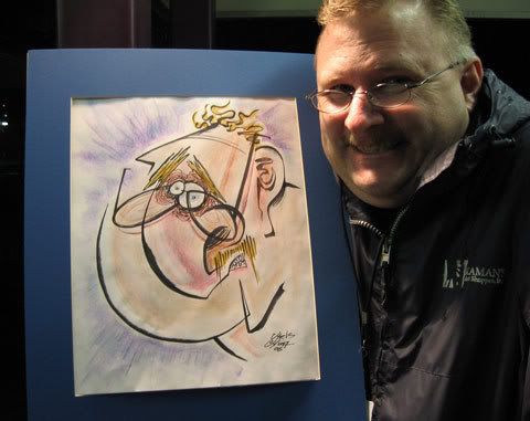
after I saw the awesome 2nd one Brad did of me, I felt I had to up the ante and do a 3rd one, push it even more. I think this is one of the closest to my normal studio style. it's been a month and I've been doing more live caricatures and I still think this one is prolly the closest. I really should try to do more of this stuff in a live setting...
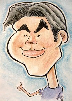
here's a caricture I did of myself during this time period, more on the tame side, I'll post another one I did more recently using these tool that's more crazy.
----------------
I've got more live caricatures coming up from Great Wolf Lodge which is where I'm working now doing caricatures. there's some really crazy ones...and also some crap lame tame ones as well, booo. but stay tuuuuned!


6 comments:
Man the second I saw that kid in the headband I thought "Wow Chua's gettin a bit riské by drawing as a kid as a penis."
ha ha, like I said in the commentary, it was a coinkyDicky, heh.
Man some of the are super cool! GONZO is the best and that last one of that Brad guy is awesome too!
It sucked that the film by that one director (Baroody something) was so short and really tiny too. I couldn't see what was bein' drawn. I think you were just writing "Steev Stinx". Either that or you were drawing a waterbuffalo pooping or something. :)
thanks, Steev! I really liked those 2 too, especially that last one of Brad.
and it wasn't a water buffalo pooping I was drawing, it was a water buffalo eating a sandwich. a chicken sandwich. and by chicken sandwich, that's just code for poop.
The Bailey sketch is super sweet!!!! It's really awesome to see how the first two sketches evolved into the third. Good stuff!
thanks, nolan! I've got a lot more drawings where I've drawn the same person multiple times. I like doing that, it's fun and challenging.
Post a Comment